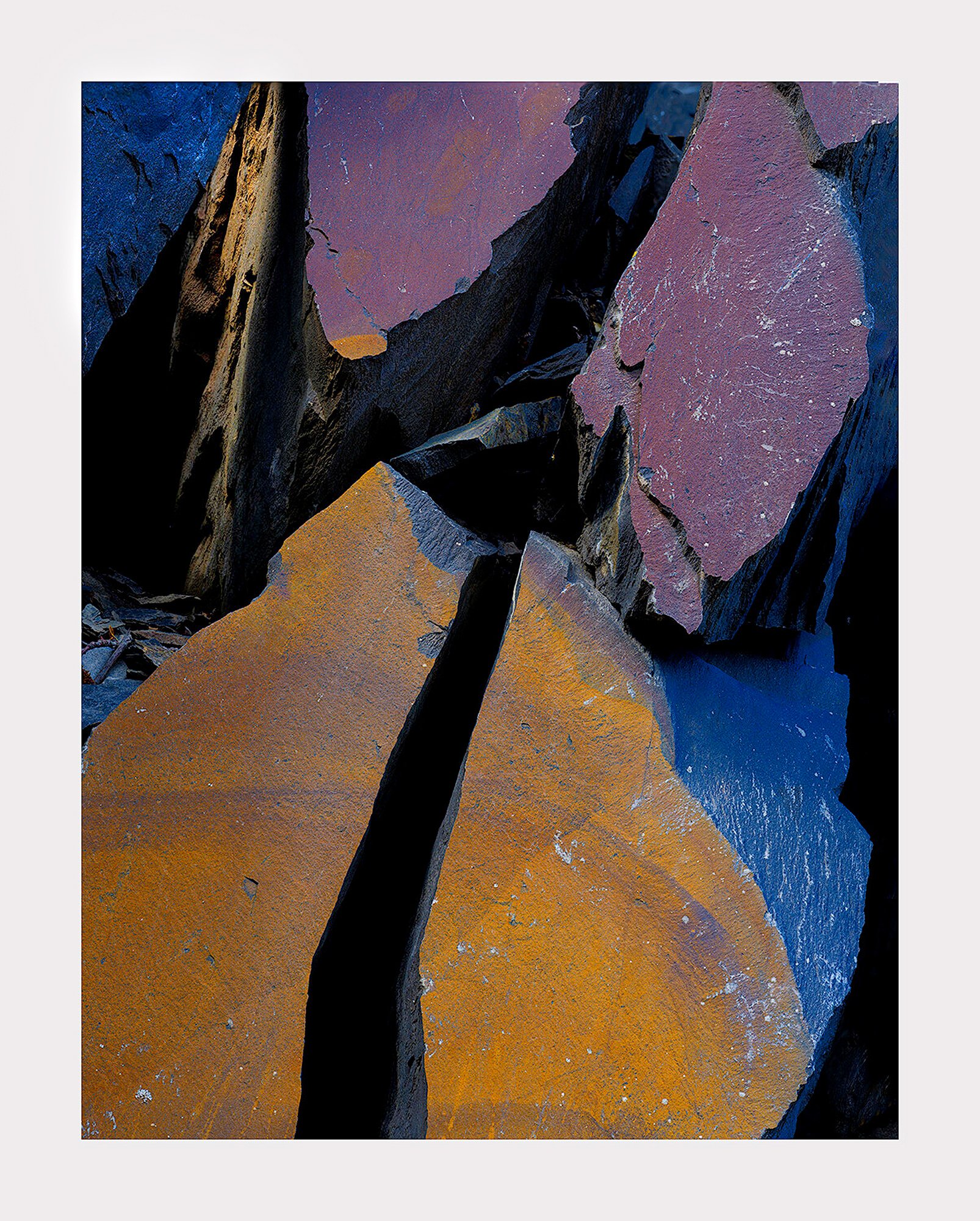
Kandinsky, if you’re not aware, is the father of abstract art. I’ve been studying his work and decided to incorporate what I’ve picked up into a photograph. That, admittedly, is hard to do because he painted two dimensional art often using geometric shapes. Anyway, the point is to have an emotional response to shapes and colors on their own without any reference to the real world.
So, what do you think of this image? My initial versions had deeper blacks that had very little definition in them. However, I’ve slowly moved in this direction
I like the colors and shapes, Igor. These colors convey coolness to me, which makes the rocks seem sharp and jagged. This almost has the look of some set-lighting! The cracks are sharp-edged, not crumbly, adding to the cold harsh effect for me. The colors are beautiful, and yet I wouldn’t want to hang out here. Looks dangerous. That’s how I see this! Great choice.
Hey Igor! I love this photo. I’m big on bold colors that pair together and you’ve done that really well in this composition. Speaking of the composition, kudos to you for making it so direct and obvious. That’s not easy with subjects like this. In terms of the darker versus brighter blacks you mentioned, why not both? I think the photo would benefit from darkening specific areas of the blacks and shadows to remove any distraction. ie right in the middle of where the 4 rocks converge and over to the very left side of the frame. That would be my only suggestion!
I quite like this one. The shapes and colors provide a striking abstract. I would clean up the bright white dot in the black and maybe the gray bits LLC but otherwise, I would. not change a thing. A very creative and effective image.
Hi Igor!
I like your abstract image (didn’t know that about Kandinsky😊). My initial emotional response was fascination and I guess awe. Even though the colors bring calmness, what I see is destruction, some great force breaking something apart. I’m about the upper left hand corner and what it brings to the composition. I feel it slight imbalance and the image falling to the right. Nice shot!
I agree that something should be done about that wedge. Perhaps desaturate it. Perhaps warm it up. Perhaps darken it. I thought it was all black until I started to raise the blacks. But I agree that it needs something. I’ll work on it after I get done with my current image.
Good. This is the kind of response I was seeking. Yes, the jagged nature of these rocks along with the sheen off their surface bring a lot of excitement and tension. That’s what brought me to the area and kept me there for 3 days. You couldn’t look at this pile of rocks without feeling strong emotions.
Hi Igor, what an intriguing image. The stark graphic, geometric feel is certainly front and center. The colors are quite bold too (maybe those Fujifilm colors). From an emotional perspective I see the red/orange areas attacking the cooler ares. It feels much more hostile and aggressive. I think it’s the bold colors that do that. In any case, It has a striking and memorable impression on me.
The coldness and angularity is what strikes me first, lending a sense of desolation, honestly. At the same time, the otherworldly color is quite beautiful and the shapes are nicely distributed within the frame. I also like the depth brought to the image from opening up the darker areas as you mentioned. Agree with @gary19 about the ULC–I think perhaps too much has been brought out in that area and it draws the eye. Wonderful image, Igor. I could see spending some serious time in this area.
One interesting thing about Kandinsky is that he tried to use abstract paintings to duplicate the effects of music. He felt colors had sound qualities to them. Yellow, for example, affected us similarly to the sound of the trumpet.
One of your most unique images ever, Igor. This image brings fear to me. It’s the sharp edges throughout and the glistening, saw like highlights in the gray/blue area in the LLC. It reminds me a little of the first Alien movie with the monster having very sharp teeth and everything was sharp corners and blade like. This is very ominous feeling and I would not want to hang out in a place like this. I love the lack of detail in the lower center crack and the right crack. Feels like you could fall into an endless abyss. I have more confusion in the upper left corner with the cracks in the triangle and even more than that, the little crumbly blue section just north of the gold slab. I feel it’s too bright. Same for that center jag that the tow golden rocks are pointed at. I would burn that down a bit. If there is room I might also rotate the bottom of the image counter clockwise so the right side is not so empty by bringing those golden slabs to the right but keeping the top of the image the same. Terrific and well thought out image. I would love to play for a few days with this rock pile.
Being new here I am hesitant to comment on other members photos just yet but this one of Igor’s really shone through for me. As @David_Johnston mentioned the bold colours pair together…a great display of complementary colours that hold the image together. To me, this is a wonderful example of contrasts that draw you into an image. Contrast of the complementary colours on the surface with the underlying harsh black, and contrast between the smooth upper rock surfaces with an underlying harsh jaggedness. Once that has settled, you are left with a sense of calm in the bold colours that are on a ‘peaceful’ plane. Love it.
Thank you for the detailed suggestions. I’m getting more info than usual. I think that may be due to it’s abstract quality where the compositional elements are well defined and therefore modifications are more obvious. Btw, if you think this is wild wait til you see the next one. It’s outrageous.
I’m late enough here that all I really need to say is WOW! I LOVE this and how the bold colors work with the shapes, which, to me, read as an obvious rock formation – but – OK – WAY MORE than a rock!
I wouldn’t change a thing – I love the variation in detail in the darks and, for me, the UL corner is a star field!
I’m with @Diane_Miller, Igor. I love the colors, shapes, textures and all. In reading all of the various ideas, however, I did, so boldly, take your image into PS and - just for fun - burned the two ULC triangles to see how this might affect the image.
It sure does. Now you got me thinking that maybe the blue is not so bad in that corner. I would darken the yellow some though because I want the large yellow mass to remain dominant. You won’t believe how many versions I made myself before posting. This seems to be one that can be adjusted endlessly. And they’re all valid.
So right, Igor. I suppose it depends on how many hours you want to spend and how many versions you are looking for? BTW, I do like the blue in the corner too. Have fun.
My, my Igor, you have done it again. I think this is something you would see in a sci-fi movie. The last survivors of earth are flying over the destruction trying to find a place to land. Seriously, I see destruction, but the colors add beauty to it. Maybe saying there’s hope. I love the different shades of blacks too. I think you did a great job with them. The lighter blacks in the center allow you to peek into the internal mysteries of the peak that once hid them. I love @Linda_Mellor 's rework, but agree that the yellows should be darkened a little. I also agree with @Diane_Miller that I like the UL corner and Linda’s rework made it even better. What a fun image or one that will drive you crazy playing with. One of my favorites.