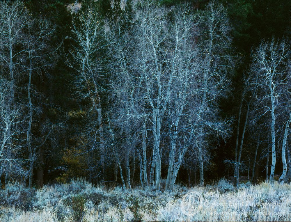
Thank you all for your feedback. Here is the full frame that I cropped the original post out of. I was not happy with the foreground due to its brightness and the two out of focus sage branches poking up from the bottom.
But I did some work on it and burned down the foreground and did some cloning work to remove the sage branches. I also took the suggestion to burn down the background to remove the brighter yellow leaves on the left side. Here is the new full frame.
So, does the reworked version look better or worse. I am not sure. I am happier with the foreground, making me think the full frame might better, They look like two very different photos to me.
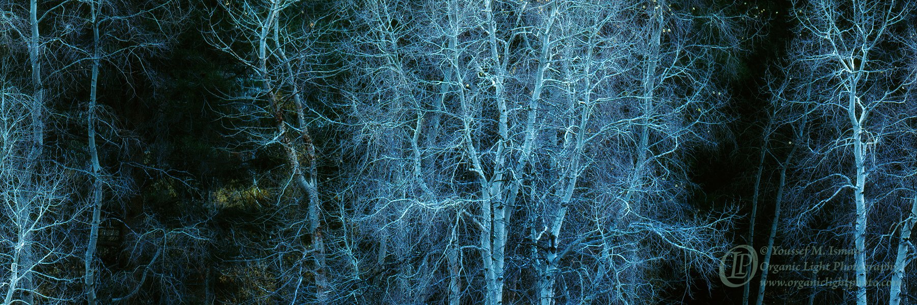
Does the reworked pano crop work better than the first? I feel like maybe I pushed the contrast a bit to far?
Would a different crop better? Maybe a vertical crop but keep the 4x5 ratio or maybe some thing different. I am open to all suggestions.
Thank you in advance.
What artistic feedback would you like if any?
Pertinent technical details or techniques:
(If this is a composite, etc. please be honest with your techniques to help others learn)
If you would like your image to be eligible for a feature on the NPN Instagram (@NaturePhotoNet), add the tag ‘ig’ and leave your Instagram username below.
You may only download this image to demonstrate post-processing techniques.
The pano versions are probably better but I like the last image you posted. I would darken the highlights in the grass below a bit further though. It’s hard to tell with your signature over a critical area. The blue gives it a spooky look but there is still plenty of blue in the other images as well.
I also enjoy the panoramic crops shown; the amount of blues in it depends on what you’re going for, I prefer the second version with less blue here. Beautiful contrasts and shapes!
A bit late here Youssef. I commented on your original post, but was enjoying Yosemite for a few days when you posted this, so I missed this one.
Of the 5 posted here, the second full frame version works best for me. And it’s hard to tell, but I prefer the color/hue of the main cluster of trees in the last and final version. Hard to tell, there might not be a difference in processing between #2 and #875-layers
#5 doesn’t work for me simply because the left and right edges are just too tight, cut-off and create too much tension really. At least with your original, the trees on the sides are just enough to provide solid framing. And with that, the sides are also what helps make the pano crops work as well. I much prefer the less blue #4 and ranks close to #2. Both of those I prefer over the others.
I think it was important in #4 that the bg yellow/green leaves be darkened as I felt those leaves (and their color) were mildly distracting compared to the mono-chromatic tones of the bare trees. Which, btw, that center cluster of trunks and delicate branches are fantastic and since you might have the pixels… I think a much tighter crop on that central cluster is a viable option as well!
You’ve got many options here Youssef, so not sure any of these comments are helping you decide…