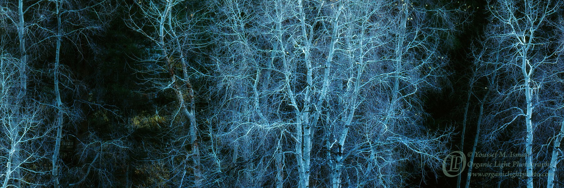
I need some critical feedback on this photo. Does this work? On any level? Its a crop from a 4x5 transparency. I was not happy with the foreground nor was I happy with the tops as some were cut off. Does the pano work? Are the dark gaps on either side of the center stand to distracting?
Thanks.
What technical feedback would you like if any?
What artistic feedback would you like if any?
Pertinent technical details or techniques:
(If this is a composite, etc. please be honest with your techniques to help others learn)
If you would like your image to be eligible for a feature on the NPN Instagram (@NaturePhotoNet), add the tag ‘ig’ and leave your Instagram username below.
You may only download this image to demonstrate post-processing techniques.
1 Like
Hey @Youssef_Ismail.
From what i understood (with my poor english) it’s a scan from film right? If so, mind if i ask, what film did you use?
The image works for me, i like contrast that those dark gaps create. Love those small yellow leafs on the right. The only thing i would change (sorry for the honesty) is the watermark, it steals the attetion from the rest of the image.
Also if you could lower those little light on the middle of the left dark gap i think it would channel the eyes more to the center of the image.
Thanks for sharing,
Cheers
The ghost trees in a blue color cast works really well. If there is more space on the left side I would add it back because the ‘ghost’ in the llc feels a bit crowded. There are some very weak but noticeable warm undertones that work well here. I like this very much.
PS The trees look like those bolts of light produced by a Tesla coil.
I am quite liking the comp and mood. I find the cyan a bit overwhelming and would back it off quite a bit and I would try to darken the mottled light (?) about a third in from the left. The dark areas work nicely for me, contributing to the eerie mood.
Youssef,
Without having seen your original, my guess is that you’ve made the best choice with this crop. The horizontal pano crop is bold and for the most part I think works.
Others have touched on some things and I agree with Igor. I’m wishing there was bit more on the left to balance what is included onthe right. You may or may not have that in your original. Harley also pointed out the lighter greens left of center - I would definitely mute those as it’s mildly distracting and actually doesn’t go with the overall tones and mood you’ve presented.
Curious as to your choice on the color - although if my memory serves me, is consistent with some of your previous work. Again, I think it’s a bold crop.
Not sure if this works any better, but what about cropping about 20-25% off the left - assuming you don’t have any more to add back. Then desat and darken the yellow greens in the gap. It may not be as strong or bold, but I think there’s still a dynamic with the main group of trees and the right side. Definitely worth exploring more.
Lon
Hi,
Cut back on the cyan and tweak up the contrast slightly might be worth trying. Comp is OK too…Jim
Thanks for the feedback so far. Let me upload the uncropped image and make some of the adjustments you all have suggested and I will upload that edited version. I am trying to make the best of a colorless, late trip to the eastern sierra. Color or not, the east side is always a joy to be in.
Thanks @Lon_Overacker, and yes the color pallet is in line with my other “barren” east side images.
This definitely works for me! I love the comp with those two darker gaps between the trees and the left-right symmetry.