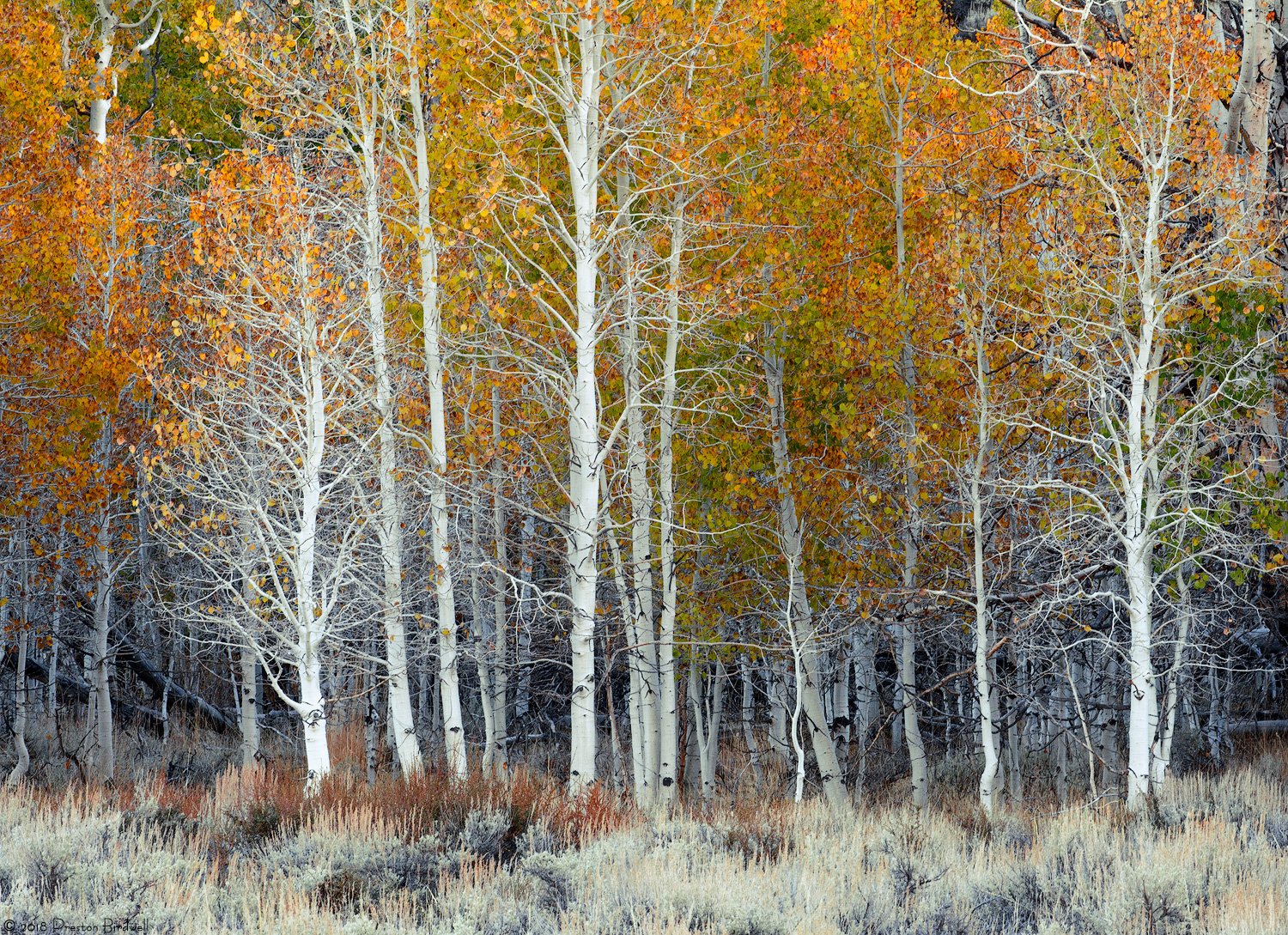
Green Creek, Sierra
What technical feedback would you like if any?
I would like your thoughts about contrast, color balance, and saturation.
What artistic feedback would you like if any?
What do you think the compositional balance?
Any pertinent technical details:
Nikon D-7100
Nikkor 70-200 @ 165mm
F 16 @ 1/20, ISO 640
ACR and PS-CC
TK’s masks.
Cropped a bit from the left and right sides
Your thoughts a re always appreciated. 
-P
You may only download this image to demonstrate post-processing techniques.
1 Like
Nice image of the line up. The comp seems a little unbalanced to my eye. Maybe crop off the left side to match the look of the right side? Also, I might try to get a little cyan into the sage in the foreground. It looks a little too neutral to me. I like it.
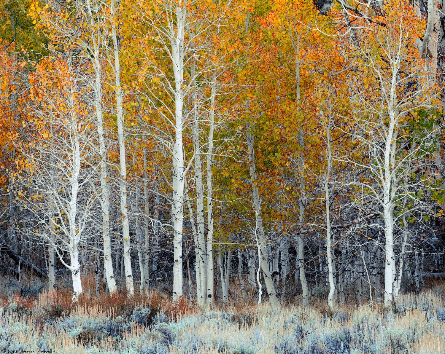
Thanks, Harley!
Here’s what I did:
**Crop from the left
**Add a little cyan and blue to the foreground sage
**Boost the yellow and red Sat in the aspen leaves just a wee bit.
**Used a TK Lights-4 mask to adjust the whites in the naked trees
Does anyone else have any thoughts/suggestions?
Thanks,
–P
Beautiful, Preston. Nailed the comp. in the repost. Processing looks good overall but I think the sage is a bit too bright and suggest burning down some.
Thanks @Dave_Dillemuth! I think this one is pretty much a done deal, but I am certainly open for any further suggestions.
I masked off everything but the foreground and then used a curves layer, along with a little vry selective burn on the sage.
Thanks again,
–P
Preston,
Looks like the same grove as your previous image? Clearly lots of potential that you were able to take advantage of. I like this more intimate composition although my preference is that the previous image had more of an impact on me (not that you’re asking…)
I really like the starkness of the bare, white trunks against the variety of color, including the sage and yellow grasses. I like your crop from Harley’s suggestion. I think though the burning of the sage may be best between your 2nd and 3rd versions. I think it went too dark in the most recent version - but not off by much.
Only other thing I can think of, speaking of the sage brush - would be wishing for just a bit more at the bottom. Right on the border of wanting to see a bit more.
Good stuff PB!
Really nice image, Preston. The color has been handled well imo. I actually preferred the original comp without the crop. I find that the emptier left side gave the image a bit more tension and am sorry to see it go. Wonderful image with artistic merit. For some reason I really like that small white sapling in the darker area. I also think the sage has been processed well in the revisions. Was there anything on the right in the original image. It might be interesting to add that back in.
1 Like
With the crop and rework youre on it. Good stuff!
aF
There is a large, dark stump just out of the frame on the right that was very distracting, at least to me. You can see a small piece of it in the posted images.
Thanks for your comments!
-P
I’m late to the game Preston, but the reworked version is great. It nails all the colors and tones and brings out great detail. Nice work.
Great image! The only thing I might do is to darken down the grass area, in the foreground. My eye wants to land there, instead of the beautiful trees.