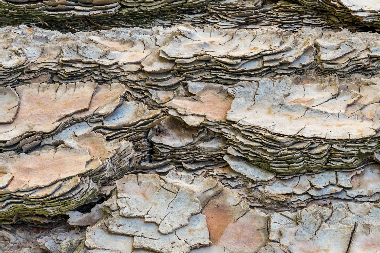
Note: It is an old tree. Still standing tall. But I liked the “rotated 90 degress CW in post” version better.
My initial impression was that I was drilling down through many layers of time. But if we stop and think about it, the top most layers are actually the oldest, while the bottom most layers are the youngest. Inverse time, so to speak. Interesting how our metaphors play tricks on how we see nature’s wonders unfold.
On a related note, I shared this image with one of my neighbor’s grandsons. And with great delight, vicariously inserted himself into the image as a Lilliputian mountain climber. [To be young again!!]
Feedback Requests
I am aware of the bright region in the far upper corner of the image. But for some strange reason, I don’t see “accents” along the edges of the image as being “distractions”.
If this were your image, would you keep this “accent” in the image, or would you remove this “distraction”? [Perhaps even going one step further and crop out the entire top 10% of the image?]
Let me know what you think!
Pertinent Technical Details
Focus stacked. Camera on a tripod.
1/30 sec at f/8.0 (the sharpest f/stop on the lens), ISO 200
Franz: Good idea to rotate this and present it this way. The textures and subtle color palette are compelling. Since you asked, I would at least burn down the URC. Just because it is so relatively bright my eye went there immediately even before reading your comments. I would not crop as I think the denser stacking of the layers there leads naturally to the more spread out layers beneath. Nicely seen, captured and presented.>=))>
A wonderful capture with so much to keep the eye engaged! I love the tonalities and subtle color. And for my taste, I would darken the bright area to make it virtually invisible. But you are the artist!
Very cool! It works nicely as a horizontal image. It almost looks like some kind of rock strata. I agree with burning down that bit in URC: don’t crop. I could see the exposure dropped down just a wee bit so that the colors pop a little more. That’s minor. This works well as-is.
-P
I like this image, and your analogy to rock strata (inverted) works with the horizontal orientation. The textures of the various layers really make the image. The bright area in the corner is distracting to me. Its one of the brightest areas in the image. If tit were just at the average brightness level of the image I think it would work better
Is there a way to respond to multiple members (who commented on my image) at the same time? For example, if I want to post the same response to all of them. Where would I find information on the NPN website for how to do that?
Franz: As you write your reply simply type the @ symbol and a list of folks who have responded to you will come up. You can only pick one at a time but you can do them in the same message. If I wanted to respond to John Doe I would type @John doe and then @Jane Doe, etc. Hope this helps and if it wasn’t what you were looking for get back to me. >=))>
Franz, the layering in this view is wonderful. I think that your rotation very nicely emphasizes all of the layers. I also think that the change from brighter to darker along the top adds an interesting feature.