Edited RePost (Curves adjustment)
Critique Style Requested: Standard
The photographer is looking for generalized feedback about the aesthetic and technical qualities of their image.
Description
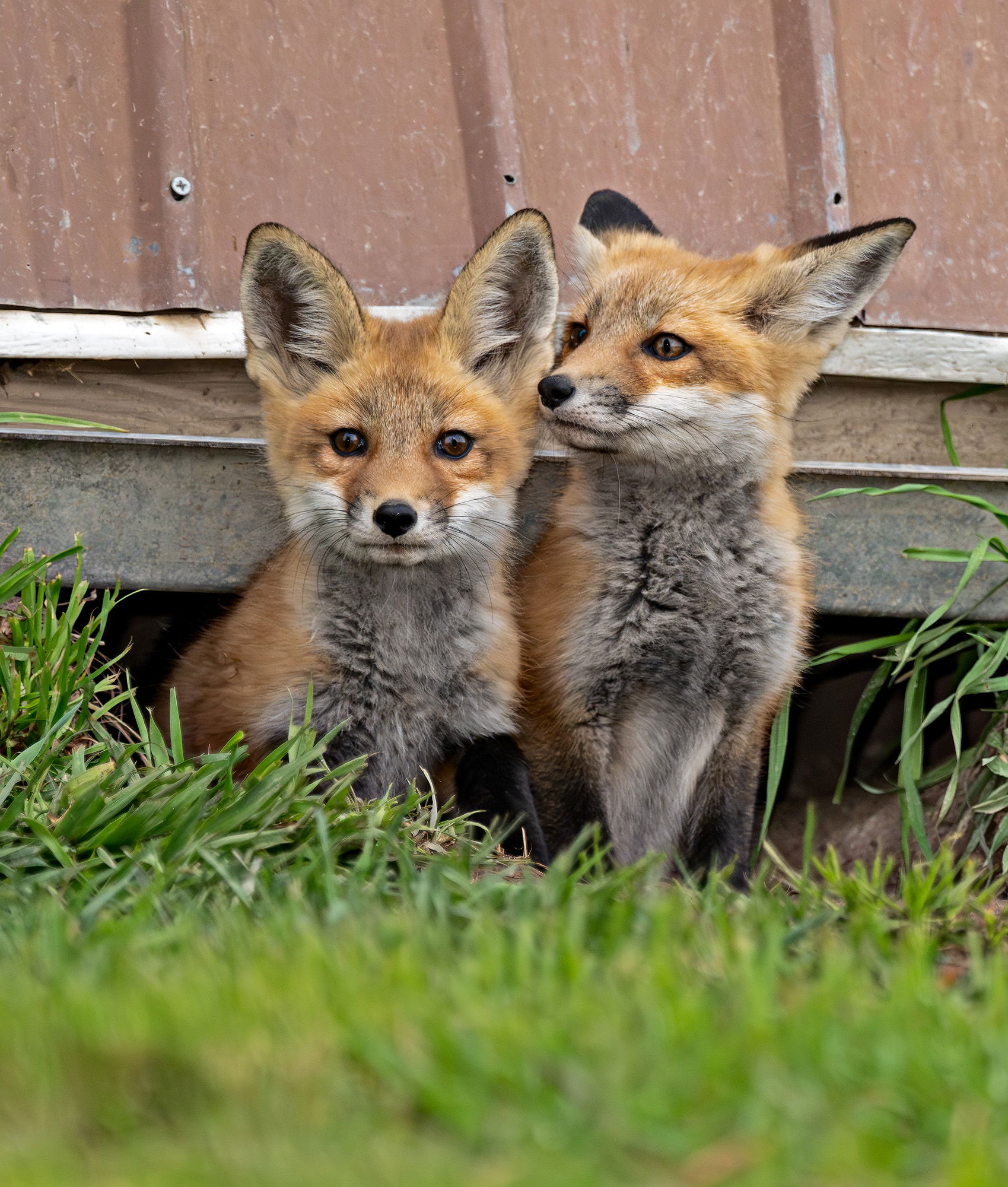
This is another from the series at the fox den. With three kits running amok, lots of shots of the other end of the kits resulted. In this shot, another kit popped up and was trying to get the attention of the kit that was intrigued by my presence.
Specific Feedback
I was able to tame down the whites in this version and I feel that much more detail was obtained. What do you think about how the whites were handled?
Technical Details
z9 180-400mm + 1.4x TC engaged 850mm (1/1250 sec. at f5.6, ISO 1250) DeNoise, Levels, Clarity, reduction in yellow and green saturation in foreground, crop for comp, red eye correction.
Critique Template
Use of the template is optional, but it can help spark ideas.
- Vision and Purpose:
- Conceptual:
- Emotional Impact and Mood:
- Composition:
- Balance and Visual Weight:
- Depth and Dimension:
- Color:
- Lighting:
- Processing:
- Technical:
1 Like
Cute x2!! The whites look OK in both – maybe spanning the extremes, but neither one eliciting any complaints from me. These little guys are SO effing cute that I’m unable to make any useful suggestions, except to ask if you run workshops…
Foxes are a huge feral problem where I live…and anywhere else in Australia, but that doesn’t take away their cuteness overload.
Such a sweet image with the little canines posing for you from under the structure. Whites look good to me.
They are so cute @Jim_Zablotny! I think the whites look good, but the foxes could be a little bit brighter (or the background a little bit darker) to make them stand out a bit more. Beautiful shot.
Too cool! Did you look at slightly bumping up the contrast and saturation? It’s a winner as is, though. I am envious. I recently got excited to hear that a friend had a family of gray foxes living under her deck (with 3 kits) but they vacated before I was able to go and try my luck. Sigh…
Thank you @Diane_Miller , @Sandy_Richards-Brown , @sanjiv , @Glenys_Passier , @debbie_campbell , and @Dave_Douglass . My repost consists of a curve adjustment to enhance saturation and contrast. Thank you @debbie_campbell, @sanjiv and @Dave_Douglass . It certainly brightened it up. …Jim
The brightening is good!! Assuming it was a curves adj layer, you could mask it off the brightest OOF grass at the bottom. Or even do a separate curve layer masked to that bottom grass and tone it down a bit.
Nice! I think it popped them just right.