The photographer is looking for generalized feedback about the aesthetic and technical qualities of their image.
Description
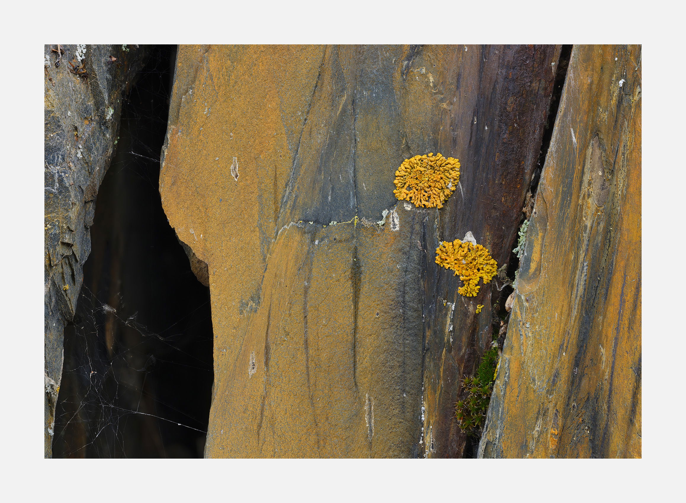
This was intended to be a vertical because I liked the line formed between black and yellow. However that made the lichens too small and the area below them didn’t add much. So I came back the following day and made this horizontal.
Specific Feedback
Most of the imperfections in this composition but a couple bother me slightly: the bright spot in upper left area and the bright spot in the lower left that’s going off the screen. Do they bother you?
Technical Details
GFX50R, 120mm, f/11. focus stacked
Critique Template
Use of the template is optional, but it can help spark ideas.
Vision and Purpose:
Conceptual:
Emotional Impact and Mood:
Composition:
Balance and Visual Weight:
Depth and Dimension:
Color:
Lighting:
Processing:
Technical:
I do not like the entire left side. I think I would crop this to square and just keep the rust colored stone and the lichen and the narrow fissure. The lichen are the star of the scene and the dark hollow on the left takes the attention away from the lichen. The interplay of the blue in the stone and the yellow of the lichen works well together.
Hi Igor,
I am always amazed with your talent for taking the most mundane of subjects; in this case a couple of lichen and cracks; and turning them into something visually engaging. I am liking the yellow and blue tones as they compliment one another very nicely. I also like the cracks as they add visual tension to this intimate landscape. For my own personal tastes I would be inclined to clone out those couple of areas you mentioned as they bother me slightly as well. Very nicely done.
Igor, those lichen stand out nicely here. I’m enjoying that I can’t tell if they’re small or large. I like the variety of brightness and textures across the scene, especially the dark to light process near the left edge. I wouldn’t clone out either of the somewhat brighter areas as they’re more detail in a very detail oriented view.
No, the spots don’t bother me at all. I actually like the spider webs and the relative untidy nature of this image. The lichens stand out nicely from the rock bed they are situated on. The colors look pretty good to me although I have no idea what this rock looked like before processing but to me, nothing screams over processed. There is terrific detail edge to edge. When I first saw this there appeared to be an imbalance in the composition (maybe more about the light…the composition is actually very good). The left side feels very heavy compared to the right side. I brought this into LR to see if I could better balance the two sides of the image by darkening the blacks in the right portion of the image and lighten the blacks in the left side of the image. I’m not sure this did enough to create better balance but that’s what I was attempting.