Hi-I’d like some honest feedback on this image-what would make it better. When I say be honest, I mean it. No need to tiptoe around if it doesn’t work, just be constructive. Thanks!
What technical feedback would you like if any? Any and all.
What artistic feedback would you like if any? Any and all.
Pertinent technical details or techniques:
(If this is a composite, etc. please be honest with your techniques to help others learn)
If you would like your image to be eligible for a feature on the NPN Instagram (@NaturePhotoNet), add the tag ‘ig’ and leave your Instagram username below.
You may only download this image to demonstrate post-processing techniques.
Laura, I really find this an interesting scene. I appreciate the way you have handled the colors and in particular the sky. The cool and contrasting warm tones really work well. I cannot offer any comments for improvements in that respect.
For me the composition has a lot going on. I think it works as presented but might be assisted by cropping off the left mound and a touch off of the bottom. That partial left mound seems to be pulling me out of the scene and does not add much to it.
I do like this a lot, very nice work!
1 Like
Hi Laura,
This is an excellent landscape and I pretty much echo Alan’s feedback.
Love the colors - they pop nicely, but are not over the top.
I think the composition works nicely as presented. Alan’s crop is a good suggestion, but I would offer that as an alternative, not necessarily a huge improvement. What really is attracting me is the little yellow flowering plant. It actually almost anchors the scene despite the size discrepancy. I’m not seeing a real clean crop to make that plant more of a feature attraction. This falls in to the “would, shoulda, coulda” backseat advice wondering how you could have composed this at the time (not much help after the fact. I do see what look to be old footprints and so maybe you stepped off a little to avoid them?
I too love the clouds. do you have a frame that includes more of them?
I think your processing is excellent. Honestly, I don’t see any big changes that would improve what you already have. Maybe you could burn the clouds in the upper right quadrant?
Beautifully captured. Thanks for sharing!
Lon
2 Likes
Laura, I like how you’ve processed the image, it looks natural to me. I think this image has a lot of interesting elements within it, such as the buttes, the nice clouds, the contrast between the green bushes and the reddish sand, and the flowers. But I think your composition doesn’t balance these elements effectively enough. The sky is interesting, I’d like to see more of it. The flowers are interesting, but I wish they played a larger role here. I’d like to see the buttes appear larger in the frame. As presented this image devotes much of its real estate to sand and bushes.
I agree with @Lon_Overacker, I don’t see an alternate crop that works much better. The points I made above would have to be addressed by composing differently in the field. If I was shooting this scene, I would have gotten closer to the flowers, and tried a vertical composition which included flowers, buttes and more sky. This would make the flowers and buttes look more impressive.
1 Like
Thanks Ed, those are my feelings as well. I look at this shot and think it could be so much more. 5 months later I took a workshop with Shane McDermott and his comment after looking at some of my photos was that I was standing too far from everything. I look at this now (I took it in 2017) and see exactly what he meant. Thanks, appreciate the insight!
I’m glad you took my critique constructively Laura, initially I was concerned I might have been too harsh, especially with someone who has not posted a lot in the landscape critique forum.
When I discussed getting closer to the flowers and using a vertical, I had in mind the near / far style of landscape photography popularized by David Muench. Some may consider this approach somewhat cliche now, but for people learning about composition, it is worthwhile to study how it works. An example of Muenchs style might be “Desert Bouquet” from this link
http://davidmuenchphotography.com/portfolios/natural_connections2.htm#.XKtF09h7myo
1 Like
I agree with most of what’s been said already, and especially Alan’s recommended crop. A shift right resulting from the crop would lend more prominence to those yellow blossoms, resulting in a stronger foreground I bet. The bright blossoms help me find a “starting point” in the image, leading me back to the threesome, then beyond to the right and the great background for “setting.”
1 Like
Hi Lon-thanks so much for the detailed feedback. I agree, that yellow flowered plant is key and I wish I’d realized that when I was shooting! I have a little more clouds in another version, but not dramatically so. I also burned the upper right clouds, that helped too. Thank you, much appreciated!
I went back and reprocessed this last night, incorporating everyone’s helpful feedback. I changed the color balance a little, added more red, and found a crop that has a little more clouds. I agree with everyone that the yellow flowers anchor this and what I really should have done was gotten right in front of them. I think this version is about as good as it’s going to get with how I shot it (that doesn’t mean I’m not open to more suggestions

) but next time I’m there I’ll do it differently.
4 Likes
My honest feedback is that with that great sky I would show more of it and play it off the pinnacles. I would not bother with the flowers nor with the shrubbery below it. This image is a descriptive image. However, the pinnacles have character and the sky has drama. Together they can be presented in an emotional way. You have 3 pinnacles and clouds that seem to radiate from them. That’s a potentially strong composition. I would not have chopped off those clouds because that destroys the idea.
1 Like
Pretty scene, Laura. A lot has been mentioned and I agree with much of it, but the one thing that strikes me immediately is that while the scene is pretty it doesn’t have much emotional impact IMO, and I think that is due to post processing. While it may be intentional, it might also be a lack of PP skills. With the different colored layers in the rocks and a dramatic sky, I think this image has great potential to really jump off the screen or paper or canvas and do so without looking over-processed. Sadly, I am NOT the person to instruct you how to do that, but there are many tutorials out there. Again, strictly my opinion, but I’ve found Sean Bagshaw’s tutorials to be excellent. Great advice and not too long winded, and they’re also reasonably priced (some are free if you want to try them); and no, I’m not related to Sean or even know him, he doesn’t pay me to promote him, etc. I just like his style, you may or may not appreciate it, but there are plenty of others out there as well.
2 Likes
Hello Laura,
I think the flat light is hurting the image. To give it some oomph, I selected the land, added 11 point of brightness, a few point of cntrast, moved the white point in in levels, and then just a little warm glamour glow with NIK. With the sky selected, added a little red and magenta in the color balance. Cropped a little off the bottom as the sandy area was too dominant and that put the green bush angling to the LRC. Also took some off the left to rid the darker green bushes on the left edge and to decenter the peaks. These are some tweeks as I see them. Like others, wishing for some more sky.
1 Like
Hi Everyone. Remember this one? I worked on it with the TK7 panel, which I am just learning but diving into like a kid in a new swimming pool. It’s still a work in progress but here’s where I am at currently. Thanks for the feedback, appreciate everyone’s input.
Hi Laura: I’m very late to the party on this image. You’ve received a lot of good feedback. Glad to see in your last post your use of TK V7. It is a fantastic set of tools .
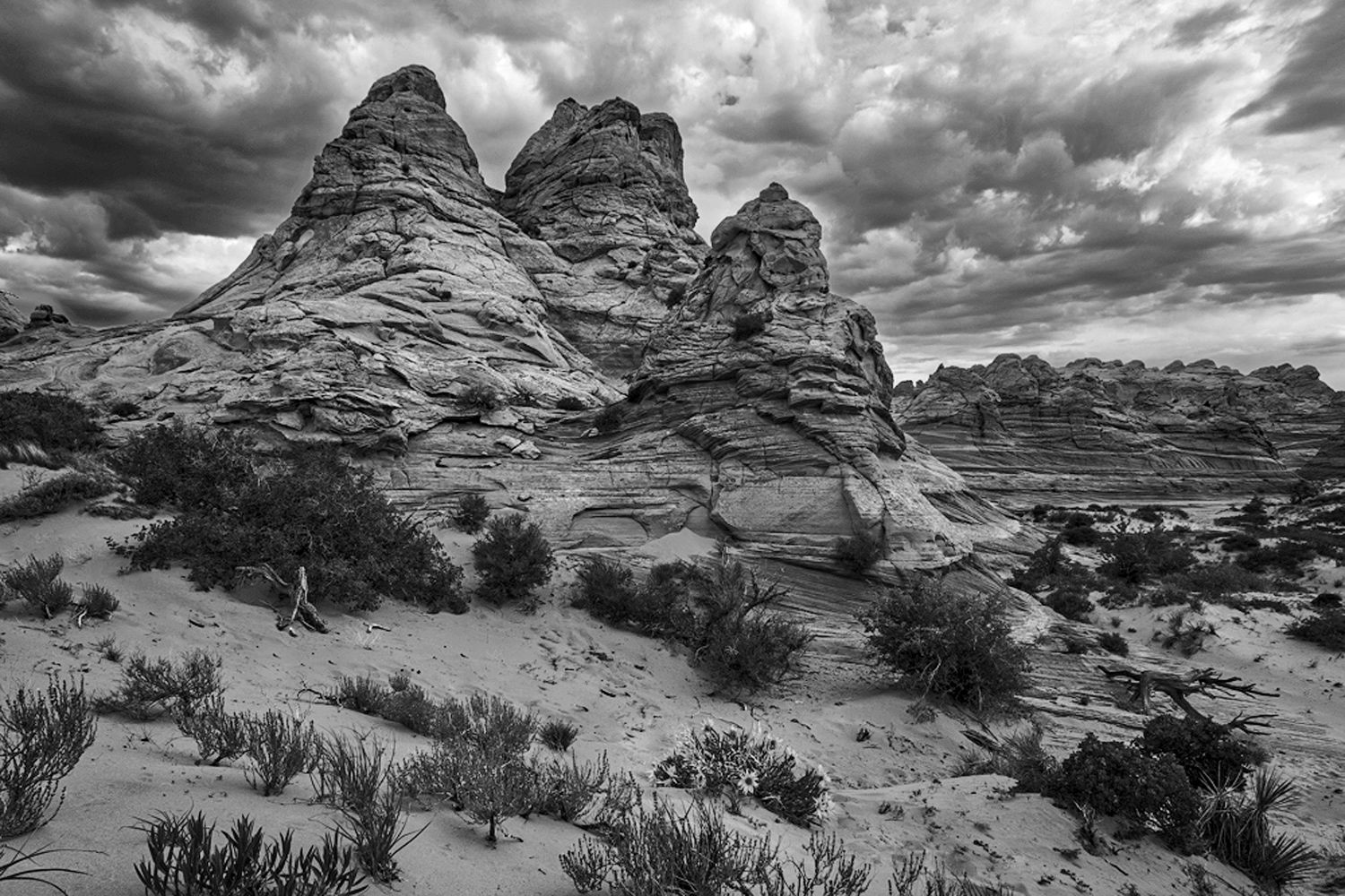
Here’s a completely off the wall different answer to this image. How about B/W. I live in the Southwest and sometimes images with all the Southwest colors just don’t hold interest for me. I wondered what this one might look like in B/W. Clearly a ton of options for processing in B/W, so this is just one thought.
1 Like
A vast improvement Laura. TK’s panels are a wonderful tool. In comparing this image with Doug’s (right above this one), I find both very appealing. I really appreciate your fine tuning of some of the tones, especially in the greenery, but I think Doug’s is nicer in one major aspect. The BG clouds (in Doug’s) are just a touch flatter & lighter than yours and this allows the butte to become the main focal point whereas your clouds seem to draw attention away from the butte. It would only take a very minor adjustment to reverse that and bring the attention back to the butte. Still, this rendition is a great improvement over your original - well done.