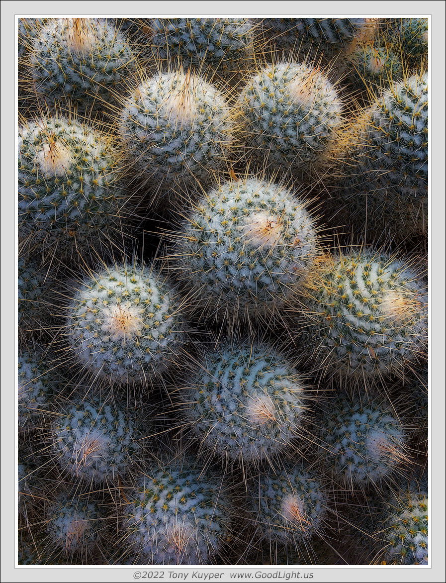
This is an iPhone image from Bach’s Cactus Nursery just north of Tucson. They have what I’d describe as a “mammalaria museum,” which is a whole building full of different mammalaria cacti. They’re not for sale, just to look at. Many fascinating specimens.
I originally developed this in color, but then decided to try it in black and white, and that brought out the counterclockwise swirls, which I thought added to the abstract character a bit. I’ll post the color image below too.
Specific Feedback Requested
Which do you prefer: color or black and white?
Technical Details
First-gen iPhone SE camera. 29-mm equivalent lens.
I like how you’ve picked out the lighter tops of the lobes. Really brings up the spiral pattern well. Terrific prickliness! I think I like the monochrome for that factor - that it concentrates the features so well. The color though, brings a different element - that of softness which contrasts so well with that prickliness. Super arrangement of a complex little scene.
This is a real gem, Tony. I have to say I prefer the monochrome because it highlights the graphic, abstract nature of this image. The light is superb in this one and I think the colour actually distracts a bit. A wonderfully balanced composition.
This is a very nice composition Tony. But a difficult choice. The monochrome softens the prickliness and brings out the spiral pattern really well, while the color version hides the pattern but highlights the needles and softens the rest. I think I like the color version best because to me it is better at showing the beautiful light.
Terrific composition Tony. As others have noted, the black and white really capitalizes on the swirling circular patterns of the cacti which you can hardly see in the color version. However, in the color version you’ve capitalized on the the glow of the needles and the superb light that this was shot in. It also appears to be less dangerous as it has a soft overall, less contrasty appearance. You did really well to compose such a complicated scene. I might dodge the URC as eth light in both versions falls off very rapidly, particularly in the B&W version. The other three corners look great.
What a gorgeous composition!! I love both, for the different reasons stated above. The monochrome certainly does bring out the patterns but the tonal “softness” (if one can say that about a cactus!) of the color version is just pure beauty to me.
Tony: Great images both so I will be lazy and just ditto Diane. I’m a color junkie so I do prefer the color version but I think I know a good B&W when I see one and this is certainly compelling. Most excellent. >=))>
Me too! And this is an old iPhone. The print looks great too. I’ve not bothered with focus-stacking using the iPhone yet since it would require a tripod (I think), and a tripod would negate the advantages of just photographing with the phone. I did use Topaz Sharpen AI on this this particular picture, and that helped some too.