The photographer is looking for generalized feedback about the aesthetic and technical qualities of their image.
Description
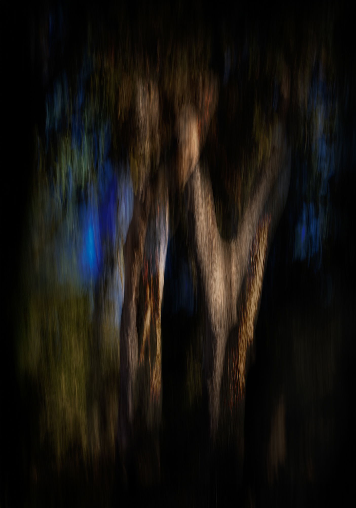
Another recent ICM, with two very similar frames stacked in PS. I liked how this evoked a very different feel than either of the frames. They were done on a plain, regular day with plain, regular daylight.
Specific Feedback
All comments welcome!
Technical Details
Two very ordinary and not very interesting frames, layered in PS and played with blending modes. Mostly full frame, very little masking or heroics.
Critique Template
Use of the template is optional, but it can help spark ideas.
Vision and Purpose:
Conceptual:
Emotional Impact and Mood:
Composition:
Balance and Visual Weight:
Depth and Dimension:
Color:
Lighting:
Processing:
Technical:
I like the textures you got from this one, Diane. The blue in the middle left is just awesome. Unfortunately, to my eye it dominates the image and combined with the solid black lower right quadrant, gives the image a bit of an unbalanced look. I’d be tempted to take a bit off the top and the bottom, then pulling in from the right a bit to reduce the mass of the black area.
Oh lordy! This image has all the hallmarks of a scary halloween setting! I love it! For me, the blues and almost blacks give quite a uneasy feeling. That might not be what you were thinking.
I certainly wouldn’t think the image was made in plain daylight.
I like the diagonal darkness on the bottom right and the smaller diagonal darkness on the top left. The texture throughout is great.
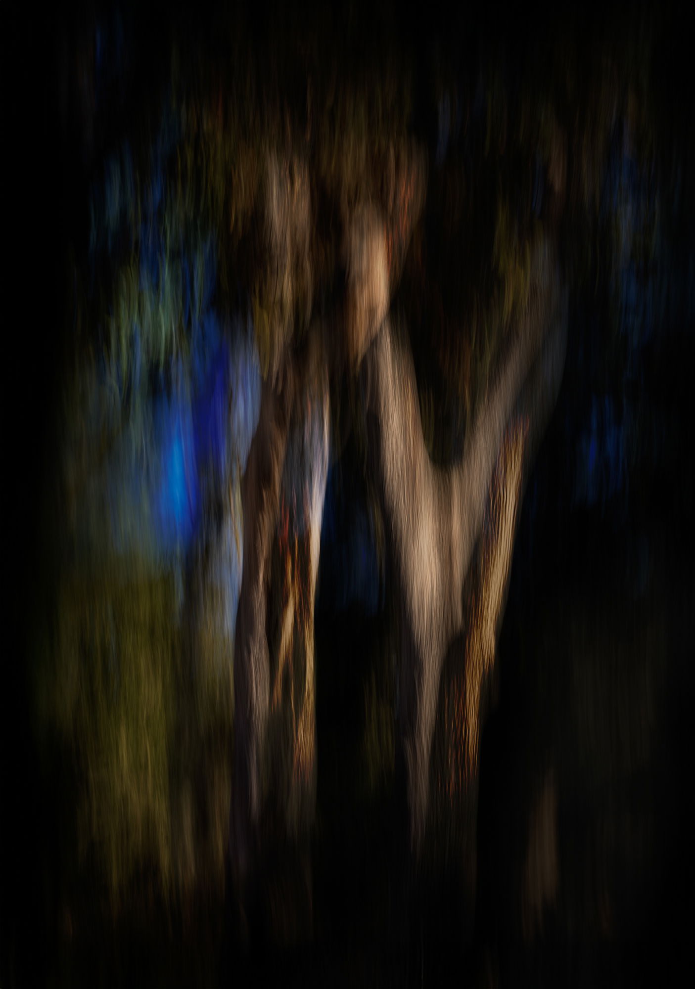
Thanks, @Dennis_Plank, @glennie and @Don_Peters! The blue patch is what I love most about the image, but I agree it could be toned down. If I cropped top or bottom it would cut into the softly fading lines, so I added canvas instead and a bit more vignette, and increased the darkness on the left to balance the right. I also let a little more detail through in the lower right. Does this strike anyone as an improvement? (Posted above.)
The title of this one caught my eye, and made me think, oh, I should try night time ICM. Interesting that it’s actually shot in the daytime, but thank you for the idea.
I like this alot. I see the issue with the lower right, and to me, that blue, as much of a focus as it is, is also the bright spot in an otherwise gloomy scene.
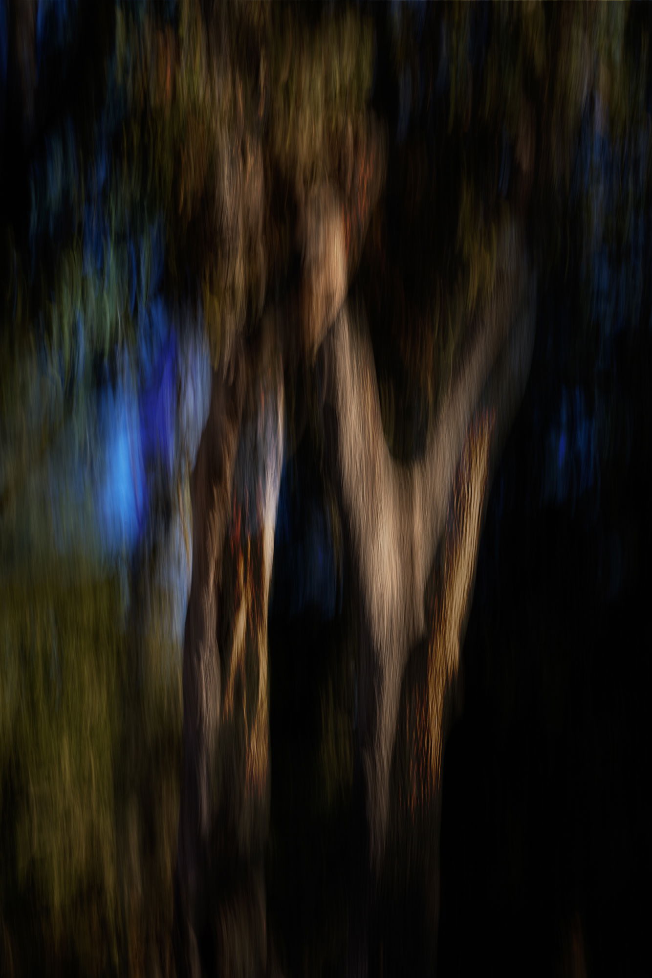
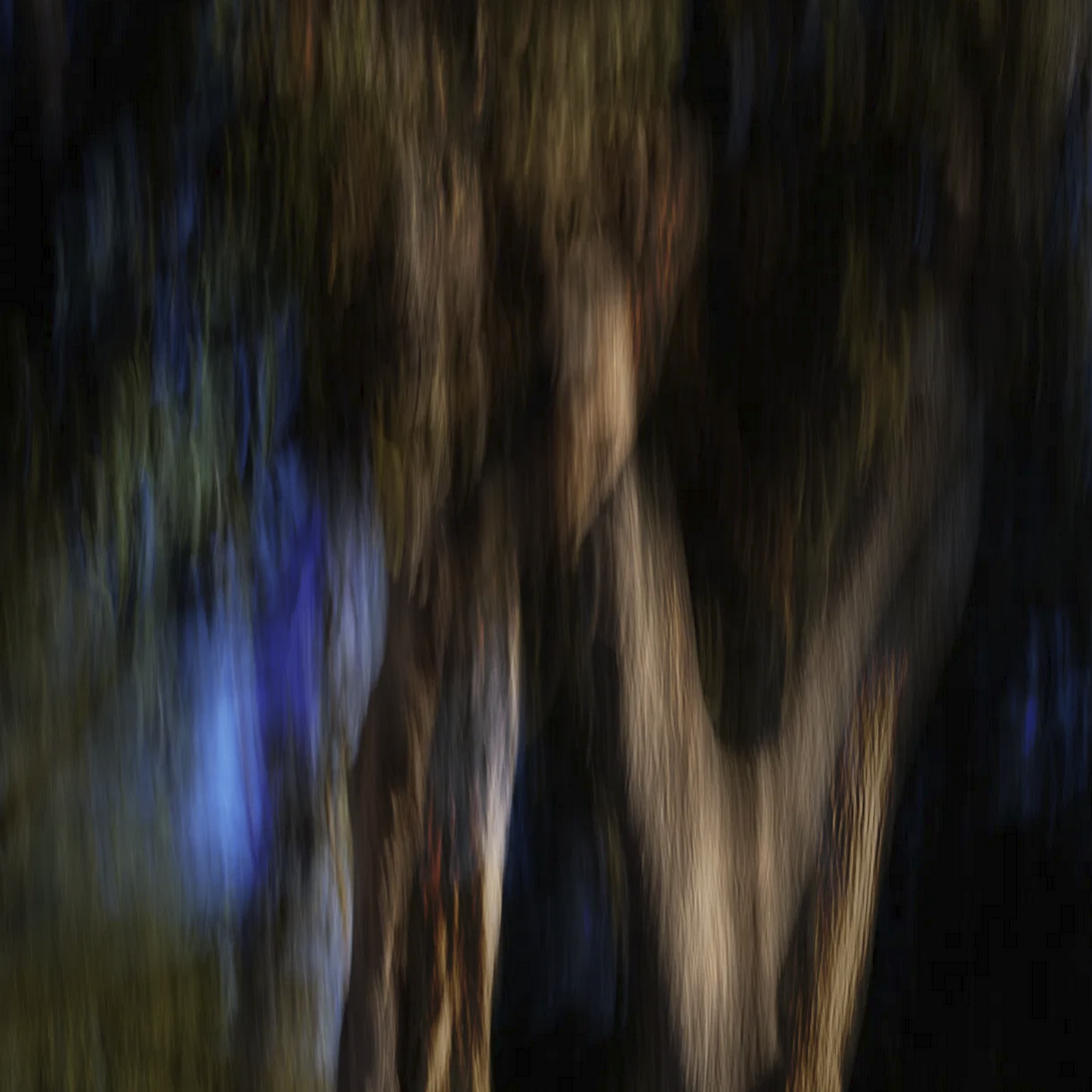
Since the blue is the part you like the best, I wonder if it would make sense to crop this to a square (or some other aspect ratio and framing) to highlight that blue.
Here is one take on that approach, with the full color palette still represented. I got a little too close on the blue to the right, but this is just a quickie screenshot (this is how I keep other people’s genius out of my LR catalog ;-).
I like your repost a lot, Diane. The only thin I might play with is bringing up the blue patch on the right to make it just a little more noticeable, but I don’t know if it would improve the image-just something to play with.
Yep! Your repost has worked a treat. I like seeing tiny glimpses of detail through the darkness and I think the added canvas and vignette has also worked.
The image still, to me, feels wonderfully creepy; like I’m spying.
Thanks, @Don_Peters, @Marylynne_Diggs, @Dennis_Plank and @glennie! Dennis, I like the idea of bringing out the blue on the right. Another RP added above. And for reasons known only to my subconscious, I lightened just a bit on the left side. Marylynne, although I like the bit of blue, I also like the way the light areas fade toward the top and bottom, and would hate to lose that with a crop. But I could redo the vignette and might play with the idea – it is an interesting rebalance of visual weight. Thanks for the suggestion!