Midtone Contrast

I’ll admit it…I’m obsessed with learning new post-processing techniques. Just when I think I’ve got a good post-processing workflow, I hear about something new…and I immediately want to know more.

Case in point, I recently read @David_Kingham’s article about adding micro-contrast. I’ve never tried this, and thought it would be a great addition to my workflow. And then, I was listening to @Matt_Payne’s podcast with David Thompson, and he briefly discussed how he primarily sticks with adjustments in the midtones.

I know it’s almost impossible to give a generalized answer…because every image, scene, style, mood, etc. is different, but I’m wondering if anyone has any insight/perspective/article on how they use midtone contrast?

My goal (and it’s still a work in progress) on how my images “look” would be to keep them natural, and clean. Some photographer’s I admire are: Joe Cornish, Guy Tal, and David Thompson. I’m not trying to copy someone’s post-processing techniques, I’m just trying to get a better understanding of how to use midtones to enhance your images.

An easier technique than David Kingham’s is to use Luminosity Masks to select the mid tones. There are several (Lumenzia, Raya Pro, etc) extensions that can be purchased relatively cheaply for use with Photoshop and are easy to use. Make a mid tone selection (the other tones will be masked out) and then play with curves and sharpening.

1 Like

Ryan:

I too am a regular user of Midtones for various purposes. First things first though… How do you get to midtones to isolate them. I use the TK Luminosity masking tools which makes life much easier. Here are 3 images to help visualize midtones.

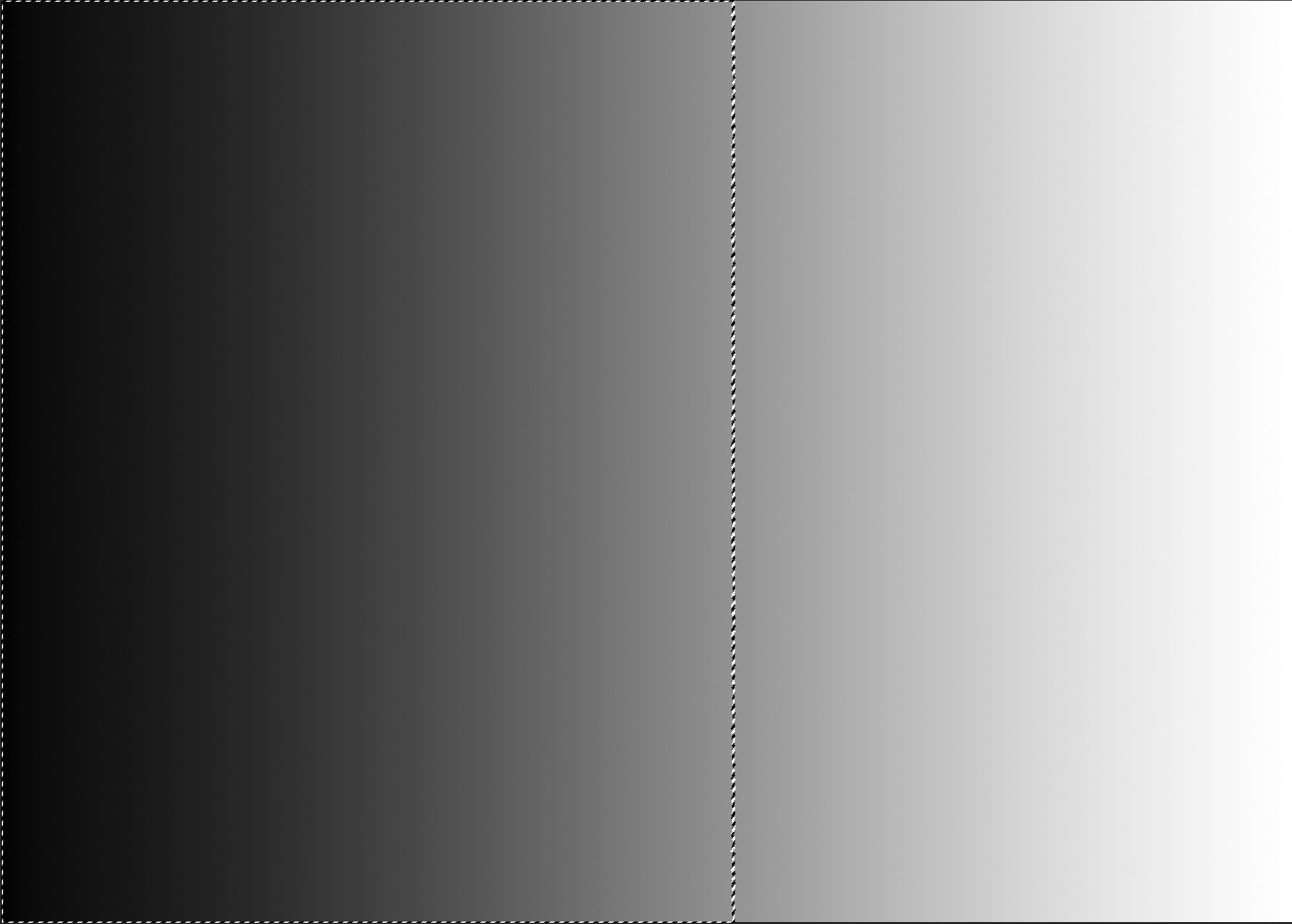
For this example I started with a straight Black to White Gradient:

Selecting the Brightest 50% of the pixels via a Lights 1 selection yields the following selection:

Then Selecting the Darkest 50% via a Darks 1 selection of the pixels yields the following Selection:

To get to a Midtones 1 selection you subtract the Darks 1 from the Lights 1 which you might think leaves nothing. The visual issue is that marching ants in Photoshop only show the pixels which are at least 50% selected, so there is a feathered edge to both the Darks Selection and the Light Selection which leaves the midtones.

Here’s the Mask for a Midtones 1.

Remember this is a mask so the part of the mask that is the lightest in tone is the most selected which is the middle tones of the original Black to White Gradient. The parts of the mask that are Black are not selected at all. There isn’t a way to show the marching ants for a midtones 1 selection because there are no pixels which are at least 50% selected.

So how do I use this on a regular basis? As the last step in processing I always take a look at a subtle contrast addition to an image via a midtones 1 mask.

I create a midtones 1 mask, create a curves adjustment layer with the midtones 1 mask associated with the adjustment layer and change the blending mode to Soft Light. Since the Soft Light Blending mode is designed to ignore 50% gray, tones that are brighter than 50% in luminance get a touch brighter, and tones that are darker than 50% luminance get a touch darker. Therefore you get a very soft subtle contrast boost through a midtones 1 mask. Note, I don’t adjust the properties of the curve at all. It is left as a 45 degree line. (This technique also works fine with a Levels Adjustment Layer, or any other layer than deals with luminance adjustments).

If you want a slightly stronger contrast adjustment, change the blending mode to Overlay as it is just a variant of Soft Light that is a bit stronger.

A very cool technique that I use regularly. On most images I like it with no further adjustments. Sometimes I’ll drop the opacity of the layer just a bit if I feel like it introduced too much contrast or conversely on very rare occasions, I’ll increase the contrast by adjusting the curve, but that is really rare.

3 Likes

Thanks @Tony_Siciliano

Great info! I have TK Actions, and I’ve been using it for awhile, but I’ve always been confused on how to use the midtones masks/selections. Now that you’ve given me some great descriptions, I’ll give it another shot. Thanks again!

I used blend if for the article because it’s accessible to anyone without installing a panel or intersecting masks, it’s quite simple really and plays well with an action too.

Anyways, to add onto Keith’s great description; there is an even easier way to do this as well if you have the newer version of the TKPanel (or any other panel). In TKPanel v6 all you have to do is click the midtones button

Then click ‘Layer’ and create a curves or levels with the midtones mask attached. I prefer to create a levels adjustment and then pull in the white and/or black points to create midtone contrast that I have more control over.

You can also then add this to a group with an inverted mask and paint in white to only the areas you want affected.

1 Like

Perfect! I do have TK v6, and have clicked on the midtones masks button before, and had no idea what I was supposed to do with it. Now the trick is to figure out how to take all this new knowledge, and actually make my photographs better. Thanks for the input!

P.S. Thanks for the screen caps…very helpful :+1:

1 Like

Absolutely. I didn’t mean to imply that you have to go through all the work of creating a Lights 1 and a Darks 1. I was only trying to show the concept about how a midtones mask is created behind the scenes.

2 Likes

I guess I am behind the times, since I am still using the v4 panel.

For those that are:

On the Spectrum tab click the MT1 button
In the upper panel Click Levels or Curves
Next, click Soft Light (changes the blending mode on the layer you just created to Soft Light)

The effect on the midtones is subtle, but definitely visible. I use this trick quite often for bit of extra punch.
-P

2 Likes

Really nice discussion here!
I use Color Efex Pro (you can still get the google free google version if you look for it) which have a tonal contrast feature. It has given me nice results up to now but I’m really trying to get into luminosity masking to be able to have more control over specific tones.

2 Likes

Preston, the V6 panel is mind blowingly excellent, it’s worth the very slight learning curve to make the switch.

I use TK’s Luminosity Mask Curves - mid’s, darks and lights but stick to #2 I think for most photos unless I need some really dark shadow or bright highlight detail work. I’ll tweak the curve and further mask out the parts I don’t want it applied to. I don’t really do anything fancy beyond that.

I also use the TK V6 panel. It is excellent. Sean Bagshaw’s videos are very helpful as at least in my experience there is a learning curve to luminosity masks.