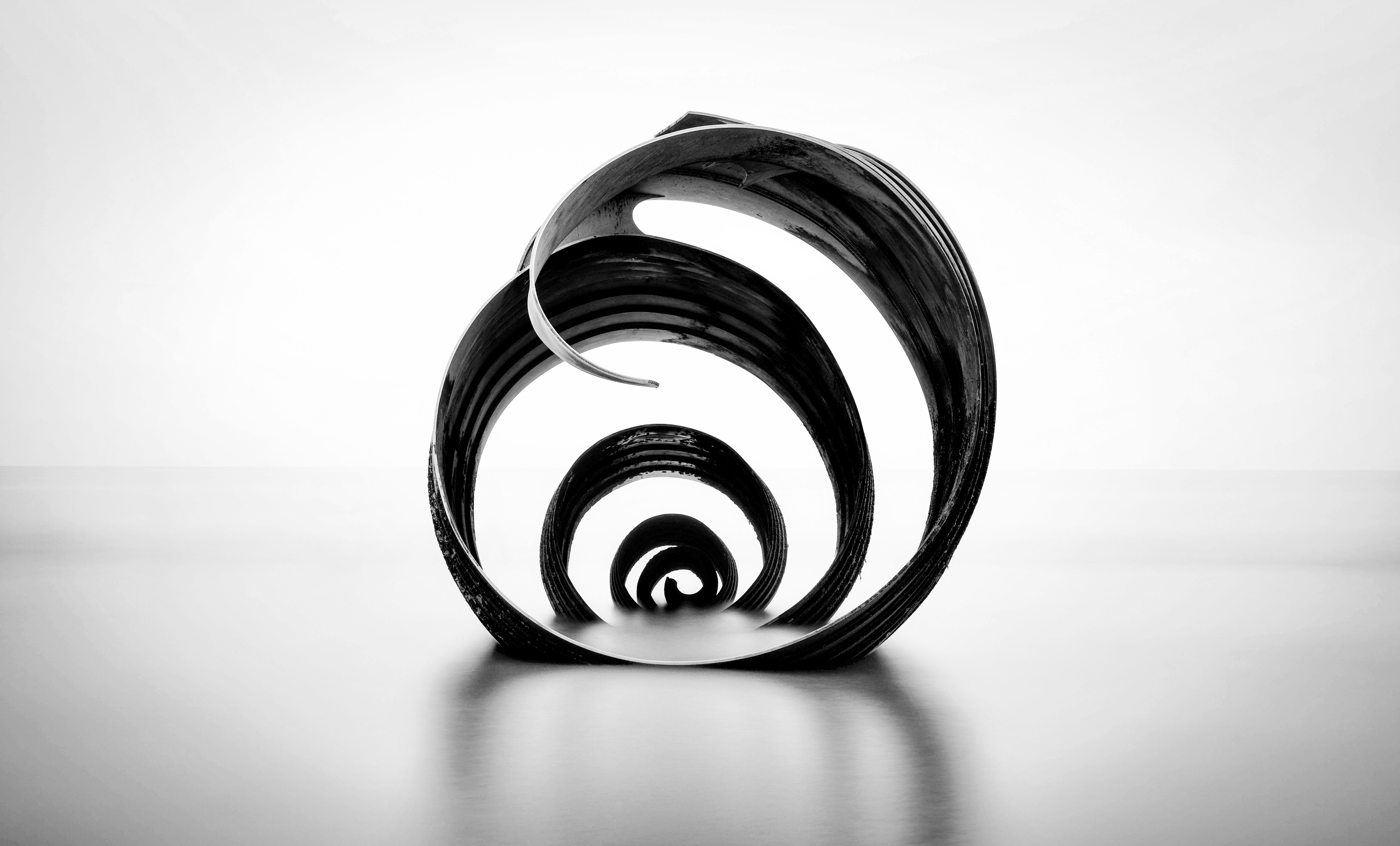
A (sadly) aborted aerial photography trip away with friends made for an impromptu adventure with mother. We drove about 12 hours in a day and a half and managed to reccie a few places south of the border that I’d wanted to try for some time. One didn’t have enough overflow water (despite a dam having burst 12 miles away), but the other was Mary’s shell. I’ll certainly go back in the hopes of a colourful sky but my preference would always be a more simple mono feel, which the bleak day provided nicely for. #simplistic
What technical feedback would you like if any? Any and All
What artistic feedback would you like if any? Any and All
Pertinent technical details or techniques:
(If this is a composite, etc. please be honest with your techniques to help others learn)
If you would like your image to be eligible for a feature on the NPN Instagram (@NaturePhotoNet), add the tag ‘ig’ and leave your Instagram username below.
Hi Vikki,
I like this a lot. The simplistic, monochromatic approach makes sense to me, and I think a more dramatic sky might compete too much with the concentric curves here. I had to google Mary’s Shell to discern what I was looking at. What an interesting sculptural piece, and your treatment of it rivals anything on Shutterstock!
ML
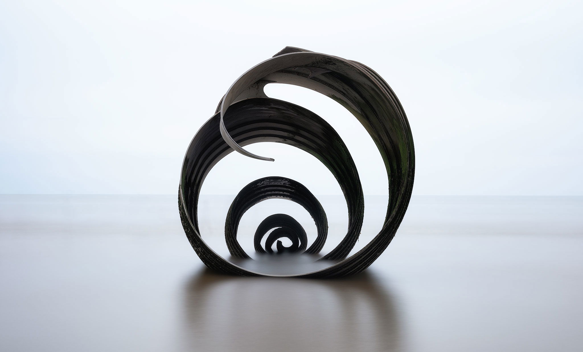
This has a strong graphic appeal. The concentric circles of the sculpture focus the composition and the minimalist approach with the light and processing yield a very artistic rendering. I kind of wonder about a vertical composition to include more of the reflection and less of the space to either side of the sculpture. I do like the choice to go with monochrome versus color. While this is a bit outside of my aesthetic tastes I think you have done a great job with this.
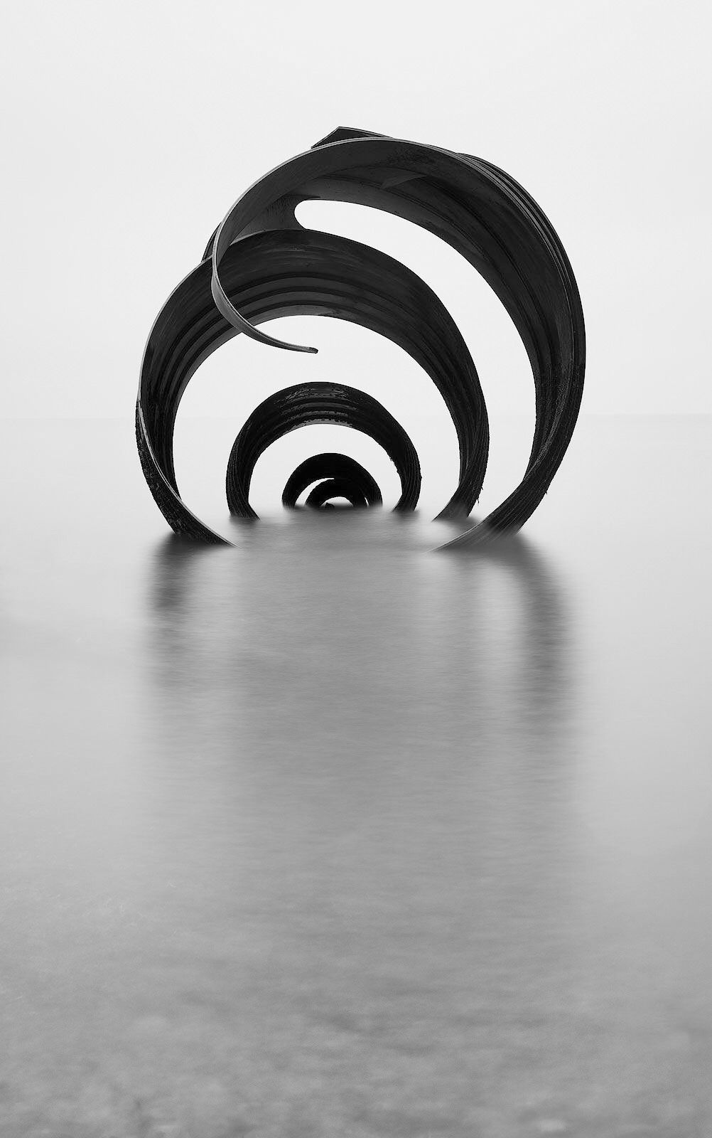
Thanks @Brian. I did shoot some portrait version, and rough draughted one up before opting for the image I posted here. I wasn’t sure if the pebbles that start to come through with that tide level added or distracted. I’d decided on the latter. Would welcome your thoughts.
Vicki, I do like the vertical composition although I had imagined a more complete reflection of the sculpture. I’m not bothered by the pebbles in the foreground, but I can see how you might see them as distracting elements since your goal was to go for a minimalist composition.
All three are fantastic, Vikki. Please don’t make me choose a favorite. That said, if I HAD to choose, I think I would chose the second one. The only thing that bothers me (easily fixed) is the hard line in the BG. I find that to be distracting. I think if that were blended out this would be beyond perfection.