Another from my trip to the rockies last year. The weather was constantly moving and changing with the clearing storms. For this image I went with a fairly hi-key approach and with unsaturated colours. For me the image was about the mist and the light shining through. I’m open to hearing others ideas on what they would emphasise or how they would approach contrast. I decided to throttle the contrast in the sky as I was going for a lighter mood which isn’t dramatic.
What technical feedback would you like if any? Anything
What artistic feedback would you like if any? Anything which you think would improve the image.
Pertinent technical details or techniques:
(If this is a composite, etc. please be honest with your techniques to help others learn)
If you would like your image to be eligible for a feature on the NPN Instagram (@NaturePhotoNet), add the tag ‘ig’ and leave your Instagram username below.
Nathan, I like this image a lot. The high key approach looks great with the mist and light on the distant mountains. I also love the silhouettes of the trees against the light on the background mountain. I wouldn’t change a thing about this, the image is very effective as presented, great work.
This is beautiful, Nathan. I like the direction you chose to take the image. Processing looks excellent. Only suggestion would be to experiment with dodging or maybe adding some negative clarity to further accentuate the mist in the lower left.
The light and atmosphere here is excellent - the mountains enshrouded in the mist is quite dynamic and potentially dramatic. I think you did well to mute that drama in favor of the light - as I like very much the hazy light across the face of the mountain.
As presented, I find the LRC area a little heavy with the shadows blocked up. I think raising those shadows a tad would help, not only with exposing some detail, but also in terms of balancing the contrast.
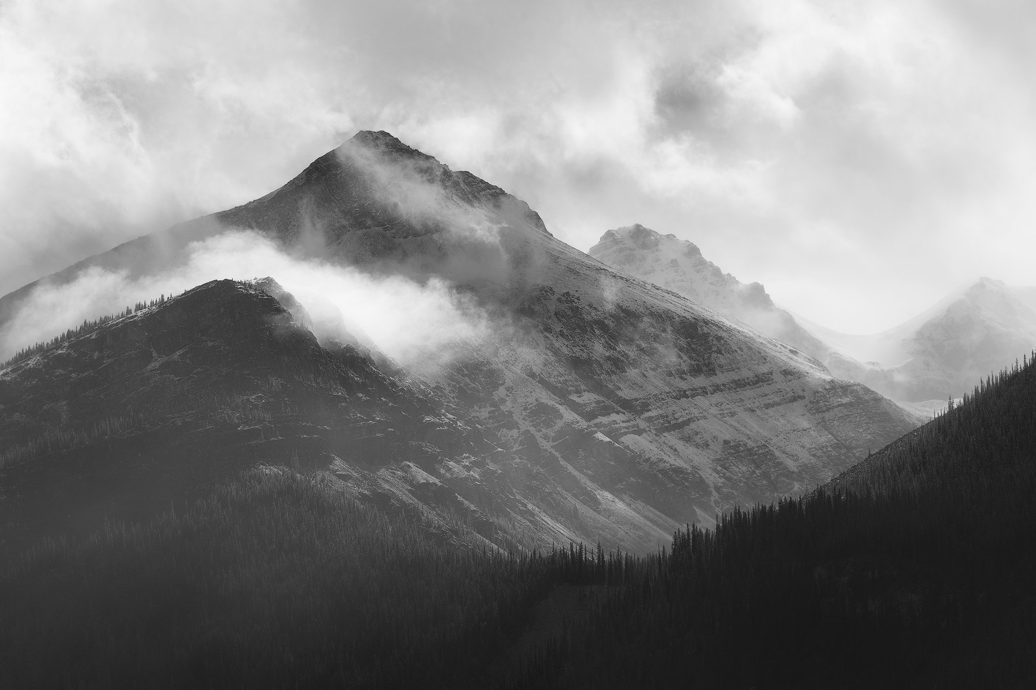
Have you considered b&w? While I think what you’ve presented is excellent and you’ve achieved the look you were after (kudos on processing for that.) As a pure alternate, the potential for a quite dramatic b&w is there (I tried a bit…). But then that might not fit with your vision and experience of the scene.
Dave, I did remove some contrast with negative dehaze with the camera raw filter but it’s good to know that there is room to take it a bit further.
Lon, I think you have a good point on the contrast. My intention was to have a dark area leading the eye towards the light. But now that you mention it having a more gradual transition might add some more realism. I don’t have much practice with B & W but I’ve given it a crack below. For me B&W is a whole other skill set I only really use it while processing to see how the tonal transitions look.
Both shots are successful to my eye, but i do prefer the B&W shot better…(good call @Lon_Overacker!). As well as you’ve managed and restrained the color, it still seems to add a dimension that does not augment the beauty of what you’ve captured. This last repost is a total winner to me!