Hello! First post for me and I am looking forward to learning and growing in this craft.
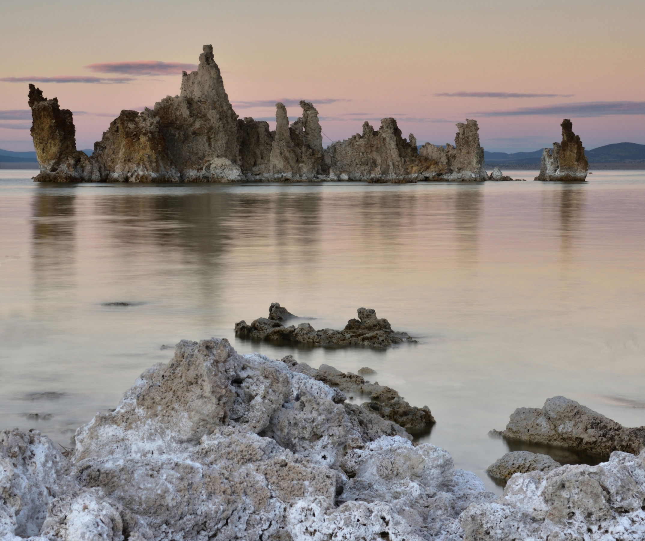
This was a sunset at Mono Lake, but not many clouds. I used an ND filter for this image and was shoot in RAW. I did not play around too much in post processing in lightroom
What technical feedback would you like if any?
Any critiques and comments
What artistic feedback would you like if any?
Any critiques and comments
Pertinent technical details or techniques:
NIKON D750 24-120, Lee Filters
If you would like your image to be eligible for a feature on the NPN Instagram (@NaturePhotoNet), add the tag ‘ig’ and leave your Instagram username below.
This is a nice first post from a place I have visited often.
You have enough clouds and color in the sky to have a nice backdrop for the shoreline, lake and tufa towers. I like the softness of the water and the subtle, but effective reflections. You also have nice detail in the scene.
Compositionally, this works nicely. In the future keep an eye out for objects that touch, such as the saltbush in the foreground touching the tufa. The fix is is change your vantage point to provide some separation. With this image, you could crop a bit from the top for a more pano format because the upper portion of the sky is pretty empty.
From a processing standpoint, I think this looks nice. The contrast is fine to me, and the subtle color palette works well. My only concern is the image is slightly soft sharpness-wise.
You might consider telling us what software you are using for processing your images. That will help us give more specific hints.
Again, welcome to NPN. We’re happy you are here!
–P
Welcome, Ashley. I love the subtlety of this. The colors and tones are gorgeous. I would echo Preston’s comment about the bush - moving a bit to the right would have gotten it out of the frame. Lovely first post.
Thank you Preston for your feedback. I attached another photo that removes that tree and focus on the towers and reflection. As far as sharpness goes for an image how could I improve this in my work? Through post processing or something I can work on while shooting? I use lightroom
Lovely scene. You caught a great time of day with that late light. I love the touch of light on the clouds and that vague color reflected on the water, and the close/distant tufa is a nice contrast. I don’t use Lightroom, so I can’t speak to the specific steps, but you might play with increasing the saturation, adding a touch of vignette, and as @Preston_Birdwell suggested some sharpening. (There are also a few dust bunnies that would be worth cloning out.)
@ashley1. I prefer your original framing. While the detail is nice in your cropped version, I think it loses the mood and expansiveness that is present in the original.
I do like what @John_Williams did with the saturation–it added more punch to the color.
On Sharpness: You did not mention if you were using a tripod. If yes: good. That’s the best start to a sharp image. A remote shutter release, eith wireless or wired will also help eliminate any camera shake.
I do not use Light Room, but here is my suggestion: After resizing the image for posting, apply sharpening while viewing the image at 100%. Save the file in sRGB color space as a jpeg.
Welcome to NPN Ashley, this is a wonderful first post. I look forward to seeing more of your work here at NPN.
While this was a sunset that did not have lots of colorful clouds, the subtle pastel colors of twilight can also make for beautiful images. I think the rework done by @John_Williams does a good job of illustrating how to get more out of these pastel colors in your processing. And the nice soft, even light at twilight allows the colors and textures in this scene to stand out better than they would in a high contrast sunset scene.
I think you have a nicely balanced composition in terms of the spacing between sky, tufas, water and foreground rock. The pyramid shape of the foreground rock mimics the tufa’s shape, which is nice. But as @Preston_Birdwell points out you have merger between the bush and the tufa, which is a minor distraction. My best advice is pay attention to that in the field, in this case by moving a few feet to the right you could have eliminated the merger.
In terms of image sharpness, Preston has given you good advice about field techniques. Within Lightroom you can tweak sharpness via the Detail Panel, and also by adding Clarity and Texture via the Basic Panel. The LR Tweaks can enhance sharpness, but if you start with a soft image LR can only do so much, so its best to employ both the proper steps in the field and the LR tweaks. I would be careful with LR Lightroom Clarity and Texture, they can be easy to overdo which creates a “crunchy” look. Many folks prefer to apply clarity and texture on a localized basis using the adjustment brush in LR, rather than applying it globally with the sliders in the Basic Panel (the adjustment brush has all the same sliders but it allows you to paint the adjustment in only where you want it). In this case you would want to apply texture/clarity to the tufas and rocks, but not to the sky or water, which should be smoother. The adjustment brush allows you to do that. With that said, I do not see any sharpness issues here in this image on an overall basis. For creative effect you could try brushing in some T/C to the rocks and Tufas, but keep the settings low at like +7 to 12 to avoid overdoing it.
One other comment relates to a more advanced Lightroom function that might help here. You said you used an ND filter, which overall did a good job balancing your exposure. But notice that you can see the line of the filter where it darkened the top of the bush (this is a common issue with trees sticking into the sky too). With physical filters this issue is unavoidable. But Lightroom has it’s own graduated filter which helps to darken skies (and/or lighten foregrounds). The LR filter also has a function called Range Mask - Luminosity which would let you darken the sky, but only in the lighter tones, and it can sometimes protect things like trees or bushes from getting the darkening applied to the rest of the sky. This is too complicated to explain in detail here, but if you do a search on the topic, I think you will find it a very useful Lightroom tool for landscape photography.
Welcome aboard! Quite a nice first post, too. You have gotten good feedback so far and I quite like what @John_Williams did with his repost. Not much more I can add to what has already been said. I look forward to seeing more of your work and reading your comments.
Welcome to NPN. This is a fine first post with a good well balanced composition. I like you original version with the delicate usage of color. I wouldn’t stray too much from that or it starts to lose its identity. Both reworks imo have altered it into something different. This is an image that needs to be processed slowly with with each change be given enough time to decide if it’s consistent with your message.
Welcome to NPN, Ashley. This is a wonderful first post. I think you have received some superb ideas to tweak this lovely image. I find myself wishing you had moved a little more to the right so as to get rid of the saltbush so here is another idea for a crop. I very much like the subtle colors in your original post as they look very natural. I look forward to more of your posts along with your comments on others.
A great first post. And from someone who been to Mono Lake and South Tufa, I’m really enjoying this and find both the light and composition to be somewhat unique - which is a compliment given this place has been photographed a gazillion times…
I really like what John did with the saturation - although personally I think it’s a little too warm - but then colors, color balance and saturation are most often simply personal preferences.
I actually like the presence of the brush, although as pointed out the graduated filter effect is somewhat problematic - and as mentioned unavoidable in the field with the use of the filter. Additionally, it’s hard to regulate the exposure between the filtered and non-filtered areas. For me, I think the below-grad area is relatively brighter than the top, graduated area. But very minor difference.
As far as softness and detail - it looks to me like there is good detail and also pretty good depth of field. If anything, perhaps picking up on some web sharpening techniques.
Looking forward to more images and your participation in the critiques and comments.