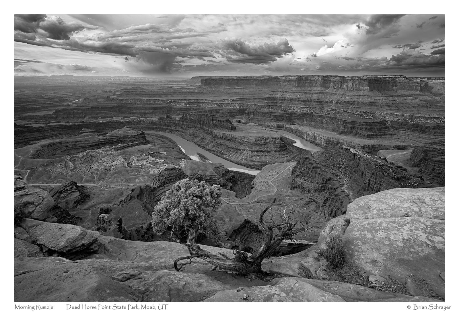
So here is an image that I recently processed from a trip that I took to Dead Horse Point State Park in 2013. I was browsing through some old images when I rediscovered this and decided it might work in black and white.
This was taken about an hour after sunrise and I could hear rumbles of thunder in the distance. I was fortunate on my trip to get a lot of great clouds and light.
What technical feedback would you like if any?
I often struggle with black and white processing, but I think this represents my best effort to date. All comments and critiques are welcome.
What artistic feedback would you like if any?
I suppose I don’t get any points for originality at this icon, but all comments and critiques are welcome.
Pertinent technical details or techniques:
(If this is a composite, etc. please be honest with your techniques to help others learn)
Capture Info:
21 mm
f/8 @ 1/40 sec.
ISO 100
Processing Info:
Extensive use of TK’s luminosity masks and triple play actions to bring out the contrast. I created a dodge and burn layer to brighten the tree.
If you would like your image to be eligible for a feature on the NPN Instagram (@NaturePhotoNet), add the tag ‘ig’ and leave your Instagram username below.
You may only download this image to demonstrate post-processing techniques.
I think that worked out really well for you. There is good separation without looking unnatural,
The bottom right is pretty bright but it looks right somehow. I would make that entire foreground ledge of the same brightness perhaps. It separates nicely from the canyon below.
This is a lovely image Brian, which I think could be greatly improved by adding some contrast selectively. Here is a quick edit of the direction I would take it personally.
Using the TKPanel I added some mid tone contrast to the overall image by selecting the midtones-1, creating a curves adjustment and pulling in the black and white points. Then selected the darks 1 and subtracted the darks 5 in order to not affect the very darkest tones, created a curves adjustment and pulled in the black point and added a slight s-curve. Then I selected the lights 2, loaded as a selection and dodged various parts of the image through that selection to bring out the light tones. Then selected a darks 5, loaded as a selection and burned through that to darken the lower right corner without darkening the lighter tones.
Really nice image and I like the direction David took it. I might be tempted to go even further, but that is very personal taste at that point. Great sky.
You had some awesome conditions Brian. I know for me, big landscapes in b/w end up with a lot of middle grey. It can take a lot of massaging to pull all of the tones out. It has a very classic look and if you did nothing more it would work just fine.
The elements all separate well, and that’s not always easy in B&W and wide-angle. I particularly like the drama in the sky. Lots of variation and interest there. If I were to offer a recommendation it might be to try and work to add a bit more contrast to the non-sky areas in a subtle way to create a slightly better match with the drama in the sky.
Brian, I like this a lot as presented. Part of why it stands out for me, is the limited contrast, which helps me explore all of the details and there are a ton of details. I do think that Igor’s suggestion of evening the luminosity of the foreground ledge would work well.
Thanks again for taking time to make revisions and explain your process, David! This is very helpful. I will keep working with this image and put your suggestions to practice.
Brian, I miss this image and I am pleased to see it brought up. Very well done. I like the direction that David took, I won’t probably go as far but it’s a personal taste. The composition here is just spot on.