This is my first pano done with my DSLR (as opposed to smartphone). I was quite pleased with how easy it was to do in Lightroom and am mostly pleased with the result. The hike was amazing and I would love to go back at sunrise/sunset sometime!
Specific Feedback Requested
Not really. Unfortunately one of the images appears to suffer from camera shake, but it’s not too noticeable unless you zoom in. Any feedback welcome! Things that I focused on in postprocessing were the crop (originally I had a much looser crop which I felt didn’t emphasize the mountain enough) and colors. I also made some local adjustments to the mountains, as well as added a gradient filter on the LHS because it was quite hazy on that side.
Question: For the purposes of this form, is a pano considered a “composite”? Just curious.
Technical Details
Is this a composite: No
Pano from 4 images merged in Lightroom.
ISO 100
70mm
f/8.0
1/125s
APS-C
Technically a pano is a composite, just like images where you blend multiple brackets for exposure and dynamic range (HDR), or for focus points (focus stacking). There is nothing “wrong” with any of these approaches. A more traditional definition of “composite” would be where you blend in an amazing sky from another image into scene that has a dull sky. NPN allows this too, as long as it is disclosed as a composite. The emphasis of NPN is on education through critique, so we like to have folks disclose and discuss how they created a shot, so that others may learn about techniques.
I don’t do panos myself, so I cant speak much to your technique here. I think the composition feels well balanced, with good relative proportions of sky, mountain and land. The shape of the mountain itself is interesting and well balanced across the scene.
Color is a very subjective thing, but this image feels a bit too yellow and slightly green to me. I look at the clouds and they look too warm (yellow), where I might expect to see more pure whites. I did a rework where I reduced the warm color cast by reducing yellow and green to the image overall. This gives purer looking whites. And by having the sky cooler, I think you get even more warm / cool color contrast against the warmer landscape.
2 Likes
Thanks @Ed_McGuirk! Yeah, I think you answered my question which is that the composite question is more for the sky replacement kind.
I appreciate your feedback about the color. I’m not sure how I feel about your edit yet - at first it felt way too magenta, but that could just be because I’ve been looking at the green edit for so long! In reality it was very green. I will have to play around with it some more in Lightroom.
You have a color cast here, it’s just that you have been looking at it for so long that your eyes have grown accustomed to it. It happens to all of us. The real telltale sign of a color cast is to look at neutral colors, whites, mid-tone grays, blacks, etc.
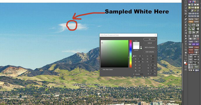
Here is a screen shot from photoshop of your white cloud, where I sampled it with the color picker. Pure white would be close to R256, G 256, B256, where the RGB values are nearly identical to each other,.Your white cloud values are R 219, G230, B222, and with green having that much higher values you have a green color cast. I recognized this by eyeballing it, but the RGB values show it quantitatively too.
RGB values of white cloud
One Lightroom trick to test for color casts is in the Develope module, in the White Balance area you can click on the eyedropper tool, and then if you click on a neutral color like the white cloud, Lightroom will attempt to neutralize any color casts. The rework below is simply doing that alone, and to my eye it looks similar to the rework I gave you earlier (even though I adjusted color a different way, using TK Actions Neutralize Color Cast 1). Sometimes you want to remove color casts, and sometimes you don’t (for creative effect). But in your original post the white clouds (and the sky) just don’t look right to me.
Using Lightroom Eyedropper to neutralize white
I think either my earlier rework, or the Lightroom eyedropper trick image have more natural looking whites and sky.
1 Like
@Ed_McGuirk Thanks very much for the helpful detail! I’ve noticed that color cast, especially on the green-magenta dimension, seems to be a recurring theme in critiques of my work here. I appreciate having others with a sharper eye who can spot this. I agree, comparing my original image to the second edit it does seem to have a green cast. So I think paying close attention to that in my editing for a while is called for! Thanks again for your help.
If this is a recurring thing, first make sure you have a good current calibration on the monitor you are using for processing. And the Lightroom eyedropper trick is something I do on almost all of my images early in the process, to look for potential casts. I don’t always use the results it produces, but it is a good signal directionally of what needs to be done.
Thanks Ed! Yes, I recently got a calibrator for my monitor. But I think the issue is training my eye and tweaking my editing workflow more than anything. I will definitely be using the eyedropper more.
Appreciate all your helpful advice 


