The photographer is looking for generalized feedback about the aesthetic and technical qualities of their image.
Description
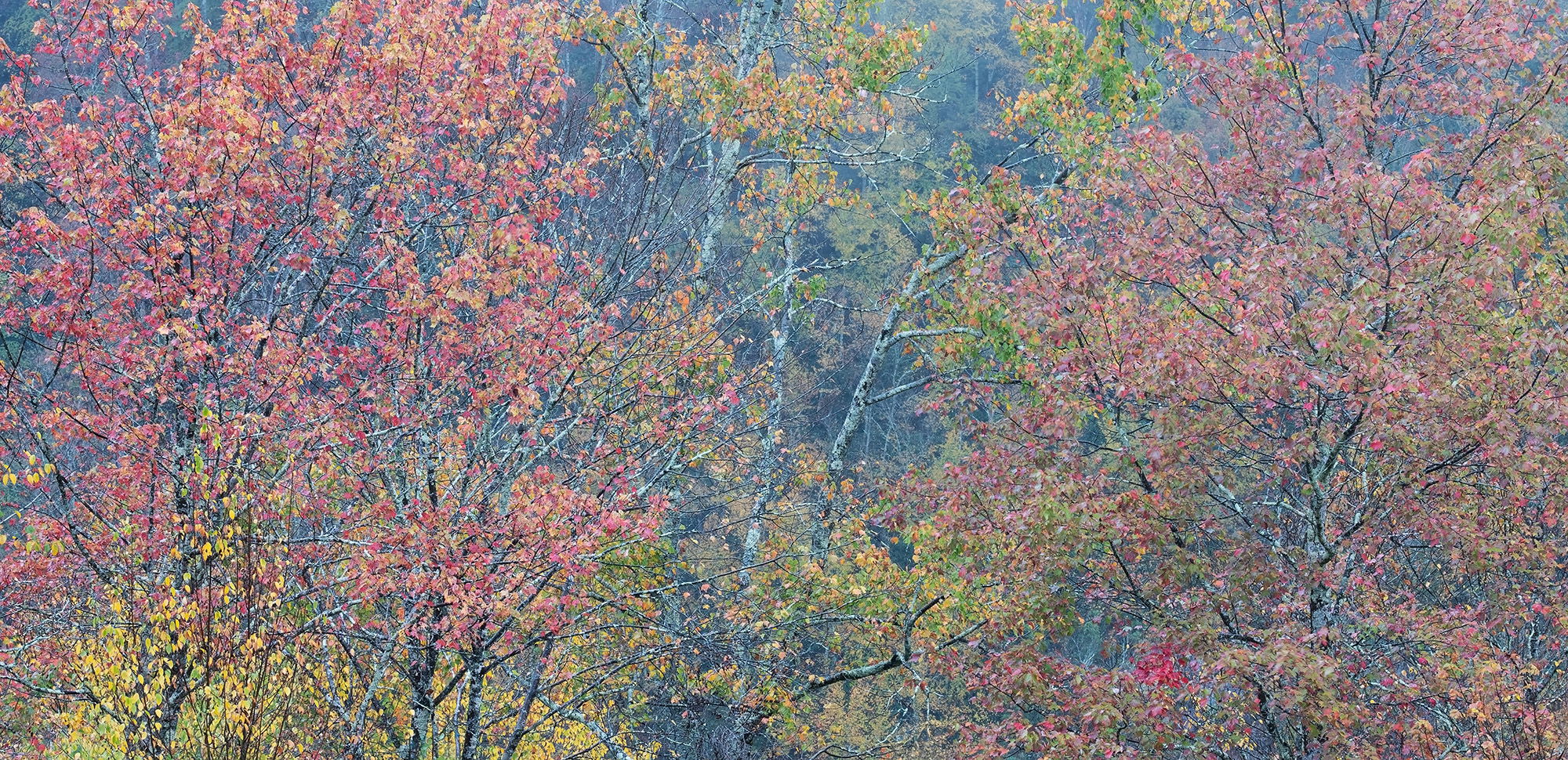
My brother and I had been watching the weather forecasts for a week or so waiting for a rainy day before making the four hour drive to Blackwater Falls SP in WV. Rain was forecast for Tuesday afternoon, so we made our plans. More times than not; when you get a rain event in Blackwater; you can get these lovely atmospherics with the fog/clouds as they swirl about the Blackwater Canyon Walls. These subtle autumn colors caught my eye as the light rain was coming down. The rain had been forecast for noon, but didn’t arrive until about 3:30. We eventually got wet, but neither one of us cared because the conditions were everything we had hoped for.
Specific Feedback
The subtle colors gave off this peaceful vibe so I tried to keep the saturation and contrast to a minimum so as to not destroy the mood. How does that work for you? I could have gone farther with the dehaze slider, but I thought this was the sweet spot. Should I up the dehaze? I also went with the pano format due to brush and unsightly small trees lining the bottom of the frame. Does the pano work? Anything else you notice please feel free to mention it.
Technical Details
Nikon Z7, Nikon 100-400 @ 100 mm, f 11 @ 0.6 sec, ISO 200, Kase magnetic CPL, cable release & tripod.On Tuesday my brother
Critique Template
Use of the template is optional, but it can help spark ideas.
Vision and Purpose:
Conceptual:
Emotional Impact and Mood:
Composition:
Balance and Visual Weight:
Depth and Dimension:
Color:
Lighting:
Processing:
Technical:
Hello Ed,
What a great idea for a photo trip.
This is simply pure color.
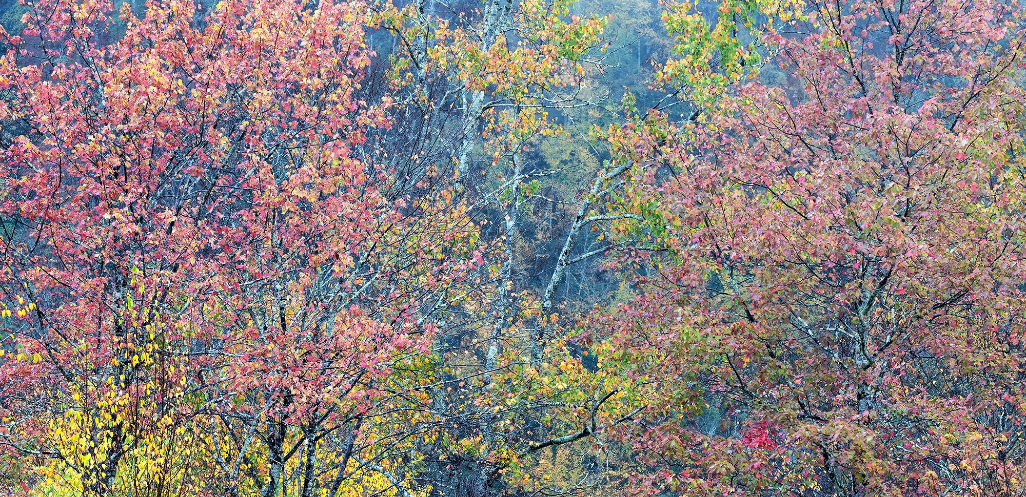
I hope it’s okay for me to edit the colors. These aren’t suggestions for improvement, but rather possible variations.
Image 1:
Red and yellow slightly more saturated. Overall, more contrast. Blue darker.
Ed, I think the pano format works well. You’ve got a great range of colors and luminances. This has a fine, quiteness as presented. Yes, there are lots of ways to make subtle adjustments. I’d suggest thinking about some burning-in of the darkest tones (similar to what dehaze does but without the changes to the middle tones) and maybe some dodging of the mid-tones to bring out the leaves a bit more. This is very well seen.
This is a gorgeous image!! You have isolated a very interesting segment and could go in many equally good directions with the interpretation. An N-fer!
I wonder about one of the interpretations being some tweaking to the yellow leaves in the LL. They pull my eye away from the more subtle areas. But the yellows in the center are perfect. I had to play with a selected area and some Hue-Sat adjustments. Selective Color could probably give more control.
Ed, the pano view is a best look scenario from most all thoughts on that point here. I do also like the muted approach and overall feel to this scene.
The variety of thoughts on changes all have their own merits. So, I won’t join in on that thought pattern overall and just say I’m enjoying the original as presented…
Super image, Ed. I missed this section. Gnarly tree overlook? The pano format works great. Some of the reworks are nice but I much prefer the softer, slightly muted tones of your original. The opposing canyon side really makes for a nice BG. Lovely image.
Lot’s of thoughts on this one Ed, so I guess I’ll toss mine into the ring too. I like the vibe you kept with your processing, but think this has just a bit more of a fall vibe if you move the overall color slightly warmer.