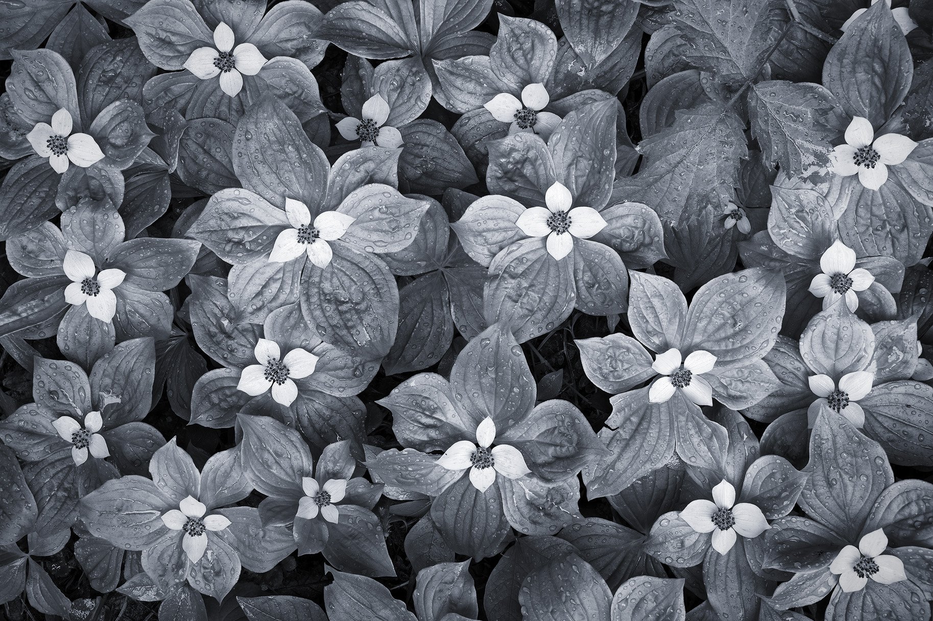
This is an image from last year. I’ve tried to photograph bunchberry before, but this was the first time I’ve found them growing in a large patch; they are often more isolated.
Specific Feedback Requested:
In my prior post there was some discussion of toning. I’m partial to cool tones, because I like the silver effect they can give. Does that work for you here?
Does the interloper leaf in the upper right worry you?
Pertinent technical details or techniques:
NIKON Z 7II
NIKKOR Z 24-200 f/4-6.3 VR at 59.0 mm
1/30 sec. at f/6.0 and ISO 64
Truth in Blending Statement: Seven images blended for depth of field
This is very nice John! I don’t recall seeing this large a mass of bunchberry before either. I really like the comp and the silver effect you’ve given them. The interloper fits tonally, but it creates the only gap of blooms, which is distracting. I don’t know if it’s workable, but I might try to find one of the bunchberry plants that I can clone over the interloper to balance the pattern.
This one works for me and there’s just enough contrast to prevent the textural features of the shadows from disappearing. The comp is fine even with the gap in flower distribution…Jim
Wonderful image and patterns John. I don’t mind the missing flower since it adds a bit of imperfection and wabi sabi to the image. I enjoyed the toning as well. Nicely done!
Another really good B&w image. I like a lot your toning. The focus stacking has given great detail and sharpness in all layers. The water drops add to the quality of the image.
John, great work on the comp, stacking, and especially on the processing. I like the toning you gave this. The interloper is fine, but I also agree with @Steve_Kennedy that if you can find an area to clone without being obvious it would work too. Either way, this is a terrific image.
Another wonderful monochrome image, John. Done especially well here is the lack of cut-off flowers, which is often difficult to manage with other plants so close to one another. Though the upper-right has such a flower hidden, I do not believe it creates any visual tension or difficulty. I do agree with others that the interloper is a bit odd, as it does not conform to the unity of the image; however, I had not much noticed it after reading the comments where others more obviously pointed to it. Perhaps cloning one of the flowers and placing it there in Photoshop will suffice; perhaps it is fine as it is. Your best bet, I believe, would be to ask a friend or family member who does not pursue this craft; if it does not bother them, it should not bother you.
And when it comes to the cool toning, I see no issue with it here, even with my partiality to warm-tones.
Have you introduced a vignette to this, or thought of doing so? Something slight is always a final touch for my pieces, as it helps draw the eye through the image a bit nicer in my opinion.
Oh what a stunner! I love everything about it, even the interloper, although I admit that in the field I may have tried to move or hold it out of the way for the sake of continuity. I don’t do a lot of selenium-type toning when I do monochrome, but when I do, I like it and I like it here. Part of why is that most viewers will be familiar with this flower and the change is surprising and makes us look at them in a different way. We can take in the form and the tonal range. But the rain - the rain just makes this. The freshness it conveys comes through even with the monochrome treatment. A winner!
Elegant, with an absolutely perfect arrangement of the flowers and wonderful cool toning! The missing one in the UR doesn’t bother me but after shooting it I would probably have tried to push the leaf aside and see if there was a flower behind it or one that could be pushed into place. (I would have moved it very carefully as it looks like it might be poison oak.)
I agree with @Diane_Miller - sometimes if I remember I pack a small pair of scissors in my bag to carefully remove such an interloper. Anyway, I only noticed the rogue when you pointed it out! The B and W treatment makes it much less visible and it’s a gorgeous composition, John. Congrats on the Editors Pick.
Hi John, I like the cool tones and the silvery effect you used. It
really helps to bring out the textures.
I find the missing flower section to be a bit distracting but I think that’s also a function of that area also being darker than the other leaves that have flowers. I find this easier to notice when I zoom out and look at the image when it’s really small. The flower at the bottom left is also a little brighter and I find this also tends to make the dark spot stand out more. I darkened it to get more symmetry with the spot on top.
Other than this I would go the cloning route that the others have suggested. Either way, it’s still a beautiful image as is.
I like the scene and the interloper leaf does not both me. This image works very nicely in BU@, though the texture in the petals seems to have been lost. Also, like with the ferns, I think there could have been better separation between the flowers and the leaves. With this conversion, it looks a little overexposed to me.