What technical feedback would you like if any?
any and all
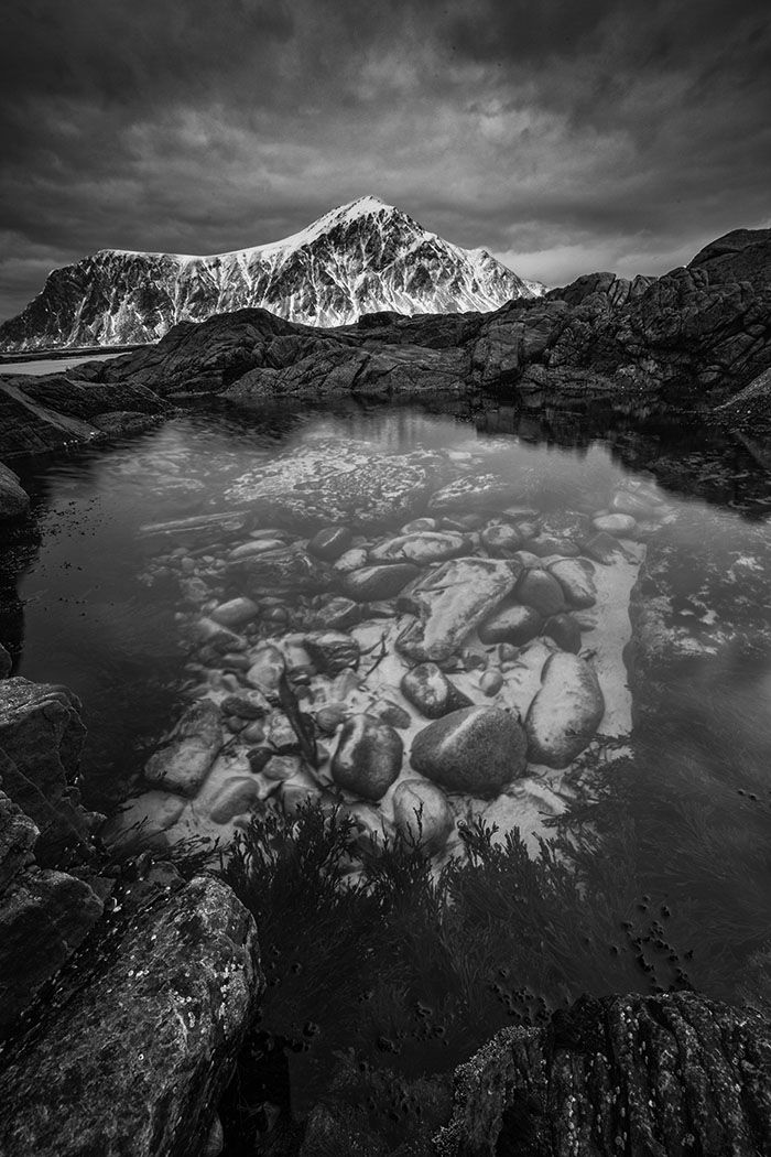
i would like to reduce the glare on the further side of the tide pool. how do i do that?
What artistic feedback would you like if any?
any and all
Pertinent technical details or techniques:
iso 400 16 mm f20 1.0 sec
(If this is a composite, etc. please be honest with your techniques to help others learn)
If you would like your image to be eligible for a feature on the NPN Instagram (@NaturePhotoNet), add the tag ‘ig’ and leave your Instagram username below.
You may only download this image to demonstrate post-processing techniques.
1 Like
A truly compelling composition and lighting for a black-and-white. While I love it as-is, the tide pool lover in me pines to see the color version, too. I have to guess that it has great merit as well.
I think this may be the first time I’ve seen a tide pool with a snow laden mountain as a background. Really well done. The tonal richness in both the dark and light sections is really appreciated. I particularly like the upper half of the image.
Frank,
Another excellent wide-angle, near-far composition and image. B&W processing looks great.
And again that snow-covered mountain is throwing me off. Not in a bad way at all, just in a way that makes me have to think about what I’m viewing - and it’s making me engaged as a viewer. Like Igor, having snow and tide pools together in one frame requires the viewer to expand their thinking - at least for those of us who associate tide pools in a more temperate climate…  It’s all good though!
Only minor nitpick would be the perceived ccw rotation by looking at the left end base of the mountain - kind of the only horizon reference. It may be lens distortion, an optical illusion, or as simple as not being level. I mean everything looks vertical and level, except that little area of beach/ocean at the base of the mountain makes things look tilted. Maybe it’s just me.
As far as reducing glare, I’m not sure how it could be done in post. I know it doesn’t help after the fact… but I think using a polarizer at the time you could have controlled the glare. But unless you can return, not sure what can be done after the fact. Maybe someone knows of a way.
Lon
Frank, in this image you have another great B&W subject, and your processing of exposure, contrast, and tonality looks pretty good. And I think you have a very dynamic composition as well. I like the repeating layers of dark/light in the comp.
Regarding the glare in the tide pool, Lon is correct, using more polarization in the field would have helped. But I took at stab at addressing it in post-processing. I used a TK Darks 2 mask selection in conjunction with a TK Burn layer to target darkening the dark tones in the pool, and I think it does a reasonably good job. This darkens the dark areas, while leaving the lighter tones unaffected. For a little better tonal balance, I also darkened the bright rocks along the left edge of the frame. Bright objects near frame edges or corners can be distracting. Here is where I ended up.
thanks! i like what it did to the top right area of the rocks in the tide pool. it brings out a little more detail. and a better balance i think. thanks.
Nice rework Ed. It’s definitely an improvement.