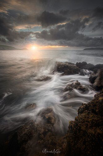
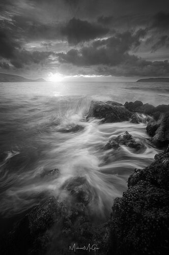
Hi all, first image post here.
I shot this scene last week and have been unsure of whether I like it or not.
I’ve blended an un-polarized sky frame into the polarized foreground and I’ve been having some trouble with managing contrast and tones across the image. (un-polarized sky because my polarizer is scratched to shit and the sun flares up all over the place)
The sky was naturally very high contrast with deep blues behind the grey clouds - Very colourful, while the foreground didn’t pick up much colour and came out much more muted. I think I prefer the B/W version more as it simplifies the image and takes some attention away from the sky.
I would be open to publishing the colour version if anyone has any tips on creating a more cohesive colour scheme.
Open to any and all feedback.
Personally I prefer color in this composition. But I think you could get away from desaturate game the colors a bit toput it maybe somewhere in between. It doesn’t have to be super vibrant colors but just enough to separate it from the black and white image. I think you lose the benefits of the sunset lighting by setting it to black and white, while retaining all of the downsides (namely the blown out sun on the horizon).
I’m also noticing some haloing along the hills in the back. Is that the result of the debate tool or is it just a natural highlight?
Overall a very soothing composition!
Thanks man,
Yeah I could definitely see further desaturating the sky colours working a bit better. I think the combination of orange, blue and the small amount of green in the hills and in the water is just a bit much.
The blown out sun was a creative choice, the dynamic range is mostly there, I just wanted it to be more prominent in the frame. I could for sure pull it back a bit in the B/W version.
Yeah I gotta fix the haloing, its just the result of average exposure blend. luminance masks are hard to work with with dark skies. I’m just lazy until I’m entirely happy with everything else.
The comp is really nice.
If you can tone down the blown sunset and deepen the sky in the B&W to match the FG drama, that would be my preference.
Welcome aboard, Michael. This is a really good first post. I am torn between the two. They present really different moods, but I think I am favoring the color. I find the color in the water and rocks works great. That said, you have an excellent image with either version.
Really like the shot and the water movement captured is great along with a great sunset.
I like the vertical format choice but the rock on both sides seems a little tightly cropped to me as presented. Feel like I would like to see it end on both sides with a little more breathing room but overall that is a minor thing I would not concern myself with if you don’t have more pixels.
The water/waves lines kind of look to change abruptly but honestly I don’t think it is something anyone would notice if they were not purposely looking for it.
I prefer the color as presented. If leaning B&W I think the sky needs to be different.
If B&W I would definitely get the highlights under control but otherwise I feel the sky needs more contrast to work well B&W overall. The B&W one has dramatic water without a dramatic sky with the color removed, think it would try to make them both dramatic B&W.
In color which I prefer I would still tone down the hot sun a bit ; I do the same thing sometimes and like it but looking at your image the sun is a bit distracting from the best element which is the water motion you captured.
I agree with desaturating some of the background elements. The cyan and blue in the sky as well as the green that is on the distant mountains all could be desaturated.
I like the current saturation level of your red/orange/yellow’s.
While I could see why B&W could be justified in this scene, because of the lack/subtlety of the color, I feel the color version works better as you have a bit more depth and separation from the cool and warm tones in the BG and FG. I don’t think there is enough tonality in this to work well in B&W. I vote color for that reason.
@Dan_Kearl Thanks for the feedback
@Harley_Goldman Thanks Harley, I agree, very different moods
@Matt_Reynolds Yeah unfortunately I was at 16mm already and couldn’t zoom out any more. A 12-24mm is on the wishlist… I think the sky needs more work for the B/W to work too, maybe a heavier vignette to match the foreground.
@Eric_Bennett Yeah thanks man, I do see the depth the colour adds to it. Might try warm up the highlights in the water and play with the sky tones. Seems like it got more votes for colour than B/W overall. Processing B/W images is an entirely different game it seems. Thanks for the feedback, big fan of your work.
Color looks great and love the drama. The b&w doesn’t hold my interest as much as the color. Nicely done.
As a youngster I used to often ask my piano teacher - who is the better composer X or Y (say Mozart or Beethoven). A big smile would invariably spread across his face - Just Play - he laughed. He thought it was a foolish question but never told me so.
The b&w has a richness of tones and great emotional impact. As someone stated the color provides a lot to the image. So it’s an excellent color image AND an excellent b&w. It’s all a question of whether you’re in the mood for music from the classic period or the romantic period.
What a great way to put it, thanks Igor.
Michael, as presented I think the color version has more impact. But not because of the color itself, I think the way you have processed these two images, the color version has more contrast than the B&W. I also think Igor makes a good observation, this is an image that can work well in either color or B&W. if i was processing this as a B&W image I would add some contrast and local dodging and burning to place more emphasis on the flowing water and the foreground rock. I downloaded this and took a stab at re-processing the B&W to make these changes.
Michael,
Welcome to NPN - what a gorgeous first post. for me, the color wins easily. Very nice color throughout, I think you did great with the processing. The b&w, while it works well, doesn’t quite match the color version. One element is that the sun is lost in the b&w version, where the supporting color around the sun in the color version really bring the sun out and more prominent. The reflected colors in the water and foreground are quite subtle, but again edge this out over the b&w.
Only suggestion I have might be to increase the micro-contrast in the sea where they crash and flow over the rock. Very minor though.
Beautiful seascape, thanks for sharing and welcome aboard!
Lon
Hi Michael. Apologies for being a bit late to the party. Like one of the other guys said “just play” - you have created a great image in both palettes, but I have to say that the B&W wins - OK it wins hands down. I feel the tones and the contrast convey the mood of the scene better. It’s well composed, I particularly like the offset of the foreground line and the setting sun. Well done!!
On a different note (feel free to agree or disagree) - when someone posts (I have done this too) a B&W/colour comparison that the leaning is towards the black and white. Is this what you were feeling? I find that folk are reluctant to choose a B&W over a colour image. Just a thought
Hey Eugene. Thanks for the feedback, had quite an even split of colour vs b/w opinions in here!
I think I am leaning toward the b/w version but I think I want to take a shot at reprocessing it slightly different.


