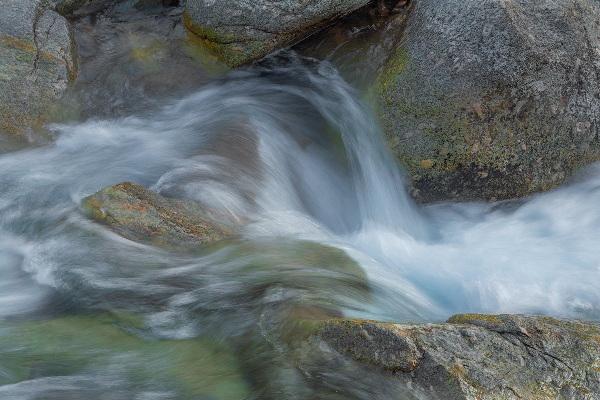
Sonora Pass Country, Sierra.
Lon and I were working this creek late in the afternoon. My first go at this one was too contrasty, so I re-worked it for reduced contrast. I think this is about right for light we had, but did I go to far?
Nikon D-7100
Nikkor 70-200
Your thoughts are always appreciated. 
–P
This looks good, Preston. The processing looks good to my eye. I played with a couple of changes, but like it better as presented than with my experiments. Real nice small scene.
Doesn’t look overdone to me. Beautiful light and I love the texture and movement in the water.
Hi Preston,
I like the granular texture of the rocks against the smoothness of the water. Maybe a tad increase in contrast for printing, but looks fine as presented…Jim
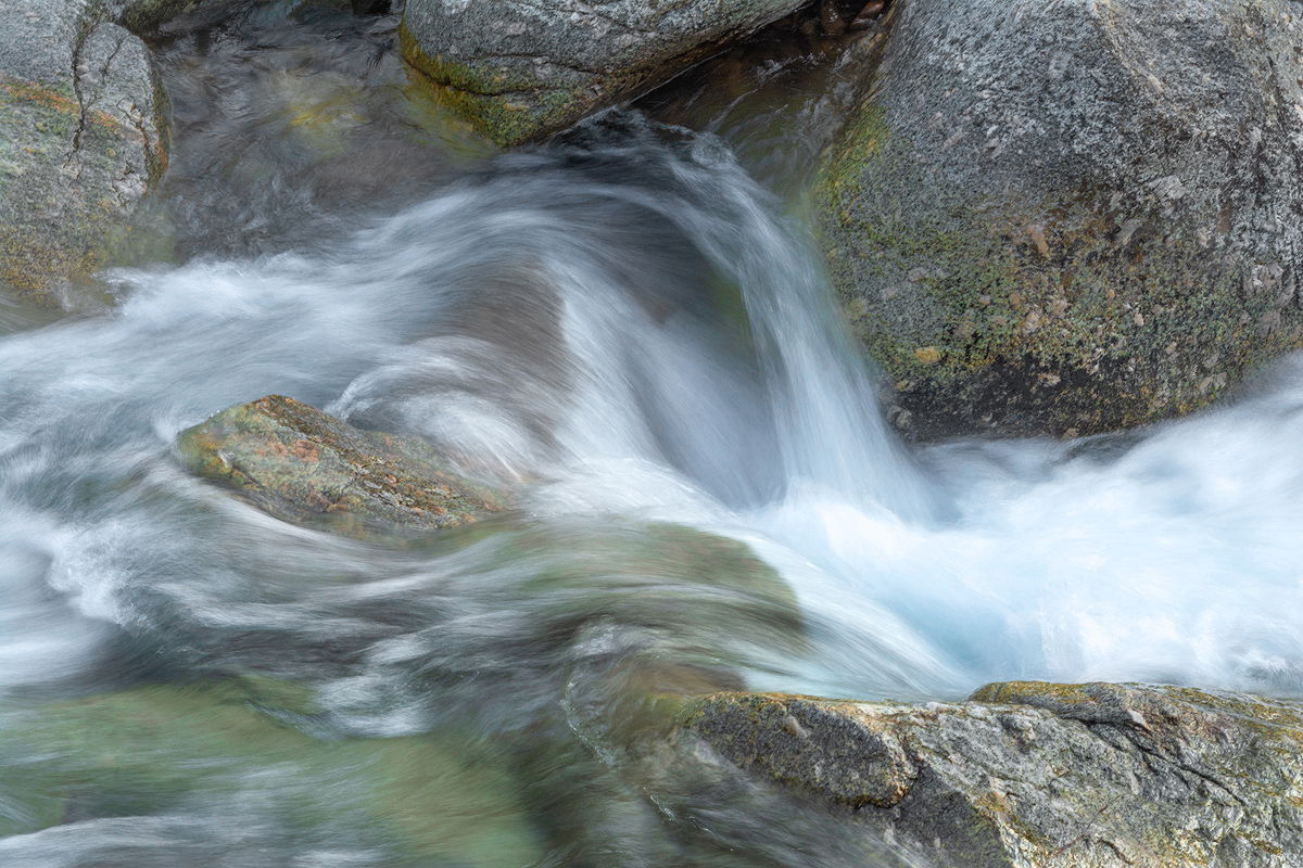
I love the composition here and the chosen shutter speed. It’s a lovely image for sure, but it looks a bit flat and cloudy. I downloaded it and opened Levels and set a white point in the brightest spot I saw and I think that helped a lot. I also added just a bit of Curves just to see what happened. I’ve included the screen shot of the Curves screen for your perusal. I’m not sure the Curves helped anything at all, but I think setting the White Point did, but you be the judge.
Revised version
Original version
Thanks, @Bill_Chambers. I appreciate your effort. As I mentioned in the OP I was struggling a bit with contrast. I like the contrast in the rocks in your version, but prefer the detail in the water in my OP, so a happy medium would work well. Research continues…
@Harley_Goldman, @Jim_Zablotny, and @Bonnie_Lampley, thank you for your comments. 
-P
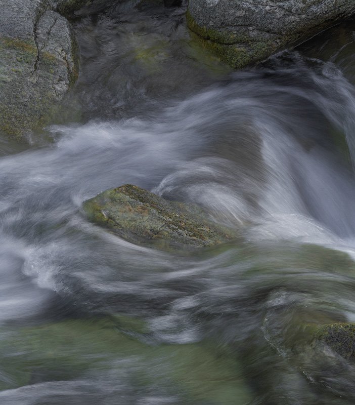
As much as I like the rocks on the right side I find the composition confusing. Confusing in the sense that it seems superfluous to the statement which I think is about the left rock and the swirls around it. That area is so strong that the white foam draws you away from it. The following shows what I’m getting at.
I really like the processing of this and prefer the original for the reasons you gave. I also like the warmth of the original except in the cracks where the yellow is just a tad too strong.
Preston,
This came out beautifully! I think I recall the spot and I was upstream more in the sun. (round file for me from there…) Love the water here and the color you squeezed out of the granite. Processing comes across as spot on to me. Having just said that, I think this could be interpreted and presented slightly differently with just as acceptable results and so in the end it’s really on how best you recall and wish to render the scene. I played with it a little like Bill and do like the increased luminosity and/or even contrast, but I think the water in Bill’s went too far.
Honestly, I see little that can be done that would make a signficant improvement - only personal choice tweaks. I think the flow to the right is important (and it’s good you got texture there) I could see like a 5% crop, but I’m reaching. Here’s my attempt which may or may not be of any significant change. I did the rather simply technique of adding a blank Level’s layer using the Soft Light blending mode set to about 20%, adding a pinch of contrast. Then at the last minute thought about burning the rock edges a little bit to help frame the water flow a little more. Just minor things though. And did shave a small bit off the right.
No doubt I can see why you might be happy with this. I would be too. Great eye, great processing.
You didn’t mention, let me guess: 1/8th second?
Lon
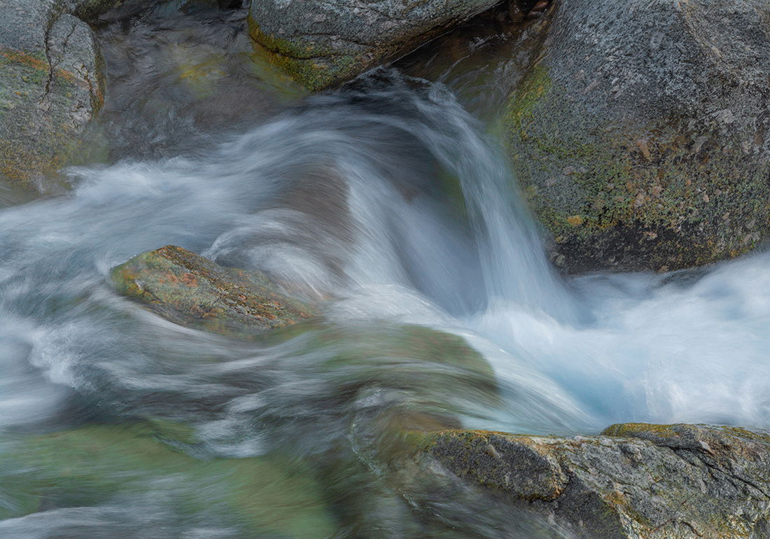
oh, for grins:
I think it is always fun when you are out looking for that grand image and are ultimately captivated by these small scenes. I like this image a lot but I agree with Igor that the left side of the image is where the interest is and the right side is distracting to the beautiful swirling water around the rock. The crop that Igor proposed brings your eye to the heart of this beautiful scene.
I think this looks great, Preston. I like the texture and flow of the cascade as well as the contrasting textures with the rocks. Nicely done!
Preston, a neat little take here. I like the title too. Once an image is processed I find I’m never totally satisfied with my first go around and wind up tinkering off & on. So, although suggestions all look like plausible ideas, the original looks just fine to me as presented…