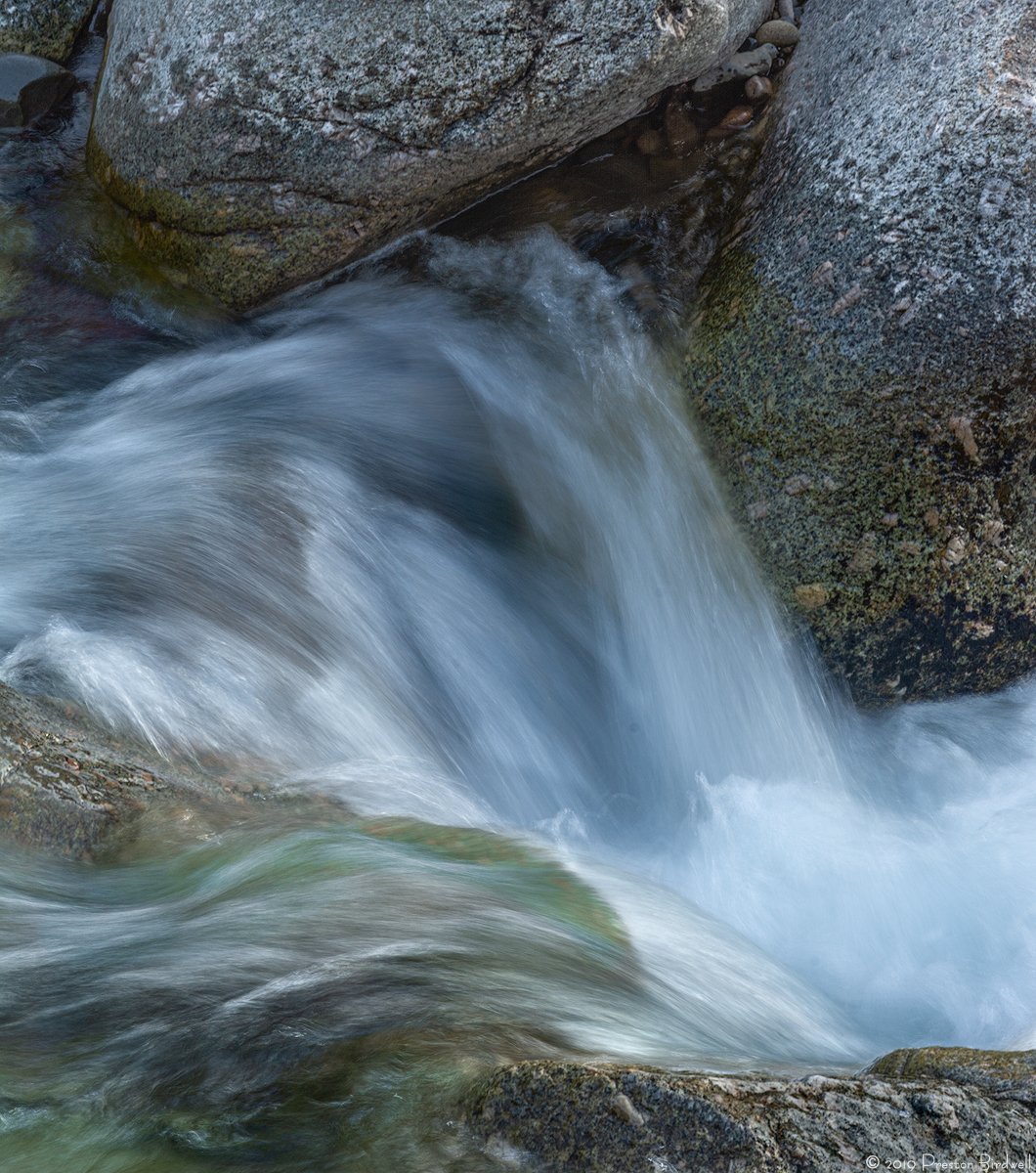
This is a tighter frame of my Ocean Bound image posted previously. This one has been cropped quite a bit from the top to eliminate a bare area. I also used TK’s Saturation Painting action at a low opacity and a soft brush to boost the green and blue/cyan in the water a bit. I also darkened the rock in the lower right corner.
Nikon D-7100
Nikkor 70-200
Thanks, All for your suggestions. I fixed the dust bunnies, and cropped from the top, as per Lon’s suggestion. I tried a 1:1 crop, but it put the dark area between the boulders on the top edge, so I felt that was distracting. Here’s the tweaked version;
Preston, I missed the Ocean Bound and I am glad you posted this one. I looked at both and I think I like this tighter crop more. I really like how clean it is and the water motion makes the image very dynamic. My suggestion would only be to crop the rock on top a little more. Its current size makes the image a little top heavy. Cropping it just a tad more will eliminate that problem.
Preston, I really like how the water came out in this shot. It has a nice look and feel of motion. In the small version I didn’t notice that it felt a bit top-heavy but in the larger version I agree with Adhika on that. Maybe just a small crop of the top would work. Very nice!
The water is just gorgeous here. Great job with the saturation painting. I really like the somewhat cool WB too. The texture in the water is just perfect.
I would agree with the others about a top crop. I was thinking the same before any comments. Maybe even as far as to the bottom of the small, shiny rock in the ULC. Might even make a great 1:1 crop.
Other minor nit and I’m surprised this got by you… but you’ve got a handful of dust bunnies I see in the water you might clean up if this is going to see print one day.
Nice job on the repost. The water looks just right. I could see cropping just a bit more off the top, but not a big deal. A nice little intimate scene.
Preston, the cropped version works best for me…
…your title name had me looking. I’ve still got a Savage .222 over a 20 gauge in a locked cabinet here at home. I carried that into the field for years as a kid…
Preston,
The repost is the ticket. Your treatment of the water is perfect as you have captured some lovely textures and details to go along with the WB. Really beautiful work on this.
Preston, I like this one a lot. It’s a nice tight composition, and i like the strategic placement of the rocks. But for me it is the appearance of the water that is very striking. It looks almost metallic, the silvery blue/green color is wonderful. I agree with @Lon_Overacker, you couldn’t ask for a better texture in the water than this. i think this would work great as a B&W conversion too, especially due to the texture in the water and rocks.