The photographer has shared comprehensive information about their intent and creative vision for this image. Please examine the details and offer feedback on how they can most effectively realize their vision.
Self Critique
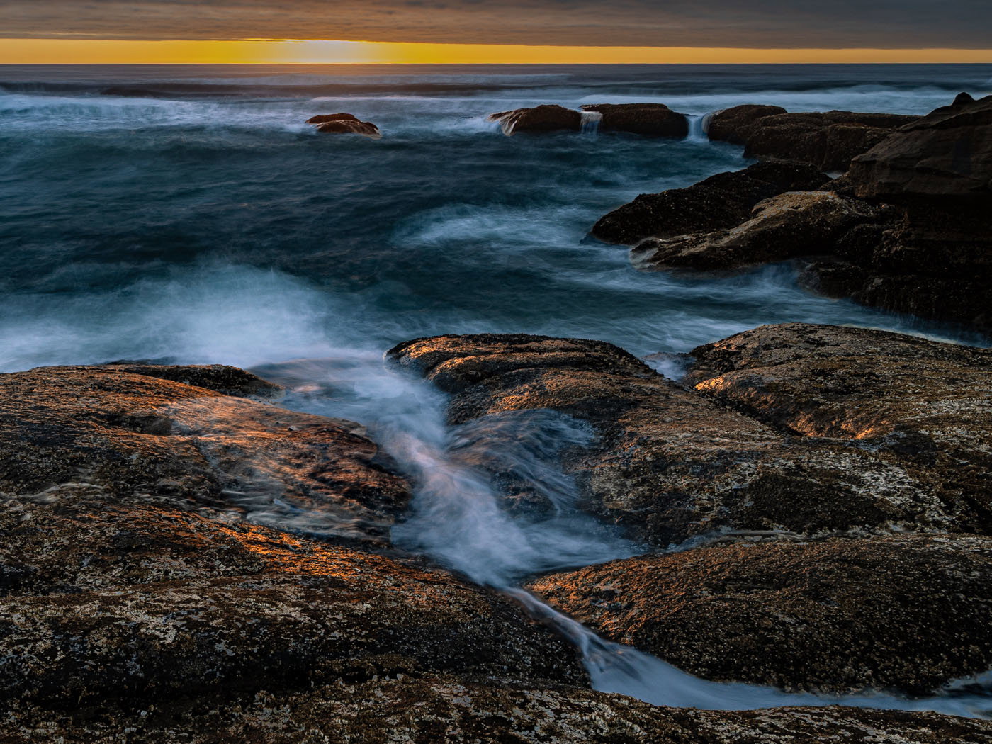
The beautiful golden light reflected on the rocks and waves, the rendering of the water , the mixture of textures and complementary colors.
Creative direction
I wanted to convey the sharp contrast between the strong waves and the beauty of the sunset. Give the viewer a sense of power and strength, perhaps even discomfort while also showing how breathtakingly beautiful a scene like this can be.
Specific Feedback
Is the crop appropriate or would it be better if the image was cropped at the horizon.
The horizon line appears crop led but it is not it is the cloud formation that give it that appearance.
Is the processing adécuate or to dark. I processed this image with just masking juggling light and darkness and no color adjustments.
Technical Details
Canon R5 mk iii
F/16
2.0 sec
ISO 100
24mm
Description
This was a once in a life time trip to the Oregon Coast last week. The weather was uncooperative and this was the only opportunity I had to take a photo of a coastal sunset.
Lorraine, this is a nicely dramatic coastal sunset scene, with the light on the rocks a special addition. I do think that your long shutter speed has reduced the drama of the waves, but that doesn’t detract from the overall scene. This looks good as presented. You might try cropping the clouds, but I think seeing the golden sky is important in combination with the golden light on the foreground rocks. Your processing looks good, although I would experiment with dodging the darkest rocks in the mid-ground to see how that looks. I’m not sure it would be an improvement and it is your photo and your statement about the scene.
I Love this! Simply gorgeous. I love the light, including the sunset and light striking the rocks; I love contrast in color between the ocean and the rock.
I would agree with Mark that the “power and strength” of the ocean isn’t necessarily what I’m seeing - but please know that’s not a bad thing! I think the longer exposure has allowed the water to show form and showcase the rock even more. A bit of a difference when crashing waves splashing, pounding, etc. depict power. But that’s just my view. No doubt to me that you’ve created a beautiful seascape. I love this as presented.
I get the cloud bank and horizon - no issues there. I do think it’s very important and works perfectly in the composition.
I also might agree with Mark about a slight increase in luminosity in the darker rocks. But just a tweak rather than a big shift. Very minor thought really.
Great work - glad you were able to witness an epic sunset on the Oregon coast!
I’m glad you were able to visit our neck of the woods; the Oregon Coast can be a magical place. It is a tough one for sunsets, though, because all too often the marine layer chokes off the sun just as it’s about to make some magic. It’s wonderful that you caught this light peeking through.
I think the crop is fine, in fact I wouldn’t mind a bit more of the clouds. I wouldn’t crop to the horizon.
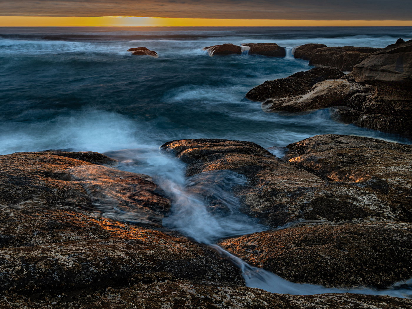
Two things two consider for processing. First, you might play with warmig the white areas of the water to help them be a bit more congrous with the wonderful warm light kissing the rocks. Second, reducing the saturation of the darker parts of the image might help the brighter areas sing out a bit more. Subtle thoughts, but here’s an example:
One thing that seems strange is that the fg rocks look noticeably brighter than the background rocks. I would try to get a balance between the two. I think the composition here is right on.
To answer your specific questions, no I would not crop to the horizon. I think including some sky is necessary to show where that great light is emanating from. I like the processing except for the darker rocks. I would dodge them a little to bring them more in line with the brighter ones.