It is difficult to see the beauty of my own environment . I discover more every day by trying to find images
What technical feedback would you like if any?As always is all feedback more than welcome
What artistic feedback would you like if any? More than welcome
Pertinent technical details or techniques:
(If this is a composite, etc. please be honest with your techniques to help others learn)
If you would like your image to be eligible for a feature on the NPN Instagram (@NaturePhotoNet), add the tag ‘ig’ and leave your Instagram username below.
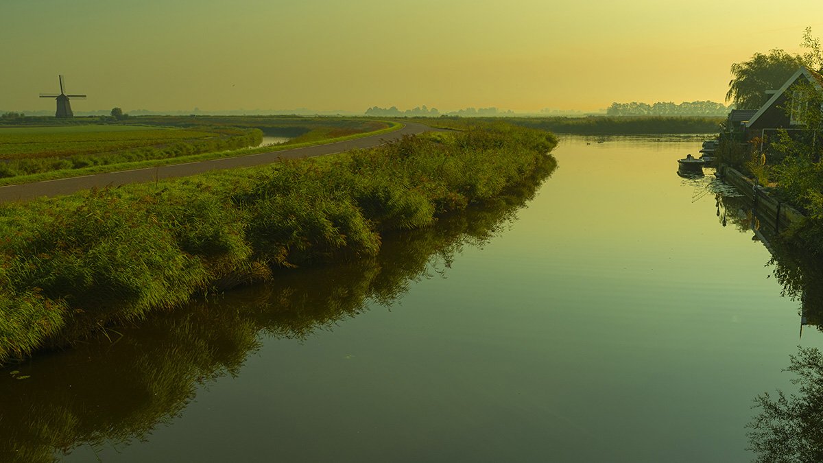
A lovely scene. I like the calm mood portrayed and the muted colors.
1 Like
This is a beautiful image; the river and the canal both pull me into the photo. I can feel the peace of the moment. I love the painterly feel of the photo. And it looks like somewhere I’d love to be right now. I cant tell if the windmill is tilted or if that is from the lens, but it does catch my attention. I think all of the blues, greens and yellows are just stunning and convey a sense of master painter beauty.
1 Like
I like the color cast you’ve chosen for this and recent images, Ben. It’s not very realistic. It improves reality.
1 Like
Hi Ben,
Personal preference but the green cast doesn’t;t work for me. I would have gone with a natural analogous colour scheme and emphasised the golden hues.
The curve of the river and the windmill are the strongest components for me.
1 Like
I like the composition a lot. There are pleasing things to view all around the frame, and there’s an interesting tension among the canal, the brightness behind it, and the curved road. I am pulled around the frame by all of it. All that said, I agree with Nathan about the greens. I’d reduce those some.
1 Like
I like the composition and the mood. A fine image. I can in general find myself in the comments of @Lyle_Gruby.
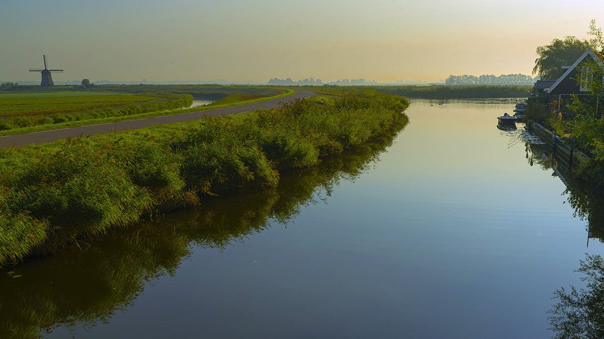
I must say that I don’t like the green cast; I suppose you did it deliberately, but I prefer a more natural look that also does justice to the early morning mood. I did a quick edit to show my preferences.
By the way: your image has an AdobeRGB color profile. This can cause problems in certain browsers that are not properly color managed.
2 Likes
I would be curious to see a poll of photographers vs. non-photographers on the color cast. On the one hand it is very artistic, but for photographers it is really hard sometimes to quiet the subconscious questions (e.g. Is his/her monitor calibrated?). My guess is that a higher percentage of non-photographers would like the effect?
1 Like
Maybe @John_Williams is it the point that some photographers cannot ignore what the “rules” say and seek reality in an image. OK by me. What you @Han_Schutten call " green cast" I used indeed deliberately . To give my image as @Igor_Doncov says improving of reality. One can discuss about using more or as @Lyle_Gruby using less of that cast. @Nathan_Klein as you like to see a natural analogous, you will miss the mood, emotion as @robertakayne and @Allen_Brooks feel. As always is this the beauty of making images " All is possible !"
Good points Ben. On a personal note, it does help me to appreciate the effect when I know it was intentional.
1 Like
Of course I respect the choices that you made when you processed the image, Ben. It is YOUR image. As I said: I suppose that you did it deliberately. That I said, that I prefer a more natural look doesn’t mean that I support the opinion that no changes should be made to the colors that are in the file. After all, your camera has already made more or less arbitrary choices in recording and presenting your image. It is up to you, what you do with the data. But in this case, the green cast (and the presence of a green cast is not an opinion, but a fact) is not pleasing to my eye 
1 Like