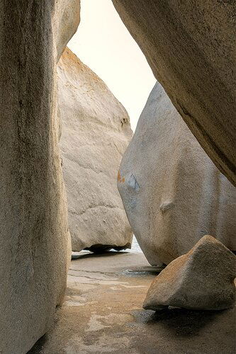
This is a 2019 image made at Remarkable Rocks on Kangaroo Island, Australia. I was revisiting the image exposed in mid afternoon light. I am interested in over-all critiques. I tried converting to B&W and decided that color is best here. Is the separation of the rocks and tonal range right? What, if at all, does the image communicate? Is this a keeper?
Type of Critique Requested
- Aesthetic: Focusing on the overall visual appeal of the image, including its color, lighting, cropping, and composition.
- Conceptual: Focus on the message and story conveyed by the image.
- Emotional: Focus on the emotional impact and artistic value of the image.
Specific Feedback and Self-Critique
See above.
Technical Details
Nikon D500, 24-70mm lens, 1/30 sec, f14, ISO 640
This is another whimsical take on the image using the TK8 panel and the Steve Dell photo sketch .
Larry,
Excellent! I’m really enjoying the graphic nature of this; the arrangement of the shapes, sizes, position and differences between all the rock features. This is quite excellently composed (is that a word?) The tonal range is quite nice too with the color version. I think you’re right on the b&w. I took a look and I think the tonal range, contrasts, etc. all work pretty well in b&w - except for me… the sky, or blank area top center (I’m assuming it’s sky.) For some reason, I think the brighter tone is a bit more congruous with the color version; not so much in b&w. Otherise, I think the shapes and arrangement would work well monochrome.
As presented, I have no nits or suggestions. All the rock elements are positioned and balanced well. This is just very well seen and photographed.
I like and get the feeling of being on the inside looking out. The two neares shapes are the walls and one might be stepping out in to a rock maze. cool.
The whimsical image? for me, just that whimsical, but more gimmicky. I think the straight shot is the real deal.
Lon
1 Like
I like this image a lot. I think the composition rocks  . My only suggestion is to try a light vignette to darken the edges and bring the eye more into the center.
For some reason in images such as this I am attracted to places where the edge of a rock comes in contact with a plane. I find that to be the most interesting part here. I would crop to make that the main focus of this image. I would also lift the darkest areas a bit.
Thanks @Lon_Overacker @Donna_Callais @Igor_Doncov . Pardon my tardiness in responding. I appreciate all of your comments. Lon, thanks for confirming that the tonal range and image works; Donna, I will review what I did with a vignette and adjust it as needed, Igor, thanks for your comment – I don’t quite understand where you mean to crop. Thanks again to you all.
1 Like

