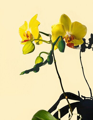
This is a 13 shot stack, manual focus image processed in PS.
Specific Feedback Requested
Lots of little issues and I suspect they are related to too many image constructs, and using Photoshop instead of a dedicated stacking program like Helicon. The worst issue I had was after the processing was complete, there was a fairly distinct “shadow” for lack of a better term, or perhaps, “outline” around the entire image that was a few shades darker than a “flesh tone.”
The second issue of import was the profound darkening of the shadows, especially on the foreground stem.
Are there too many images in the stack? First real attempt at focus point exposures for a stack.
Technical Details
Is this a composite: Yes
D850, 17-35 Tokina @35mm, f/7.1, 1/100, ISO 50
Processed in ACR, then some luminosity masking and finally stacked in PS.
Hey Chris. This is a nice subject indeed.
Photoshop isn’t the best tool for stacking. It can work in a pinch, but some of your problems would be better addressed by Zarene or Helicon Focus. I use Helicon and it serves me quite well.
It’s likely that the shadow/outline you see is a natural result of optics. The edge of blurred foreground objects becomes larger and semitransparent as the focus moves backward or farther out. That introduces a block of the background detail resulting in a blurred halo around the foreground object. The only way to minimize such effect is to use a smaller aperture. I have found that I can mostly get around it by stopping down to f/11 or even f/16. The smaller aperture doesn’t blur the foreground objects as much as the larger aperture would.
I would suggest trying f/11 and stack again. The number of shots is not a problem…
Cheers,
David
Hi Chris, this is certainly a worthy subject likely to produce some wonderful images and I know stacking is time-consuming too, so I give you credit for wanting to put in the effort. Without looking at David’s reply I will just give my quick impressions. I like the background a lot and it will show off these delicate blooms nicely. I would like to see the faces of the flowers more than what is shown. The stem and everything below it doesn’t support the main subjects very much. As for the shadows, you need some light on the right to eliminate them. Orchids are always fun to photograph!
The stack looks pretty good, the flowers and are nice and sharp. For flowers, I prefer diffuse lighting from multiple flashes. with the subject placed in front of a very dark BG. The presence of the strong shadows in your comp does create some abstraction and interest to the eye…Jim
1 Like
I did a second one with a dark BG posted on here a week or so ago.
[Miss Penelope - #2]
1 Like
