The photographer is looking for generalized feedback about the aesthetic and technical qualities of their image.
Description
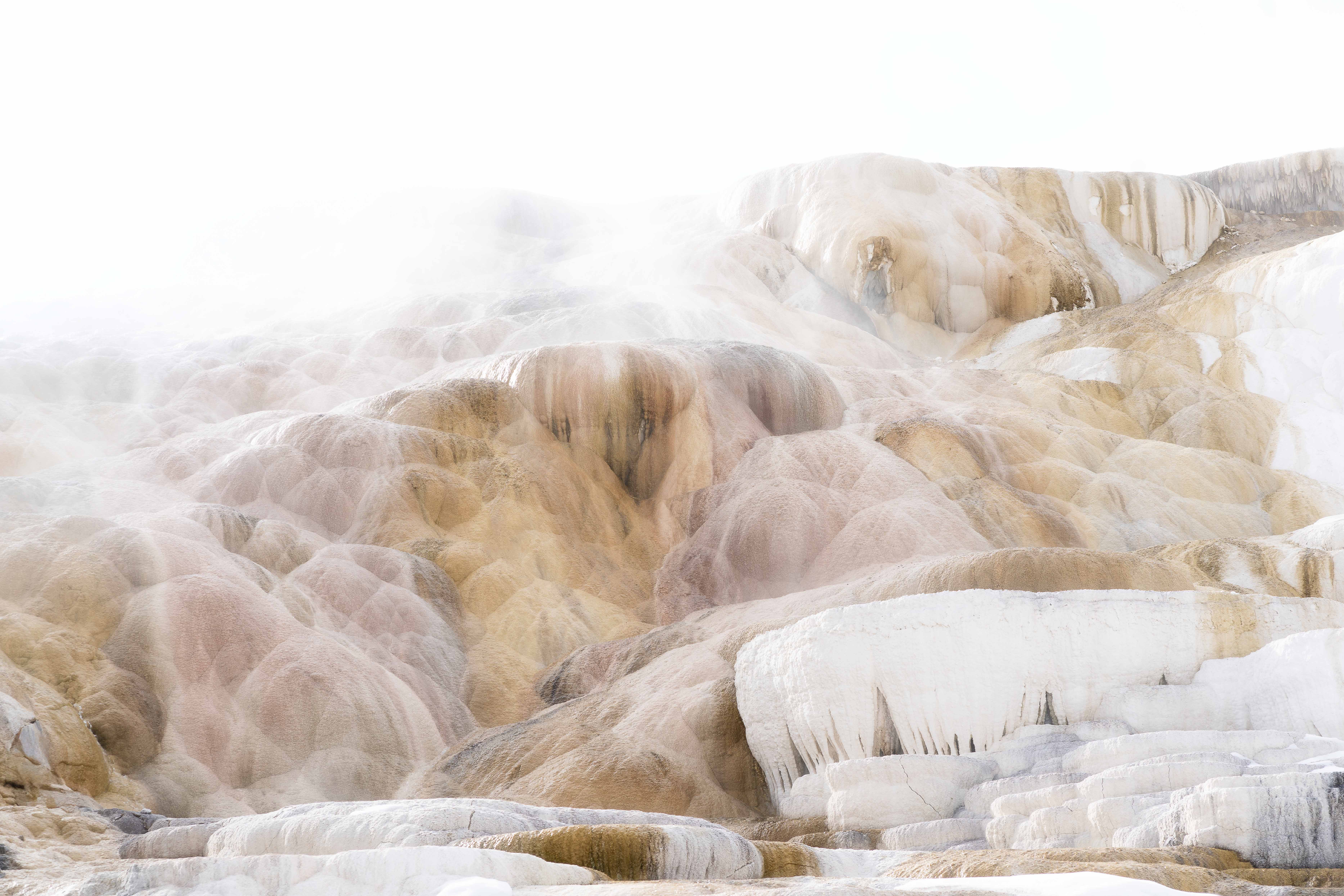
There aren’t adequate words to describe a tour through Mammoth Hot Springs in Yellowstone. An abstract photographer’s paradise for sure! One could spend hours. In fact, I think I did.
Specific Feedback
The white vignette is the opposite of what’s typically done. Is it too much? Does it work?
Technical Details
Sony A7RIII
ISO 100, f/8, 85mm, 1/200
Critique Template
Use of the template is optional, but it can help spark ideas.
This is the perfect image for a white vignette!! I might emphasize it even more on the sides and bottom. Deciding on a crop for images like this can drive a person nuts – there is just so much interest everywhere. I love the subtle colors and textures.
Really wonderful abstract @Connie_McClaran. The whit vignette works for me. I like Duane’s suggestion of increasing it on the sides and bottom OR perhaps cropping a little off the top for balance. The snow is its own vignette elsewhere, which is an element of this I really like—natural and applied vignettes.
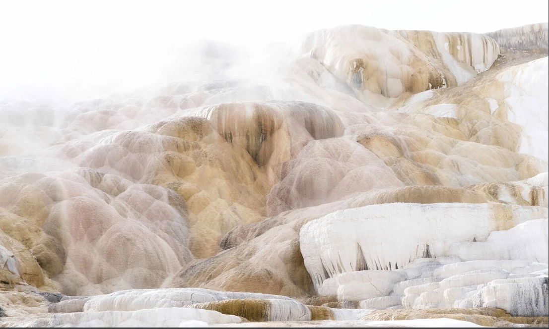
Here is a quickie screen grab crop. I’m not sure of the aspect ratio as I free-handed it, but it might give you something to play with and season to taste.
Connie, what a cool image from an awesome location! The white vignette looks great and as others have noted, adding a bit more at the bottom would help amplify the mood. I love the ambiguity of scale in your image. I have no idea of the size of that ice shelf for example. The other aspect I enjoyed are the white dusted hills. They also appear like multiple exposures.
How dreamy! The white vignette is perfect, and nice color control on the springs themselves. Everything looks so soft, ethereal, and ghostly (happy ghosts!). I do agree with the other comments to reduce the top and add it to the bottom to get the feel that you are continuing to flow with the steam and ice.
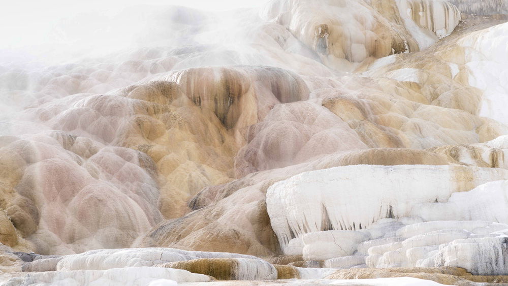
What an interesting view. At first I thought it was a composite because of the thin veil of white deposits over the brownish ones. Very cool! The white vignette works well here, although that ULC is rather bright and the amount of space its taking up in the frame feels too much to me. I thought perhaps toning down the brightness a bit up there and going to a 16:9 ratio might be interesting. Here’s my thought. I think the tighter crop makes it feel much more immediate. Any way you crop it though (or not!), it’s a lovely photo.