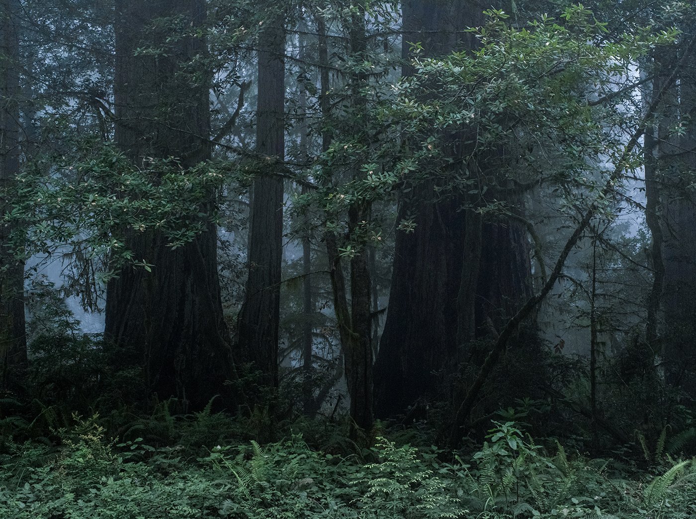
First post here! Excited to be a part of the community. I’ve been fooling around with this one and can’t decide if I really like it or not.
What technical feedback would you like if any?
I cooled this image slightly. I also desaturated the foreground. Does the color and saturation work for you? I also clone-stamped a few pieces of unruly vegetation…does anything stick out to your eye as unnatural?
What artistic feedback would you like if any?
I am drawn to ‘busy’ compositions…but is this too much? What mood(s) does the image evoke? If you’ve been to an old-growth redwood forest, does this feel authentic?
Pertinent technical details or techniques:
(If this is a composite, etc. please be honest with your techniques to help others learn)
Single image, 50mm, ISO 3200, f/10, 1/60 sec (dim light, and an intermittent breeze so I had to fight foliage blur). Incidentally, I was first trying to stitch together a wider scene with more fog-backlit trees, but none of those compositions were significantly better than this central grouping.
If you would like your image to be eligible for a feature on the NPN Instagram (@NaturePhotoNet), add the tag ‘ig’ and leave your Instagram username below.
@roadless_wild
You may only download this image to demonstrate post-processing techniques.
Welcome to NPN Sean! Glad to have you here!
Honestly, I wouldn’t consider this all that busy (relatively speaking.) You’ve got the solid anchor of the redwoods (?) and the base of the scene with the ferns/vegetation is solid and not chaotic. A couple of clusters of branches/leaves and I’d call this a pretty solid (not so busy) composition… Most know and understand how difficult these deep forest images can be to pull out a solid composition - and I think you’ve done that here.
Ok, having said that - I think you could really squeeze some greatness out of this. The shadow area at the base of the two primary redwoods could come up a little. I really like the “coolness” of the background mist, but think the coolness went too far on the foliage.
I think this has great potential. Let me know and I can post my attempt. I really like this image with the misty background and strong presence of the big trees. IMHO, the foliage went too cool
Welcome to NPN. Looking forward to more images and your participation.
Lon
1 Like
Hi Sean, and welcome to the party! This is a lively bunch of photographers and a great environment to share, learn, and be part of a great community.
Since you asked for some specific feedback on your image, I’ll just dive in here. First of all, I agree that forest scenes can tend to be “busy,” but you’ve done a nice job simplifying this one and presenting just a part of the forest while maintaining a mysterious feeling.
While cooler tones in the fog help set the mood of the piece, the foliage doesn’t look realistic. Try adjusting the green tones to a warmer hue, but try to maintain the cooler blues in the fog. And, while the deep shadows add to the feeling of mystery, there should still be some detail in the tree trunks, so try lifting the darkest parts a bit. Redwood tree trunks are, after all, reddish. So, to communicate that this is a Redwood forest and not another kind of forest, then the tree trunks need to show some of that natural color.
The bright spot near the right edge is distracting, so try darkening it. Also, some targeted dodge/burn would help direct the eye through the composition and back into the forest.
Anyway, so much of this kind of editing comes down to personal taste, so please feel free to take whatever part of this critique is helpful, and leave the rest. You’ve made a very nice composition, and it definitely has a mysterious feel!
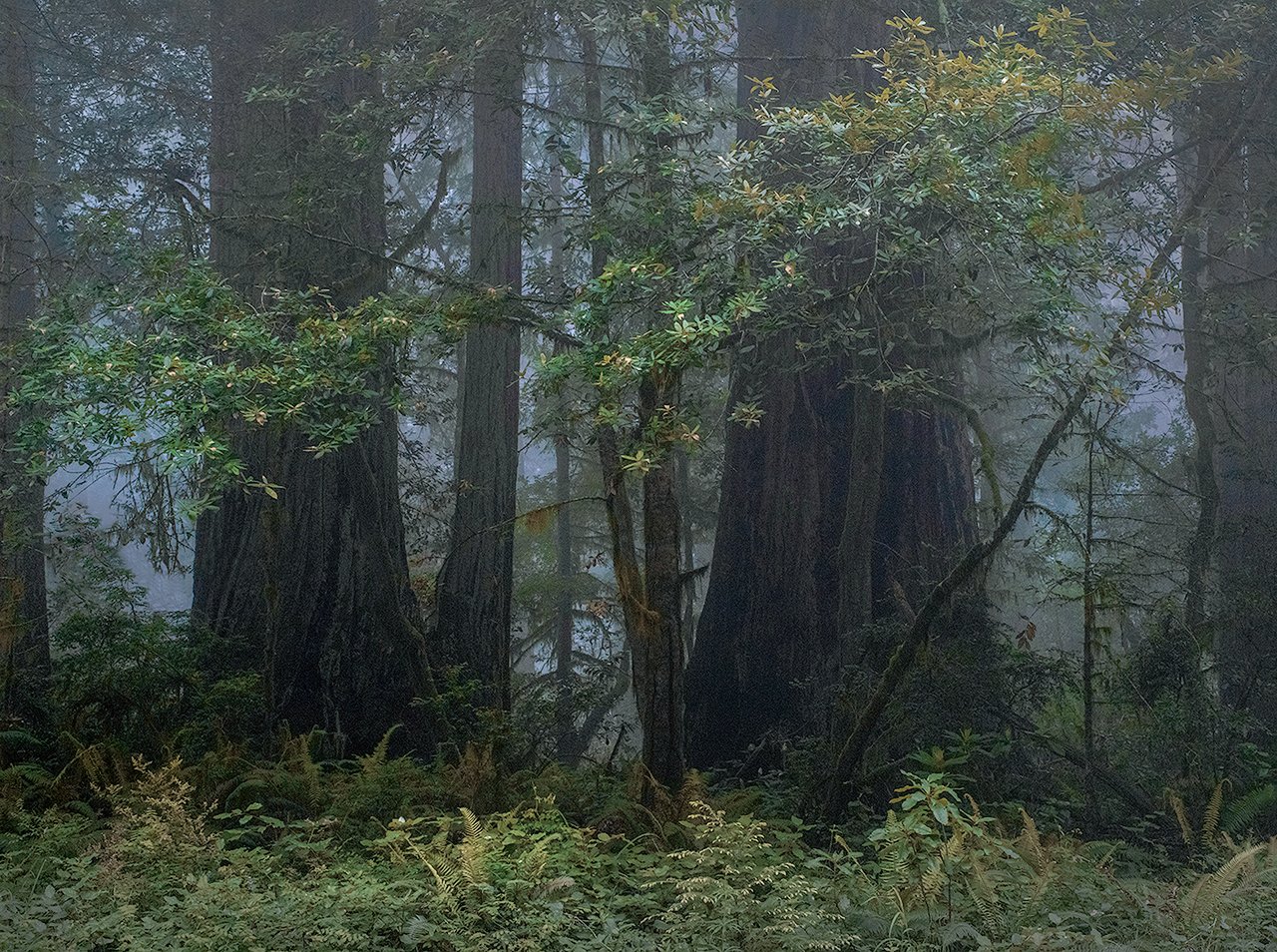
Here’s a very rough editing idea to consider.
1 Like
I was fortunate in grad school in NorCal that my office backed up against the adjacent redwood park, so over a span of several years I delighted in the shifting moods and light.
And you nailed it!
It’s a complex setting, and you’ve done a great job of composing to take advantage of the elements. I’m from the school of “less is better” when it comes to post processing, and about the only change I’d make is to crop away the bright vegetation across the bottom. When I do that with a screen crop the shadowed trunk details become more prominent, and there’s no need to start pushing other processing buttons.
1 Like
Thank you all for the compliments as well as the excellent feedback! I have oscillated on this one a bit and I think your direction is bringing me back to a more natural feel…which is great, because this is where I want to be, from a philosophy perspective. I have always struggled with color a bit and I look forward to strengthening my game there, with your help.
And Lon - please feel free to take a crack at it if you wish. I am open to any and all feedback here!
Sean
Sean - don’t feel bad, I think we all struggle at times with color, saturation, WB, etc. And then there’s the factor of staring at an image too long, where one starts to even notice color shifts… And so sometimes it helps to have a second set of eyes (not that the second set does color any better… just differently.)
My version is also quick and dirty. Certainly less blue/cyan, but a bit more green, where Charlotte’s is more towards yellow. What is right? Neither, but a matter of personal choice and preference. Charlotte’s is probably closer to reality, mine pushing the edge of believability?
The main thing I did was use TK’s “green channel” luminosity mask to create a Hue/Sat adjustment layer. This way I was mostly adjusting the greens and not the cooler mist in the background. Also raised the levels of the darks in the lower redwoods a bit with a Darks mask and Levels Adj layer. Then a Selective Color layer to bring up the yellow a few points, and reduce the cyan and then tweak again with a global H/S layer.
I think the warm/cool contrasts in this scene are cool (pun not intended) and thought that balance should remain.
(I think mine is too green on the bottom. I’m thinking somewhere in between…)
1 Like
Composition to my eye is great. Nice order out of the chaos. I think Lon’s reworking of the image is how it should be processed.

1 Like
Thanks again all! I like what both @Charlotte_Gibb and @Lon_Overacker have done with this…I can totally see the benefit to bringing up the value of the tree trunks now - so much better. I was going for a somewhat darker/mysterious mood, but it was overdone to be sure.
I am a real luddite when it comes to the digital editing side, so I will need to do some homework here (I’ve heard of TK panels/luminosity masks, but have never used them)…but you’ve all given me great ammo for future development. This scene is fairly local to me, so I hope to be able to get a cleaner capture to work with in the future, conditions permitting.
1 Like