A rather tiny butterfly with a wingspan of only 1-1/4 to 1-1/2 inches, the Pearl Crescent is found throughout the U.S., except on the west coast. This one is enjoying purple coneflower in my native plant garden.
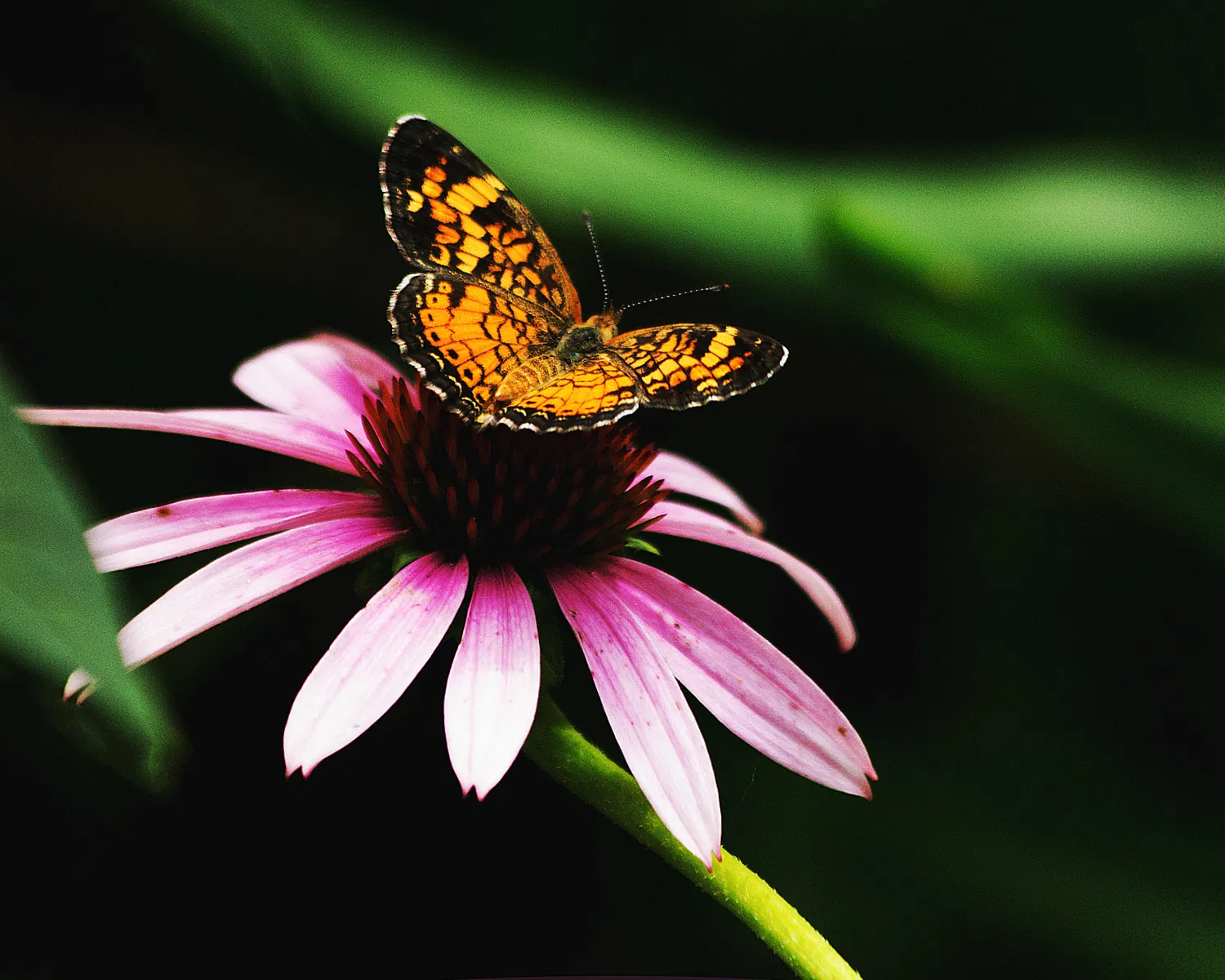
Nice image of the butterfly and the coneflower. If I am making images in my garden, I take the liberty of some “gardening”, i.e., removing leaves, moving things around. But, you also have the prospect of scaring the butterfly off and not make this image at al if you did. Gradening works well for flowers but not for insects. I like the dark background that brings up the butterfly and the flower well and the diagonal stem as well. To minimize the impact of the oof leaves on the top, they can also be darkened.
1 Like
Terry, I am impressed that you have a native plant garden. I think that is a good thing. Also impressed that you knew the name of the butterfly. I usually have to look them up, and if I can’t find them, ask folks on here for an ID.
To answer your question about the green stalk at the top, I do find it a bit distracting. Not sure if you can darken a little to calm it down. I feel like the stem of the cone flower is a bit bright below the bloom and leading the eye out of the frame. But, I really wish that part of a leaf wasn’t feeding into the frame on the left. It isn’t easy getting a quick shot of tiny critters like this, especially skittish ones like butterflies. So you probably didn’t get a chance to try a different position, that might have helped with the distractions. I usually notice these kind of things on my photos after I load them on the computer, and that pretty butterfly has found someone else’s garden to enjoy! Still, I like the composition, the way the flower is in the frame.
1 Like
Thanks, Ravi. Yes, it’s difficult to get a clear shot among the stalks and leaves, but I can darken those stem leaves for sure.
Thanks, Shirley. Planting natives was a goal when I bought this property. There is a lot of wildlife here, and I thought planting natives would be a good way to attract them. In addition, I’m on an acre and native plants require a lot less care. I highly recommend native plant gardening! As for the butterfly ID, that’s just something you learn over time as they frequent your property.
I understand the distractions in the photo. I actually did move around to several positions, but this composition was the best of the butterfly. And I could have eliminated the leaf on the left, but then I would have lost most of the coneflower! They were quick decisions I made in framing before she was gone, I can work on toning those leaves and stalks down a bit. Thanks for your input!
1 Like
Hi Terry, nice catch of this beauty. Like Shirley, I like the composition and agree with her constructive comments. I also think the contrast in the image may be a bit heavy handed. I know these tiny butterflies are hard to capture and you did well with this one.
Terry, this is a good looking catch on this Pearl Crescent and the coneflower. Getting in close to a small butterfly like this is a challenge that you’ve handled well. The bright green stem behind is a distraction that you can reduce somewhat by burning-in. The other idea would be to take a slightly higher point of view so that it’s not crossing the butterfly’s wings. I agree with Allen that the contrast looks too strong. It would be nice to see a bit more detail in the coneflower center.
Thanks for your compliments and critiques @Allen_Sparks and @Mark_Seaver. I’ll take a look at the contrast and see what I can do. As I recall, when I backed it off, the petals of the coneflower became overly bright, but I’ll take another look. I really appreciate your thoughts.
Terry, reducing the contrast should be compressing the histogram from both ends. If the coneflower petals get too bright (and it looks like they could), I would expect that you can reduce the overall exposure without the darks going totally black. Your software may also let you reduce only the brighter parts of the histogram. If neither of those is possible, some burning-in of those petals as well as the oof green stem is another option.
1 Like
If I go back to the original histogram layer before I adjusted for brightness and contrast, it doesn’t look too bad, Mark. I did some global adjustments to the histogram there. I’m working with a really old version of Photoshop, Elements 12. I don’t see that I can perform burn-in as I’ve seen described on some tutorials of newer versions. However, there may be another way to get there. I’ll need to do some research. Thanks!
Terry: Really good capture of the star of the show. Like Ravi I do a fair amount of environmental clean up before a lot of my shots but with butterflies that’s pretty impractical. However, some post processing “scissors” can also help. I cropped this tighter and just made the bright stem on the top go away with some careful cloning. I don’t think it adds anything to the capture so even taming the brightness wouldn’t be enough for me. Back to you. >=))>

That is outstanding, Bill! I obviously need to study cloning processes! I like this a lot. Thank you!