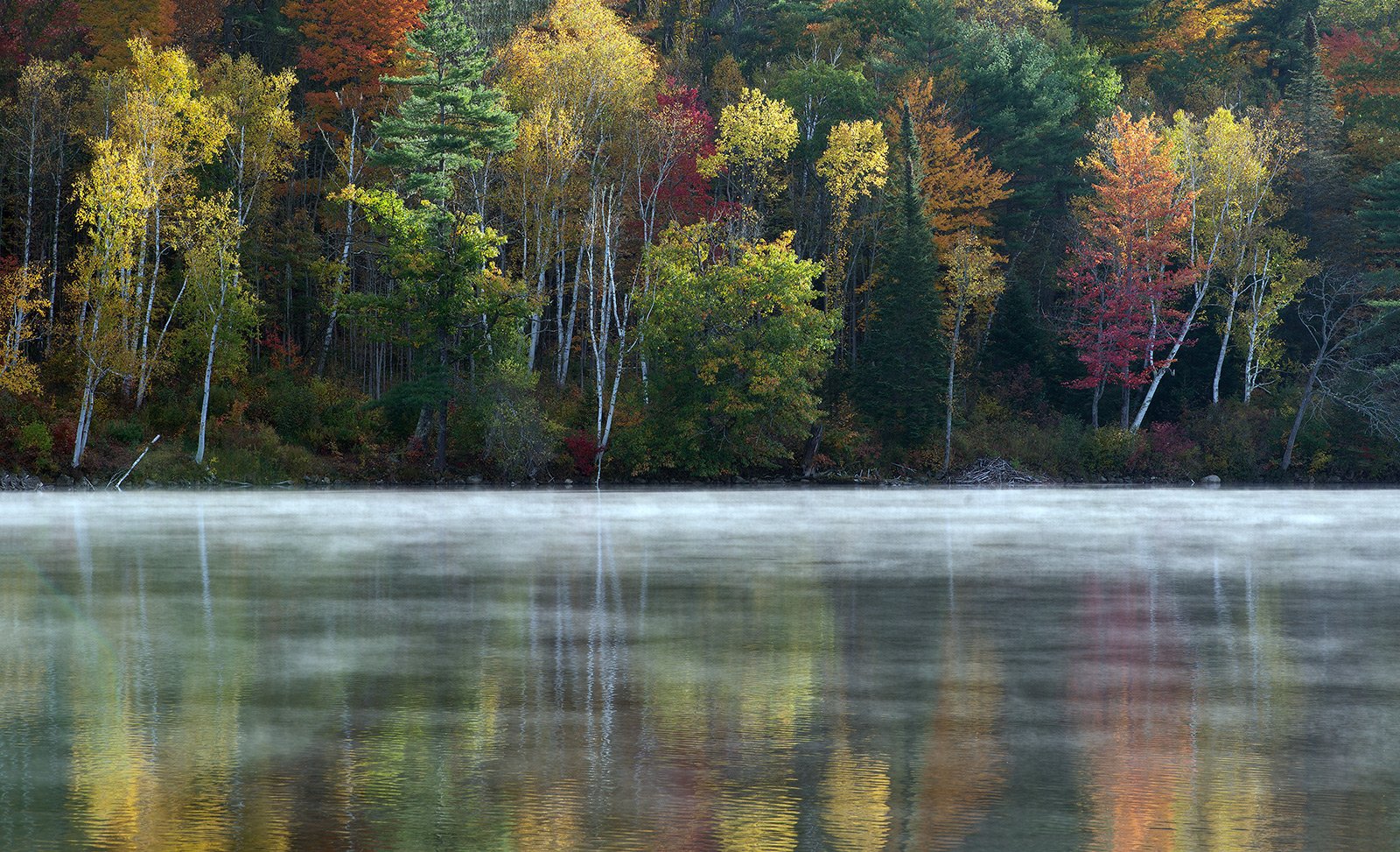
My brother, Ed, was smart enough to realize that the weather conditions were ripe for some nice atmosphere at Pearl Lake, NH. So after shooting sunrise at Sunset Hill, we headed to the lake and were greeted with some nice rising mist and semi calm waters.
What technical feedback would you like if any?
What artistic feedback would you like if any?
Pertinent technical details or techniques:
(If this is a composite, etc. please be honest with your techniques to help others learn)
Nikon D800, Nikkor 80 -200 @ 145, 1/60 sec @ f/11, ISO 100.
If you would like your image to be eligible for a feature on the NPN Instagram (@NaturePhotoNet), add the tag ‘ig’ and leave your Instagram username below.
You may only download this image to demonstrate post-processing techniques.
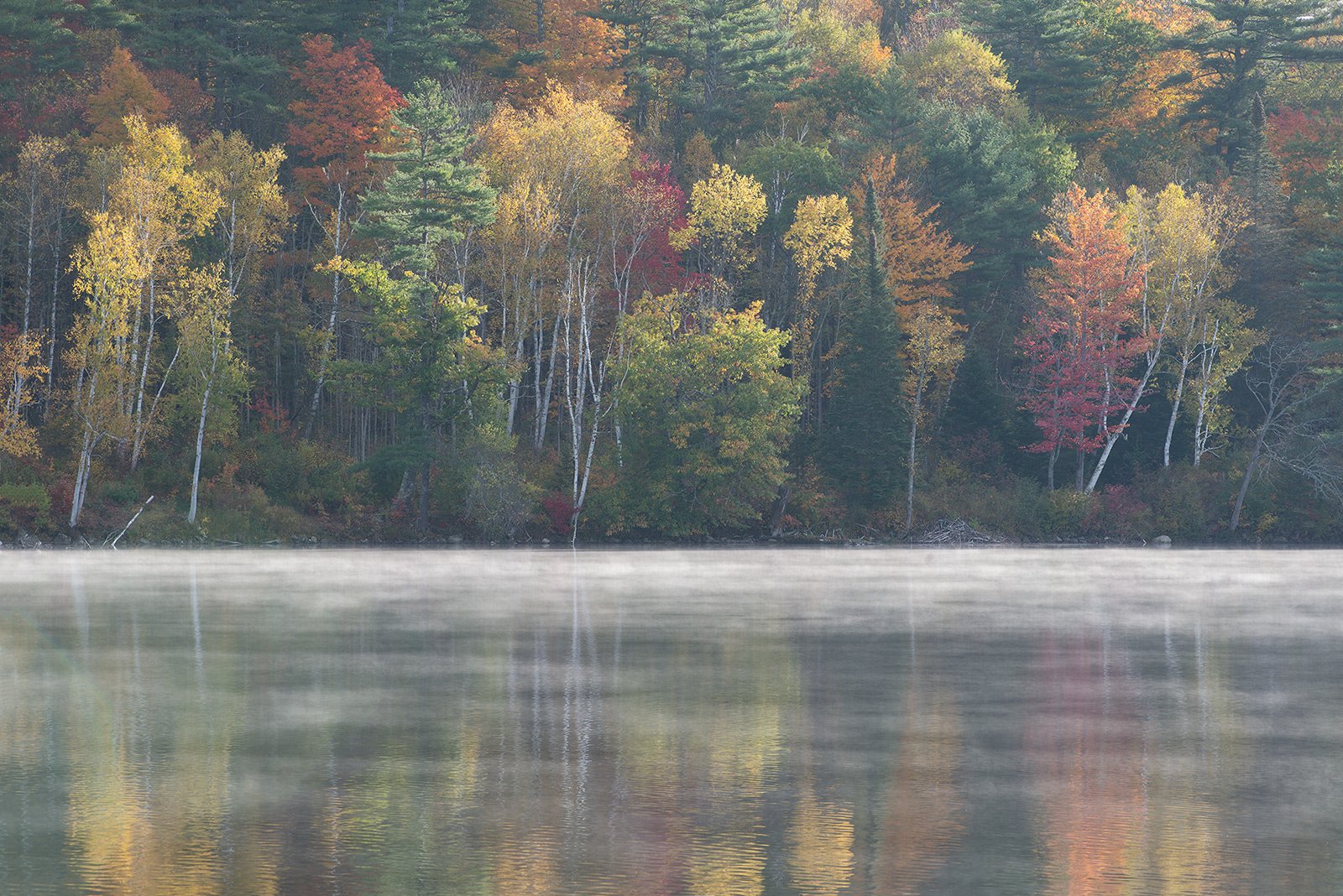
Oof, tough call on this one, Mike. The light is gorgeous on top and the fog on the distant shore sets it off really nicely. But I am not too keen on the reflection at the bottom of the image. I feel that it competes with the top. It could be just a personal preference. I do wish I can see a little more on top (hopefully you have some) so the pine tree about a third from the left is not cut off on top?
Mike, I will definitely leave the top as it is in the original and consider cropping from the bottom. The original doesn’t have that “clipped” feeling on the top of the frame. This is such a beautiful scene.
I agree that the reflections are not needed to convey the magic of the autumn trees, I would say the original is the better image as the hardwood trees (the stars of the picture) are not lopped off. The soft fog line enhances nicely. Now that I see both images I like the softer colors/tones better and think the first post is just a little too saturated. I would back off a little. Love those birches.
I agree with you on the reflection as well. While the real attraction in the bottom is the mist, the reflection still adds to the drama. Further, why crop at all? The original version you posted did not look “Panoramic” to me, Panoramics are usually a 3:1 ratio and your crop was far from that. I actually like the original uncropped frame better than the cropped version. If you crop anything from top or bottom to get to a panoramic format, I think you lose the magic that you captured.
Michael, this is a lovely fall colors scene. The reflection and the mist add a good sense of “not your normal bright day” to the view. I like the contrast and tonality in your original post and the full frame comp. The reflections are a great addition.
A couple of impressions here. My first was, wow, what an awesome reflection - with the surface mist - just beautiful. And my question was, is there more at the bottom? Or was there something preventing you from including more? I now feel the first is a little 50/50 and I’m not sure which part of the frame is the primary feature. Getting picky.
I have to say, I am actually favoring your “original” repost. Not only is there the mist/fog on the water, but it seems that there is a foggy haze throughout - at least that’s the impression I’m getting. I think this creates a fantastic mood and atmosphere. Yeah, the color, contrast, sat are more muted, but for me the misty autumn atmosphere shines in this one. AND a little preference is given to the top half and so the bottom is more of an accent rather than the main feature.
Good new is - You’ve got a number of options, cropping and processing, and you can’t really go wrong.
I think the original is a stronger composition. The rework is a bit too contrasty, especially the blacks. I would re-edit the original and not take it as far. I guess it’s a question of what you’re trying to say. I also would subordinate the river a bit. Here are a couple of suggested crops.
PS I might clone out the slanted white log on bottom left.
Michael, this is a beautiful scene. My preference is for the full-frame image. Personally I like the foreground reflections as well as the mist rising off of the lake so I would keep all of the foreground. Process the original file and you will have a winner in my book!
Mike,
My first thought was that this image was of Beaver Dam Pond, but looking closer I can see that I was wrong. My favorite is the original as the first version looks a little tight to me whereas the original has the perfect balance IMO. The colors are also a little softer which compliments the soft light and the rising mist perfectly. Beautifully done.