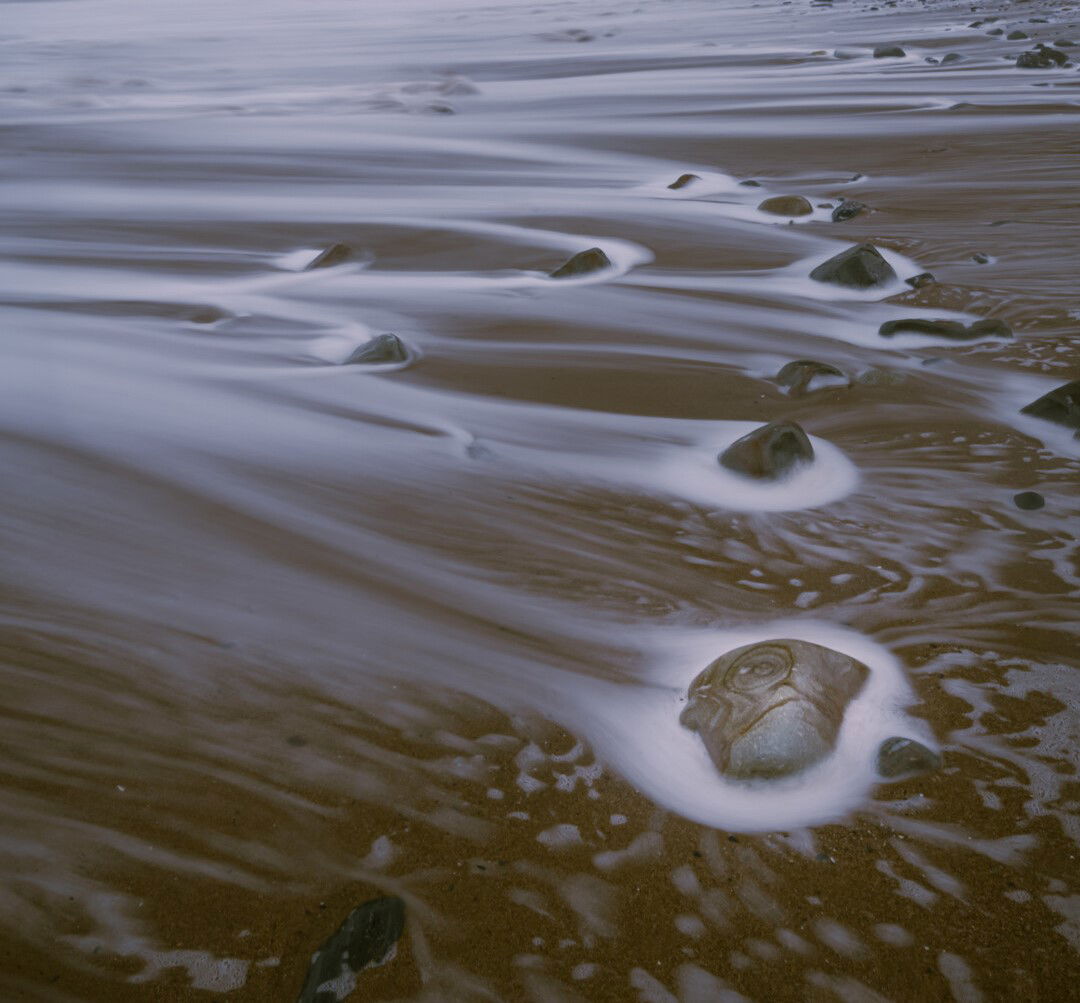
I was glad I had my waders on for this session, as I would otherwise have got very wet. With relatively long exposures it was hard to get the tripod to be absolutely still because I wanted to get the shot when the wave was just receding, and this made the sand very unstable, even when I had placed stones underneath the feet. I spent several hours at the beach, just half an hour away from home; it was such a great way to spend Christmas eve! I loved the patterns on the big stone (bottom right) and the patterns of the waves going round all the other stones. I know that people performing “border patrol” will mention the darker stone at the very bottom a bit on the left, but I am happy with that there, but of course please feel free to mention that or anything else that could be helpful for me to improve the image.
Specific Feedback Requested
Any feedback
Technical Details
Is this a composite: No
1.3 seconds at f/22. Nikon D850. Nikon 16-35mm f/4 lens. Most editing in Lightroom with some also in Photoshop, but edits quite subtle.
I love the patterns and the movement you captured. Not just the water but the sky also seems to be moving with it. The whole scene, even the outcrop of land all feels so alive like it’s dancing! Very serene and joyful at the same time. Worth all your effort!
I agree. Although the water is moving back out to sea due to the fact that it doesn’t look like water it looks like rocks streaking across the sand from left to right. It’s like a meteor shower in a way. I’m wondering how this would look if you desaturated the blues and made this less real.
I’m rather enjoying this image. Really liking the streaking water and I think this image is all about the streaking water and the motion and movement that is perceived by the viewer. The rock you mention in the bottom left corner is needed as it gives an anchor to an area of the image that has a lot of negative space. Although I do like the overall image I think that the top could be cropped to remove the mountain and the sky so that the focus is more on just the streaking water/rocks. Hope you don’t mind but I did a crop showing what I mean. It doesn’t necessarily make the image better, just different. I also think you could play around with black and white on this image.
Thanks for these suggestions which are interesting. The B and W links in with Igor’s idea to desaturate the blues and I agree there is enough of the sense of motion and play of water conveyed by light and shade for B and W to be a good idea. Getting rid of the sky and cliffs is also interesting as an alternative: it both gives the focus to the main subject and puts the bigger rock at bottom right in a better place in the frame and gives it more prominence, a good thing. But then the wider context is lost… I have to say though that I like the idea. Thanks again for your thoughts.
Phillip,
This turned out beautifully and the image has a nice sense of movement both in the water and the clouds. I do like @David_Haynes suggestions also; bottom line is you have some wonderful options to choose from. Beautifully done!
I love the shapes and tones and abstract mess of the bottom half of the image a lot! It is not easy to capture these scenes as they often shift and change with every passing wave. You did an excellent job and I don’t mind the processing. I will admit I am not a fan of shooting up the coastline with a cliff creating a split above the horizon line. It almost always feels off-balance and your image is no exception. I do like David’s crop which is worth playing around with the next time you visit here or somewhere similar! I think you could create some interesting images that don’t need context of the place photographed.
I definitely prefer the image with the cliff, I like the context and the sense of scale.
I think you got the exposure time just right, the patterns of the water flowing back to the sea are just right. Beautiful image.
I have been fascinated by Bruce Percy’s approach to photography ever since it’s introduction here at NPN. Basically he looks for general shapes in his compositions and uses tonal values to play them off each other to create emotional discord or balance. I thought this image would be good to try his approach. I broke the image into 3 major tonal areas and gave each a different overall value. Colors play a secondary role in his work and the same here. He always uses frames.
Thanks very much, Han! I like the image too and am pleased with it, but some of the comments and suggestions I also like very much, and all of them are helpful in that they are all thought-provoking!
Thank you so much, Igor, for taking the time and trouble to do this, and apologies for the late response. I absolutely love what you have done to the image with the slightly desaturated aspect, but most particularly how you have made the whole of the bottom right (around the “magic stone”) brighter, and in this way really emphasize this in just the way I wanted, with the other stones and their water patterns taking one back into the rest of the image. So, I’ll have to look at the method that you’ve used as I haven’t read about this yet. Once again, thanks for the input.
Thanks, Kyle. I know what you mean about “shooting up the coastline” and maybe I have not got the balance of the photo just right, but although I agree that this is indeed always a potential balance issue, and always needs to be brought into consideration, I think it need not be a problem when all other elements of the image are in play. When I look at this photo, I don’t see that, but then again, it is sometimes hard to take an objective view as the photographer… Anyway, thanks very much for your comment and for taking the time and trouble to make the critique!
Hi David - I wanted to thank you for your thoughts - I hadn’t thought of getting rid of the background, and I do think that it makes for an interesting and very different photo (both colour and monochrome). Plenty of food for thought here!