The photographer is looking for generalized feedback about the aesthetic and technical qualities of their image.
Description
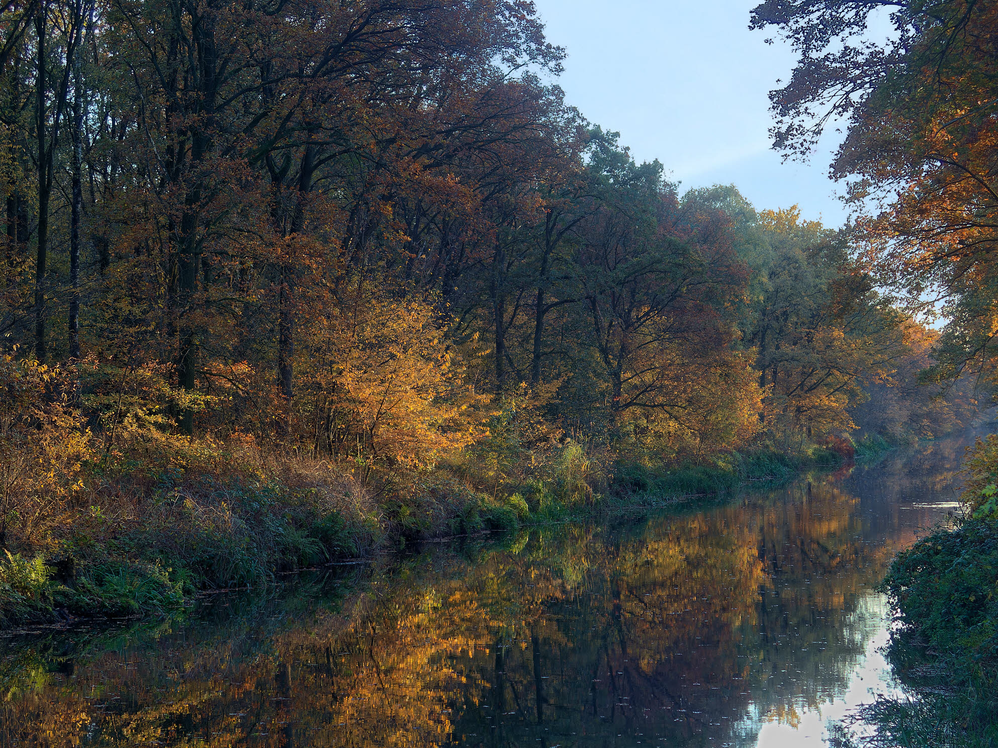
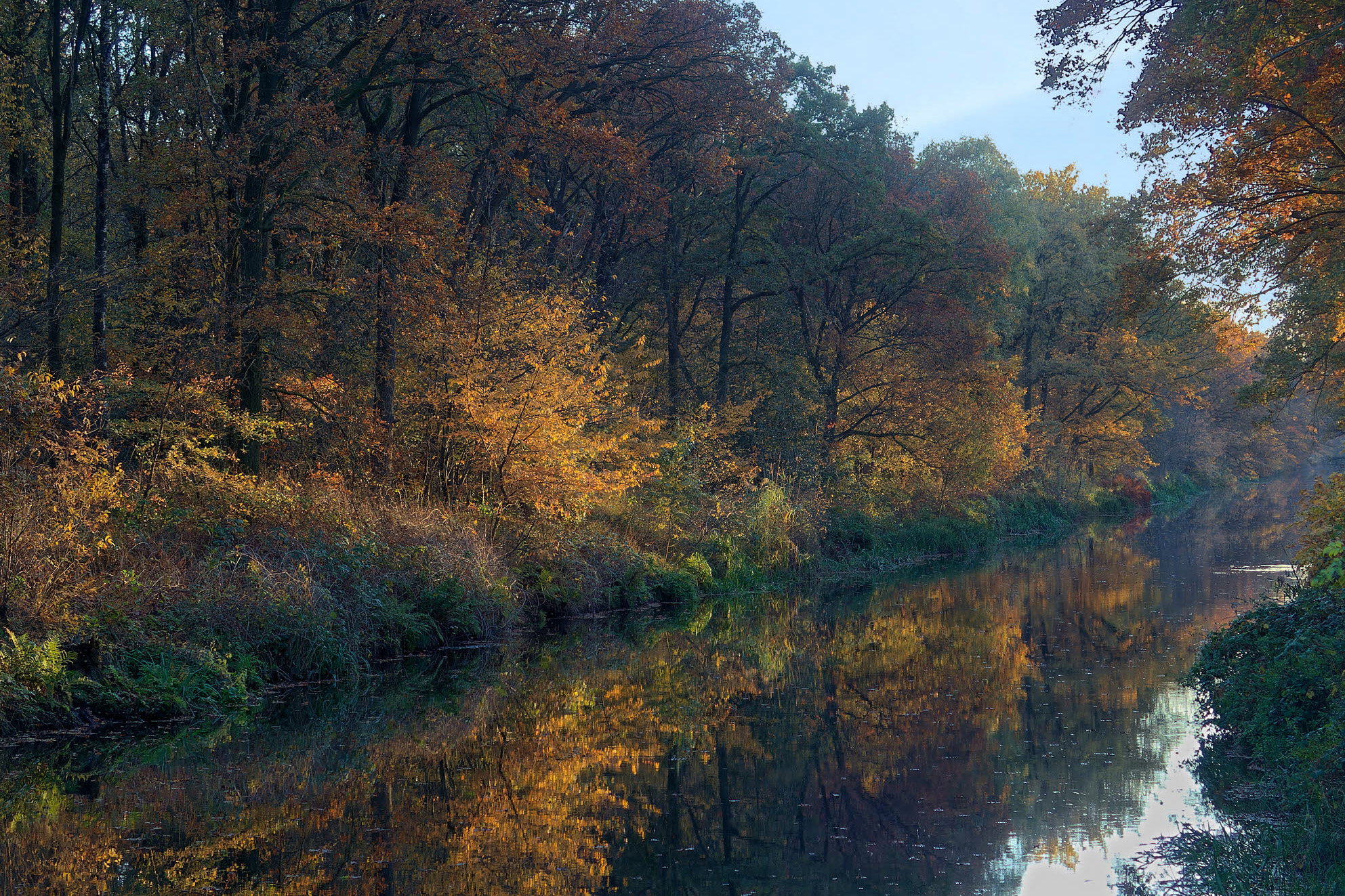
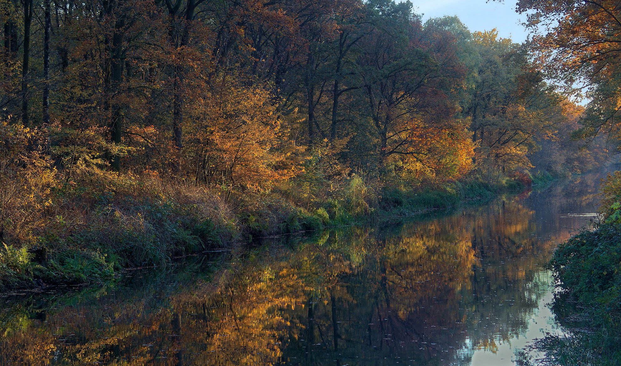
The water is a man-made canal. In the 19th century, a lot of peat was excavated here. The canal was constructed for the transportation. It isn’t in use anymore, for a long time already.
Along the canal is a bicycle track, maybe an old tow path. I found the scene appealing enough to pull the camera out of the pannier on a beautiful November day.
Specific Feedback
In general, I am no fan of the native 4:3 ratio of the camera (unless the image is in portrait orientation). But in this case I decided not to crop to 3:2.
Would you prefer a crop?
Any other comment is welcome as well.
Technical Details
Olympus Stylus 1s, 1/200 sec, f/2.8, ISO200, -0.7EV. f=100mm FF equivalent.
The contrast was too high for the old, small sensor and the sky was blown out. I blended in the sky from an image that I made a few minutes earlier, from another scene.
RAW conversion in DxO PL6, adjustments to curves and a little saturation.
Critique Template
Use of the template is optional, but it can help spark ideas.
Vision and Purpose:
Conceptual:
Emotional Impact and Mood:
Composition:
Balance and Visual Weight:
Depth and Dimension:
Color:
Lighting:
Processing:
Technical:
Hi Han,
The soft light bathing the trees along the canal is flat out gorgeous. I also quite like the trees reflection in the water as well as the diagonal placement of the canal. I also think your 4:3 crop ratio works rather nicely for this scene. My only suggestion would be to remove that bright spot of water in the canal toward the right edge of the frame as it catches my eye a little. This is beautifully done.
Thank you @Ed_Lowe and @Preston_Birdwell for your comments.
You are right about the hotspot. I already toned down the much larger sky reflection in the LRC, but the smaller spot can be removed or toned down as well.
I like this – especially the backlight on the yellow leaves on the other side of the canal. At first glance I was a bit disappointed that the canal’s vanishing point was out of frame but after contemplating it a bit more I realized that I actually like that we can’t see the “end” of the canal. I think that adds a bit more mystery to the image and a bit more tension that elevates the composition to a more complex level.
Oh, and the 4:3 ratio is perfect for this scene in my opinion.
Han, I like this very much. The lighting is beautiful. My feelings about the crop are: I feel scenes with lateral movement such as this ie. eye moves left to right, should have a little wider aspect. Therefore I feel 3x2 would be more appropriate. It would also get rid of a little more blank sky. Just my opinion of course.
Thank you @Mark_Seaver , @Tom_Nevesely and @Michael_Lowe for you comments. Much appreciated.
Always very helpful to read your thoughts and always a contribution to the development of my own view.
I appreciate you bring us to this quiet scene and telling its story. The bright spot in the water does not bother me, as it tells me that a carp or duck is doing its thing in this quiet place.
I wondered if brightening the middle/right yellow leafy area relative to the left middle might guide the eye more easily through the scene. Also tried a more panoramic aspect, as I personally did not need to see so much sky. Tried to paint some color into the bright areas of the water.
This is flat out gorgeous, Han. I think the ratio is just fine for this and I personally wouldn’t crop anything off. I very much like the taller trees in the left portion of the image and cropping any of those trees out doesn’t work for me. I’m not in love with bare section to the left of the larger tree in the ULC but cropping from the left doesn’t make it nay better. The bright spot where a fish has surfaced is something that I like about the image and I probably wouldn’t reduce the highlights.
The bright spot in the lower right corner seems too bright to me and should also have more blue in it just like the sky if possible. I might be inclined to burn the green shrub in the LLC since it’s bright and right on the edge of the frame. Other that those comments, I think I like this as is. Terrific Fall colors.
Thanks @Dick_Knudson and @David_Haynes for your comments. I’m glad that the image evokes so many reactions and different opinions.
I’ll take all ideas into consideration and work on the image some more.