The photographer is looking for generalized feedback about the aesthetic and technical qualities of their image.
Description
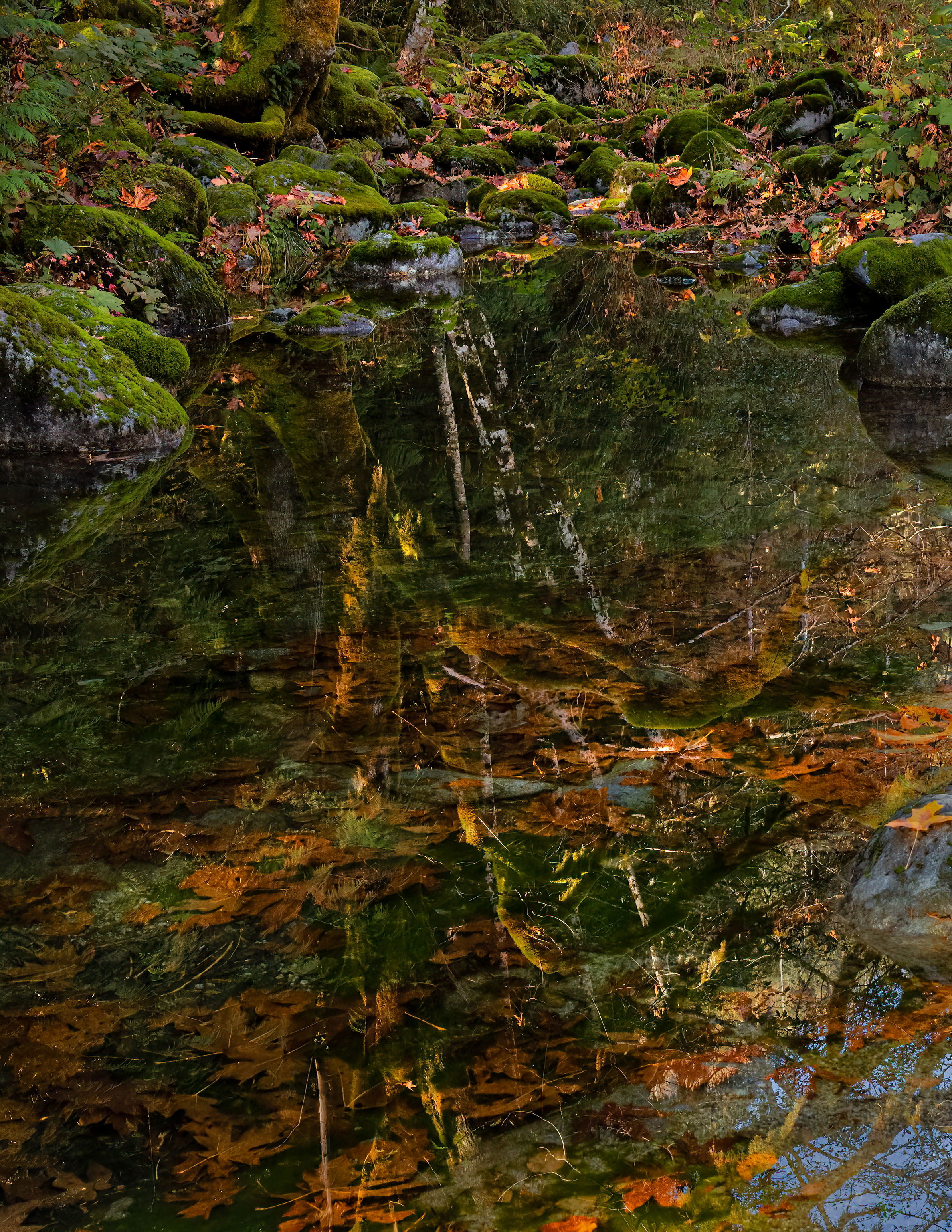
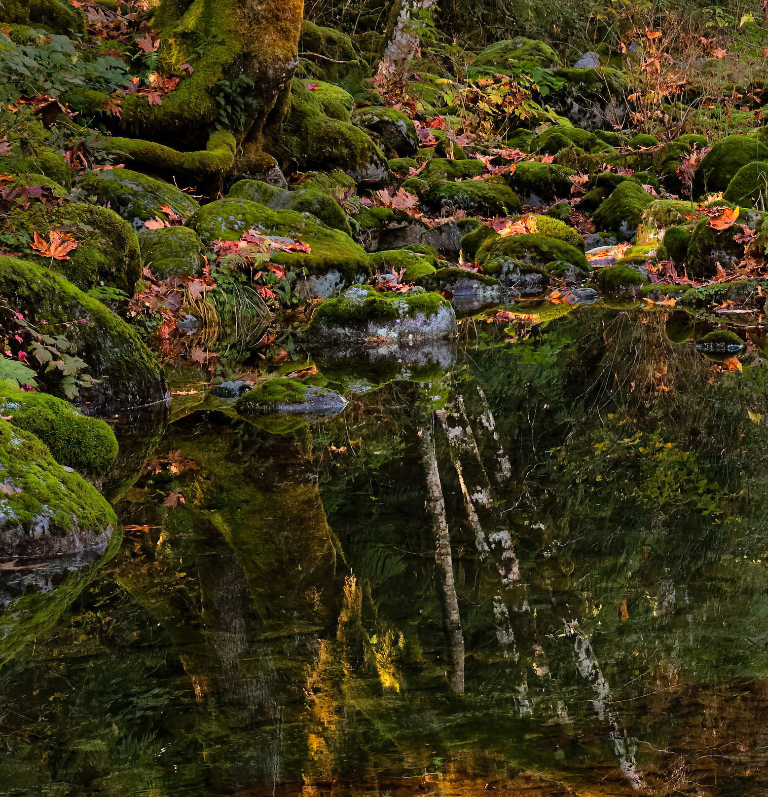
This side water of the river is quietly collecting beauty and detritus, not distinguishing between them. It is a very busy scene, but I hope viewers will stick around long enough to explore the substance and illusions.
Specific Feedback
Any suggestions about how to induce the viewer to loiter in this scene will be appreciated.
Technical Details
Handheld (while leaning into the scene) 1/200 sec ISO 1250 f/7.1 RF 28-70 @28mm , Canon R5
Critique Template
Use of the template is optional, but it can help spark ideas.
Very nice. Its hard to tell the difference between the reflections and the leaf clutter in the water. The range of colour is wonderful. Lots to look at!
I find the two rocks on the lower RH edge a bit odd to look at although I’m not sure why. Perhaps the darker water on the left and lower centre could be brightened up a tad?
Very interesting and compelling image. I think the colors work well together and the composition is interesting. I find the saturated oranges at the bottom pulling me down and I find them at odds with the rest of the image. I would crop just above the bottom left orange.
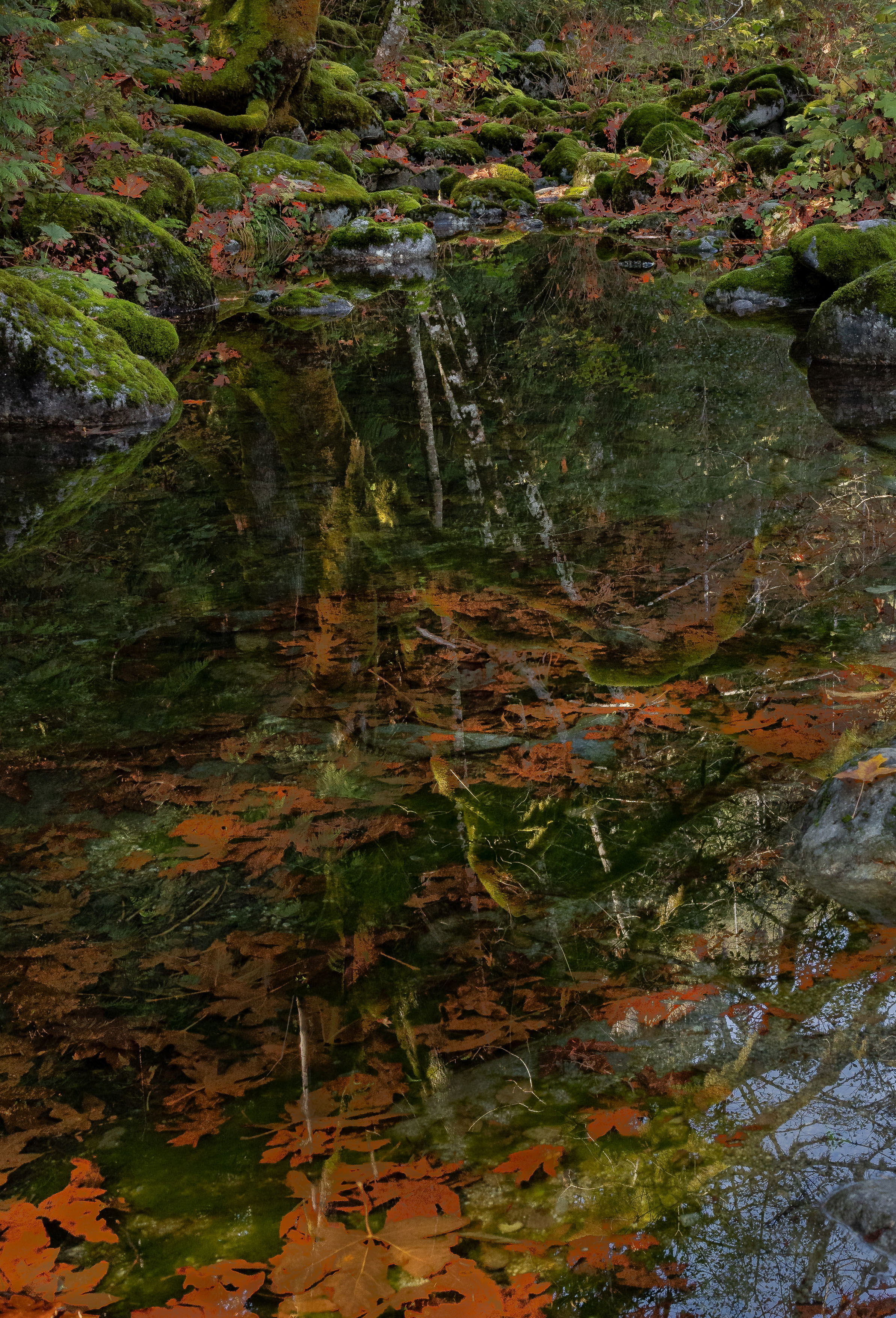
Thanks, Mark. I lightened the massive shadow under the rock, and it seems to help. Also followed your lead in working with luminosity a bit in the darker areas.
Thanks Igor. Those bright orange leaves are eye-grabbers, like the orange vests worn on construction jobs. I kept them in the frame, but doused the orange quite a bit.
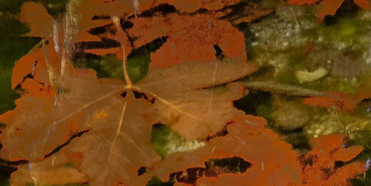
What a lovely scene, Dick! The quality of the images posted (both original and reword) is sort of odd, though. The oranges have an odd appearance and haloing around the edges, both in the leaves on the rocks and in the water:
I imagine this wasn’t present in the raw file. What were your initial processing steps?
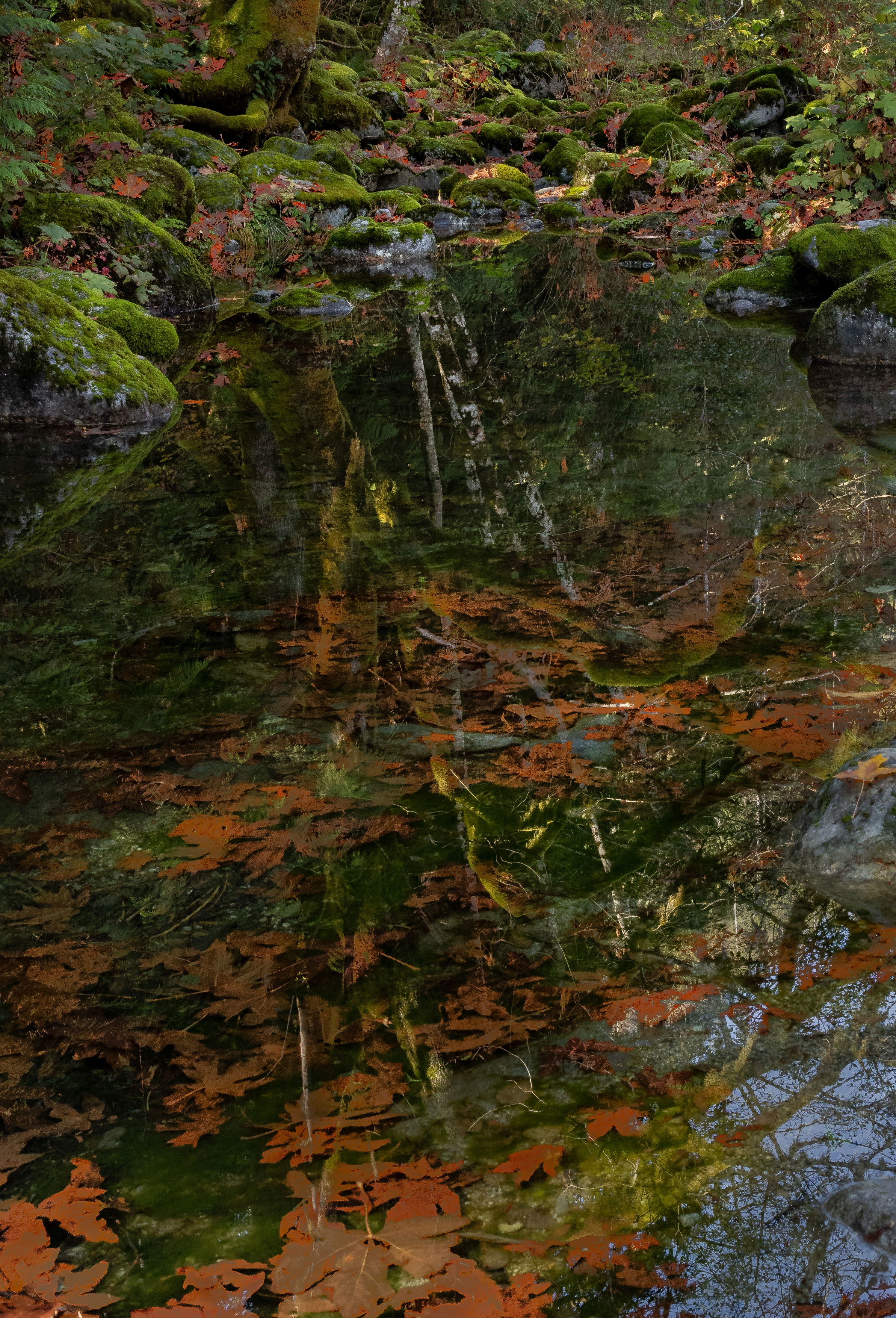
And I’m with Igor on the crop. The tall vertical ratio here feels a bit off balance. I think taking a bit off the bottom wouldn’t be amiss (maybe a 5:7 ratio). I think if you cropped, you wouldn’t have to desaturate the oranges because the big block of orange at the bottom wouldn’t be there.
Thanks, Bonnie and @Igor_Doncov … The orange was a real mess. Two causes :
1, I used LR to mask on color and set the mask too tight, so the full range of leaf colors were not included
2. I was very heavy-handed in pushing the orange in that mask
This is wonderful Dick. The second repost is the winner for me and must be viewed large to really appreciate all the little details. I think you could even make another image with this scene with a crop that would emphasize that wonderful tree reflection with that lovely light. A twofer if you will. Nicely done.