The photographer is looking for generalized feedback about the aesthetic and technical qualities of their image.
Description
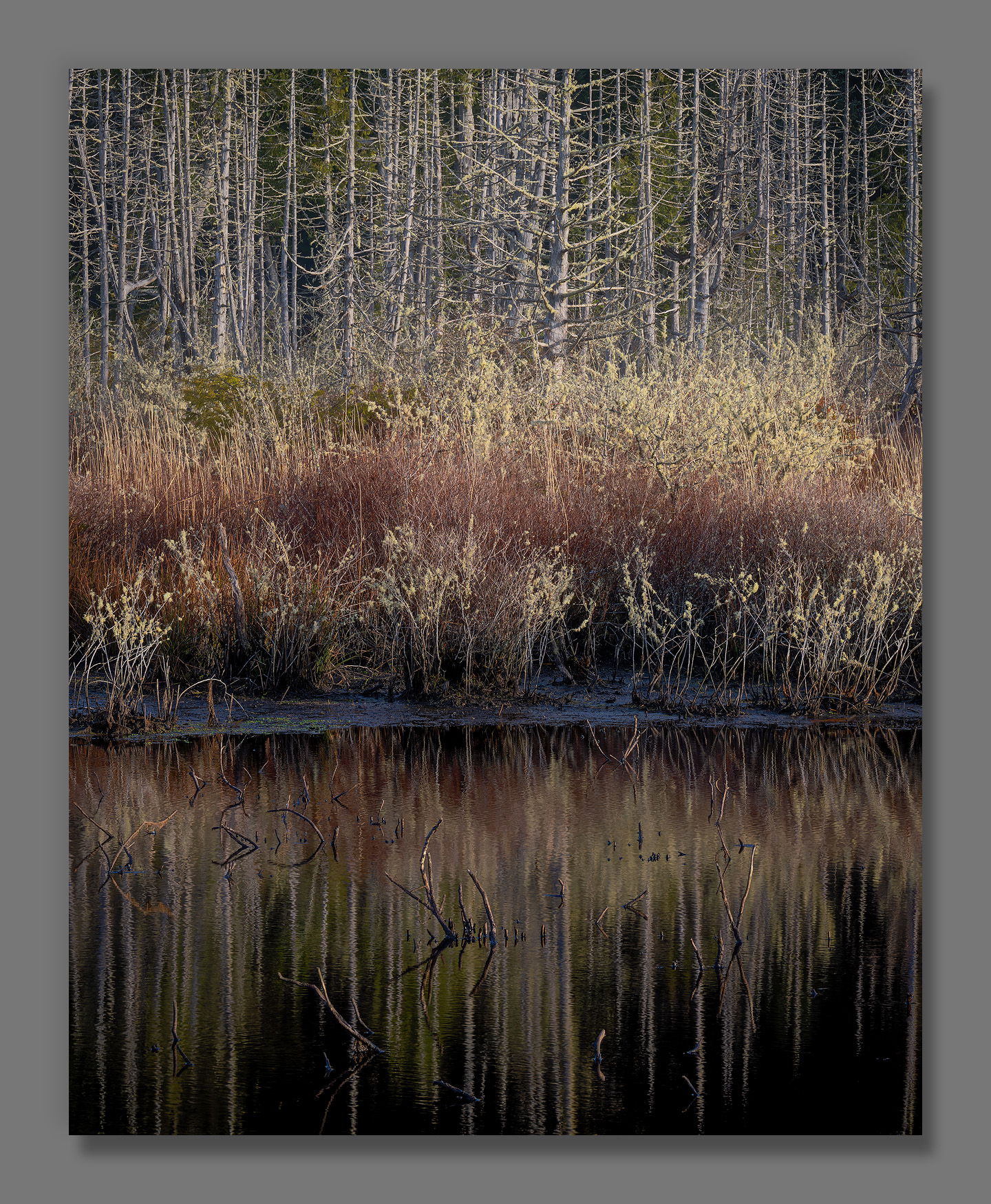
This is the edge of a pond near the Oregon Coast.
Specific Feedback
I’m curious about your thoughts on the branches that stick up out of the water? Do they add, subtract, neither?
How does the saturation look to you? I find it tricky, because my eyes get used to an image as I work on it. I’ll think it’s just about right, then step away for a while and find it way too much or too little upon returning with my eye recalibrated.
Technical Details
NIKON Z 7II
NIKKOR Z 24-200 f/4-6.3 VR at 90 mm
1/30 sec. at f/16.0 and ISO 64
John, this is great! I like the darkness of the water and the strength of the reflections. I also like how the branches sticking out of the water break up the symmetry as the show us the reality of the situation. (Clearly this pond sees major water level changes throughout the year.) The “waves” of color and brightness in the land also look good. The colors look good, possibly with a hair too much blue in the wet area showing in the larger view. That’s always a tough call, since the camera picks up the blue reflected from the sky, while our eye/brain combo tones that down.
To an observer, saturation is always a subjective thing. To this observer, it looks fine. The water might be a tad dark, idk. I love the branches sticking up out of the water. Much more interesting than an unbroken reflection. Great eye to spot this scene.
Nice one, John! I’m really liking the cohesive colour palette in this image. Everything just works together so beautifully colour-wise. For me the branches sticking out of the water are a plus. Sure, may not be “clean” but on the other hand I like that it’s not sterile and I like how they break up the reflection that little bit.
Hi John,
I do like the subdued earth tones color palette as well as the soft light in this beautiful scene. Most of the time I prefer my reflections to be clean, but sometimes some clutter works and this is one of those times. The large version has so many details and textures to savor. I have no suggestions as this is beautifully done.
John, this is an exceptional image! I think you nailed the contrast, I also like how the image fades in brightness from top to bottom. I like the branches in the water, as the rest of the image has a lot going on and I think the branches add additional interest to the lower part of the image, if they were removed the image would look more top heavy to my eye. I wouldn’t change a thing
I’m just going to say: this is a fantastic find, and your image is very successful in presenting this setting to the viewer. I’m a fan.
Texture everywhere, that one tree, the reflections, all contribute to a super vibe. Tones and colors are beautiful.
For me, those jutting sticks in the water are the perfect foil. Lean in. Dodge them, and give them some weight. Make it clear you want them in the image.