2 Likes
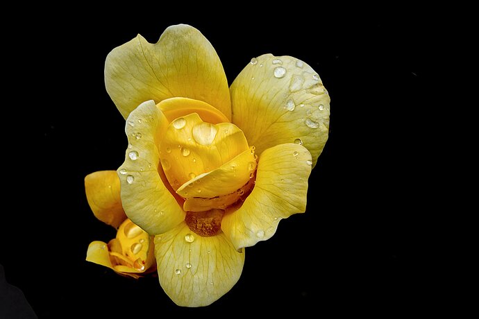
That is awesome Ian! I like the way you’ve composed it wit a bit more space on the right. The contrast between the roses and the black really works as well. Drops of water add a final level of interest. There is a lighter gray area in the bottom left that probably could be removed somehow.
