Revised Version
Revision 1 (latest)
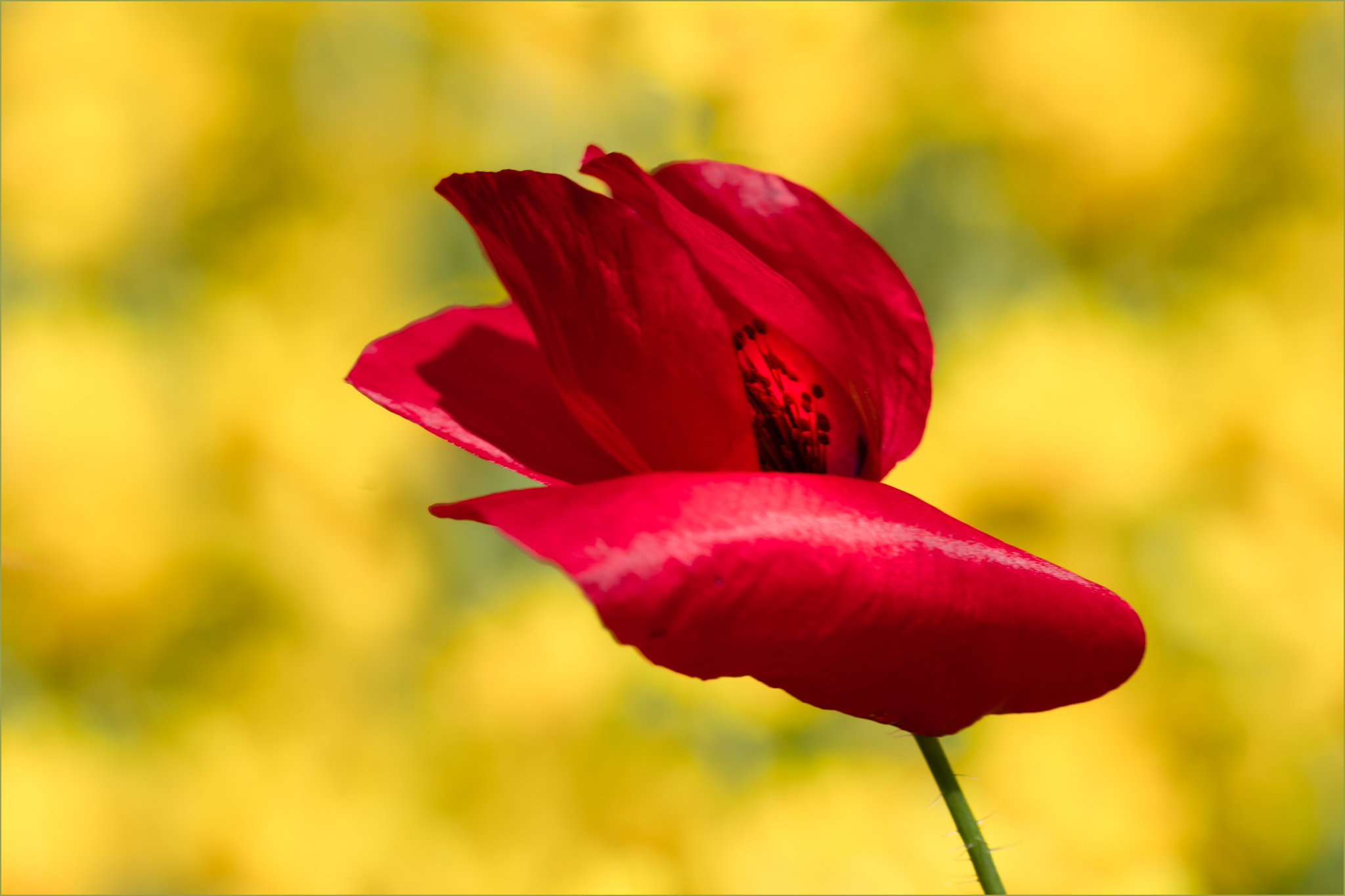
What changed: Added some more glow to the center of the poppy and raised the overall brightness of the image, which was starting to feel a little dark to me. I think this changes the mood considerably.
Added after receiving feedback from the community.
Original Version
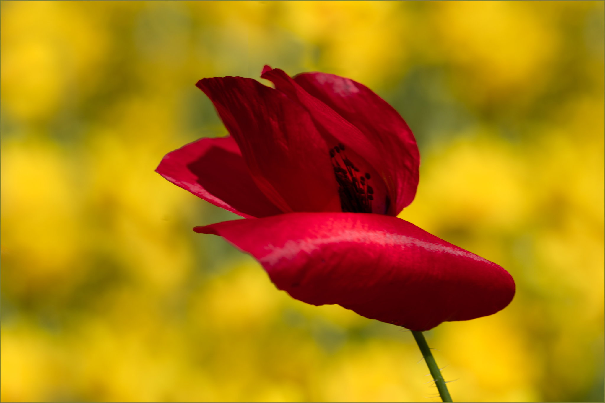
The photographer is looking for thoughtful feedback on the image as a whole, especially around the areas noted below.
About This Image
I noticed this single red poppy in a bed of almost pure Oregon Sunshine this morning and thought I should photograph it, but had other things to do at the time. This afternoon when the wind was blowing rather vigorously, I ventured out with a polarizer on my lens to see what I could do.
Feedback Requested
I had to clone some of the right hand background into the left as I ran out of yellow there-do you see any obvious issues with the cloning?
Is the presentation appealing? Any suggestions for changes would be welcome.
Technical Details
Camera: SONY ILCE-7RM5
Lens: FE 70-200mm F4 Macro G OSS II
Focal length: 156mm
Shutter speed: 1/1000s
Aperture: f/7.1
ISO: 400
The wind was blowing strongly enough that I had to hold the stem to have any chance of keeping the blossom in the frame.
Cropped to 8234x5489 before resizing for the export. There was also a bit of a purple fringe at the top of two petals that I cloned over.