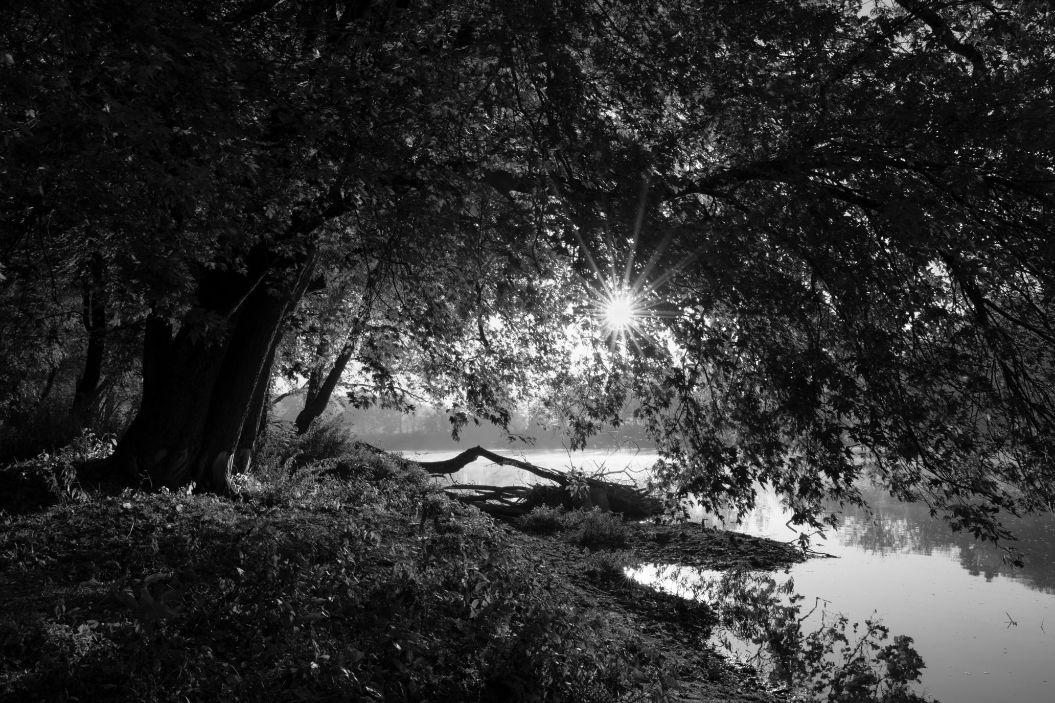
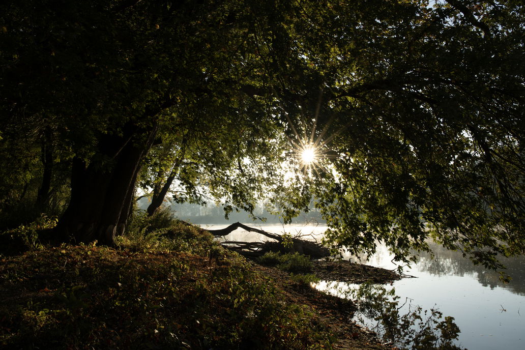
Processed for color
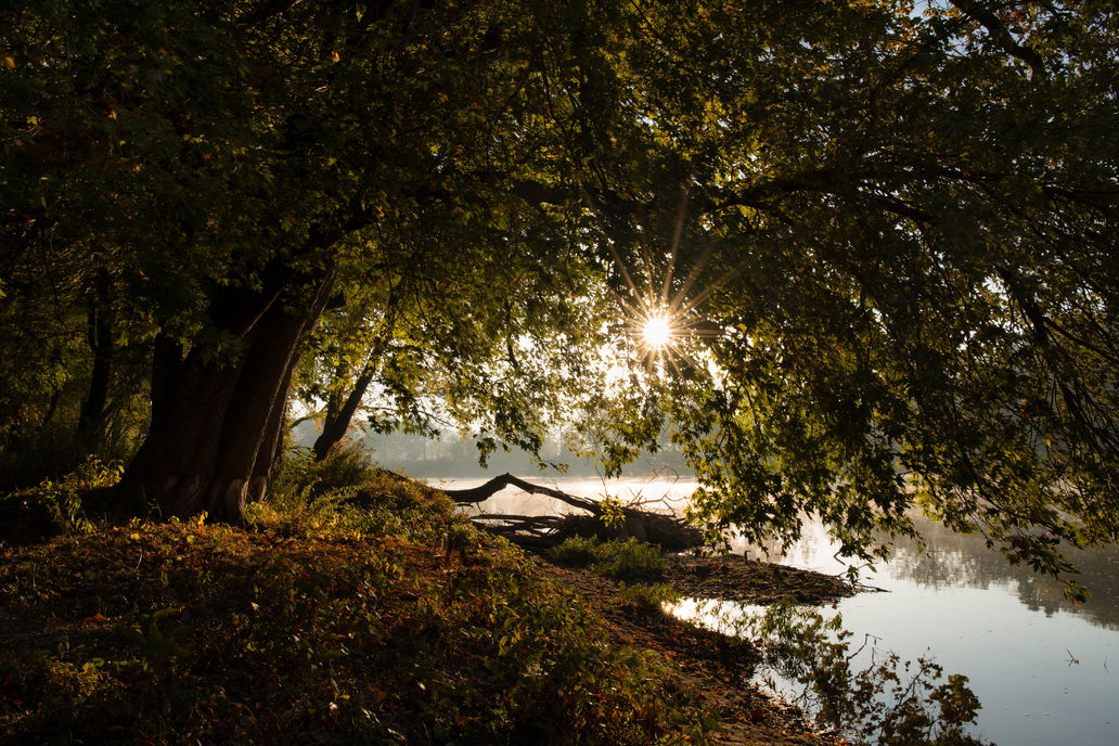
As shot
Critique Style Requested: In-depth
The photographer has shared comprehensive information about their intent and creative vision for this image. Please examine the details and offer feedback on how they can most effectively realize their vision.
Self Critique
I feel both the color and B&W versions capture the light, mist, and sense of depth. The composition draws the eye to the sun and river details. The details in the foreground add texture and context. I’m still learning how to translate what I see into a stronger image, and I feel that these image could be much stronger.
Creative direction
I may not have chosen the “right” type of critique, and I can’t fully answer questions about my vision because I’m still exploring it. I love landscape and macro photography, the way light transforms a subject, and the feel of my camera in my hands. I’m submitting these image to better understand how my choices in composition, light, and post-processing come across to others.
Specific Feedback
I’d love input on which version, color or B&W, makes a better image. Or if either of them do. Any feedback on what works, what could be stronger, and how to make that photo more compelling would be helpful.
Technical Details
Settings: 1/50, f/13, ISO 64
Lens: Nikkor 28mm f/1.4 prime
Processed for to bring up warmth and midtones. Light dodging to bring raise highlights around the base of the tree, along the leading edge the trunk, and parts of the water’s edge. Texture and clarity were dialed back slightly and clarity was dialed up.
Description
The story behind the image: What inspired me? What story am I trying to tell? What emotions did I aim to capture? Honestly, I don’t know. I don’t plan or think through what I photograph in a way I can easily describe. I just love light and want to learn to capture it in stunning images.
Here’s what I can tell you: I drive my husband crazy on our hikes, always climbing up, down, around, and through to see what’s on the other side. Or stopping in my tracks because I’m drawn to how a single shaft of light reflects on a cluster of leaves. This particular morning, I left the trail, crawled through brush, ran across a country highway, and crawled through more brush because I could see the river peaking through. I was rewarded with warm, beautiful light, mist rising off the water, and the sun in perfect position.
Critique Template
Use of the template is optional, but it can help spark ideas.
Vision and Purpose:
Conceptual:
Emotional Impact and Mood:
Composition:
Balance and Visual Weight:
Depth and Dimension:
Color:
Lighting:
Processing:
Technical: