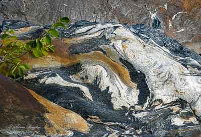
Taken with Sony A6000, F16, 1/200 sec., ISO 400.
Any and all critiques are appr
eciated.Patricia: I really like the rock textures and colors. I’m undecided about the leaves. They do provide a sense of scale but one of the things I love about these kind of images is the mystery of scale. Still well seen and captured.>=))>
Patricia, I am with Bill on this one. I love the rock, with its great colors and patterns, but the leaves throw the scene off for me. I find myself drawn to the leaves when I want to roaming the rock.
Fill the frame with your subject! Its a very interesting rock but the branch is doing nothing for the image.
I agree about the framing to eliminate the branch.
I also wonder if slightly greater contrast would improve it.
Nice work!
Huh… My contrarian gland must be at work these days. I like the branch and feel the image loses “context” or frame of reference without it. The original has the feel of one of the ancient paintings from China or Japan, and the branch is a part of that sense. The second posting is just blah to me. Could be anything from the swirl in a restaurant grease trap (don’t ask me how I know about those!) to a mineral wafer off a jewelers saw to peeling paint on a wall to a glacial moraine, and any size you want. But the branch resolves the size while adding a bit of atmosphere.
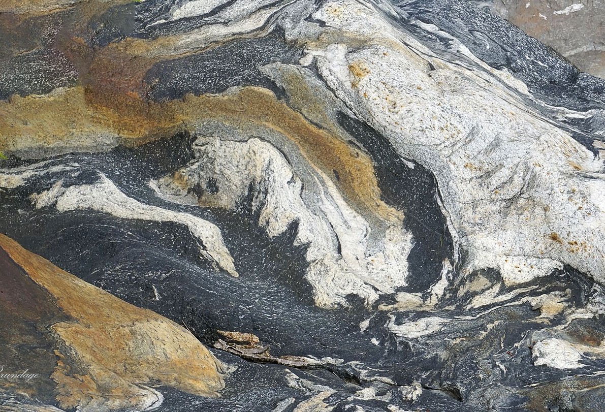
Patricia, I agree about eliminating the branch. The rock is such a powerful abstract subject that it overwhelms the branch visually. The branch doesn’t add any real context to this scene, so I would eliminate it, and emphasize the abstract pattern instead. I think the image would benefit from an increase in mid-tone contrast, which would make this pop a little more. I downloaded this and took my own shot at it. I like including more of the warm colored rock, which required me to use Content Aware Fill in Photoshop to remove the branch while maintaining the aspect ratio. I then added some contrast using a TK Midtones 1 selection.
Patricia,
Wonderful natural abstract in the rock. I have to go along with the consensus that the branch/leaves really take away from the overall impression. Without those leaves, this is one terrific abstract. To me it looks like a mountain range with unique geologic features - even including the bg “mountains” up top. Without the leaves, there’s no scale and the image really expands the imagination. Perhaps you have frames without the leaves?
Lon
I suspect many of us are reacting more to the “dead” area above the leaves than the leaves themselves. Along with removing the leaves, there’s been a substantial crop.
It’s amazing how much light even dry rock reflects making colors seem dull. A polarizing filter can help when capturing the image. After words dehazing in LR can help. See example: