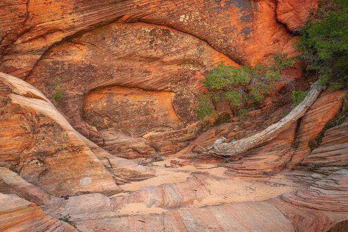
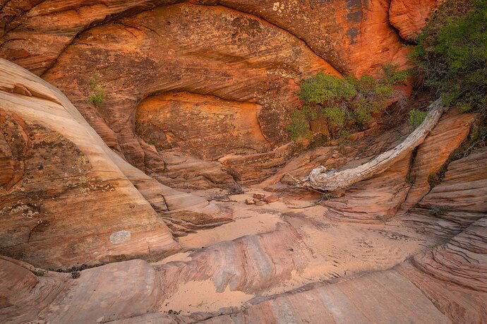
After hiking some canyons and buttes in southwest Utah I ran into a sandstone wall that looked as if mother nature strategically placed a mixture of trees, rock, sand, and other elements to acknowledge the outcropping. I stopped and worked on some different compositions. It is a bit chaotic but just enough for me.
What technical feedback would you like if any?
Which composition do you prefer. I like the side angle of the second image but the top circle in the sandstone is cut off. Is that a deal breaker?
What artistic feedback would you like if any?
How is the color processing?
Pertinent technical details or techniques:
(If this is a composite, etc. please be honest with your techniques to help others learn)
Nikon d850 nikkor 20mm 1.8 f11 1/4sec iso64
If you would like your image to be eligible for a feature on the NPN Instagram (@NaturePhotoNet), add the tag ‘ig’ and leave your Instagram username below.
You may only download this image to demonstrate post-processing techniques.
Lovely spot! For me, having the top edge sit right on top of the arch is a deal breaker, so I would stick with the first. I would also daken the lightest part in the center bottom a bit, as it draws the eye there rather than into the center of the photo. Great eye to find this composition!
Herman, Awesome find! This certainly comes off as a shrine of nature. Could be a sandstone amphitheater too. I prefer the processing of the first, but for me the merging of the arch with the top edge is a deal-breaker. Well, at least relative to the other image. The only real nit I have with the first post is that “wedge” in the LRC. Not a big deal, but wish that corner was a more continuous.
Also, I think the orange/red saturation in the second is a little, just a wee bit saturated - OR simply just a bit darker. Processing in #1 looks great.
Hopefully you have a frame or two where you can get the best of all.
Lon
1 Like
Herrmann, what a great find this is !!!
I would suggest an alternate title “Inner Sanctum”
Much prefer the first image for the same reasons mentioned by @Tony_Siciliano and @Lon_Overacker. The merging of the top arch is by far the most significant issue, which is why I prefer image #1. Would clone or heal the wedge in the LRC, and burn the bottom center as suggested by Tony.
While the concentric arches are wonderful, what really helps this image a lot is the greenery on the right side. It helps the image avoid being too uniform in color. The colors and saturation in image #1 look great to me, both reds and greens look really nice. Initially I though the fallen log was a possible distraction, but it grew on me because it echoes the shape of the arch. Nice image !!!
I like the compositional balance in your first image best Hermann. I would suggest using the burn tool to darken the foreground and bring out the striations in the rocks. Hope that helps.
@Ed_McGuirk @Tony_Siciliano @Lon_Overacker @Eva_McDermott Thank you for taking the time to comment and leave feedback! I took a stab at content aware fill for the LRC and burned down the foreground. Im still drawn to the LRC, but i think that’s because I know I healed it out…
3 Likes
Well done Hermann! This came out great. CA in the corner looks good to me, as does the bit of burning. Thanks for taking the time to rework and post.
Lon
I very much prefer the bottom image. The tones are more defined and the foreground has more time to lead the eye up into the wall and tree. Really nice stuff here, by the way.
Hermann, your repost with the fix works great. It’s really nice to run across little sandstone treasures like this, and yours is a pleasure to view. Excellent work.
Herman, this is an outstanding scene. Your repost takes care of the details very well.
What a lovely scene you have created by this framing. Colors are great, and I like the way you burned down the foreground. This repost gets everything just right for me. Beautiful work.


