The photographer is looking for generalized feedback about the aesthetic and technical qualities of their image.
Description
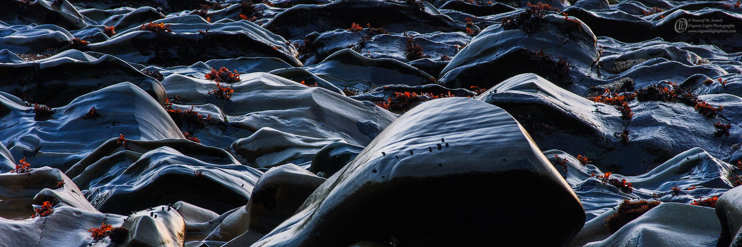
I am not sure if this photo is a better fit of Landscape of Abstract, but since I mostly consider what I do as landscape I put it here.
This is a section of a beach that has exposed sandstone during low tide sculpted by the surf. This is post sunset in the blue hour. It is a single frame cropped to the panoramic format
Specific Feedback
Overall I find this to be a striking photo. What I am unsure about is the larger foreground rock. I tried to dodge the very dark shadow but I just can’t seem to get any detail there. Is the lack of detail there a deal breaker? Is the large rock itself a deal breaker?
Technical Details
Nikon D2x, Nikon 105mm, at f16, 1 sec ISO 100. Processed in ACR and minimal adjustments in PS.
Critique Template
Use of the template is optional, but it can help spark ideas.
That’s a great geology lesson, and very interesting image. Ideally some detail in the large rock would be real nice, but it’s not a deal-breaker for me. The large rock is certainly compelling, but for me, it acts as a solid anchor for the image. I love the textures and the light. You might consider burning that light-toned rock just left of the large rock.
Its a very interesting image. In some ways its like a water abstract.
I think it works fine with the large central rock, and the lack of detail doesn’t bother me.
I think you could also make a cohesive image by a radical crop that just uses the LHS of the image and eliminates the central rock. But I don’t know that it would be a better image
Youssef, this is striking and it really draws me in. The colors are terrific.
The large rock may not be ideal but it’s not a deal-breaker. I don’t see a need for more detail in it. There are a couple of bright spots in the lower part of its shadow that are distracting; you might want to zap those.
I don’t know if you can return to this place with the same light but the area to the left of the large rock offers a good composition all by itself.
Youssef, it is indeed a strking image. Printed as an acrylic or on metal it would be stunning on a wall. I agree with the consensus, that while it would be nice to have more detail, its really the top of that rock that is the focal point for me. Great capture.
This is a really intriguing image. One of the reasons is the lack of a sense of scale. It feels like mountains and yet is not. But what makes it stand out is the highlights on the tufts of algae. This must have been a small window for you. It reminds me of the challenge of photographing cracked mud in DV where you only get 2 minutes at the most of optimal light. The darkness of the large rock doesn’t bother me at all. The absence of complete sharpness throughout is too bad. I would have done a focus stack here. The big rock works for me.
Youssef, this is spectacular with it’s black, blue and scattered reds. Since there are multiple smaller rocks with the viewer’s side being black throughout the frame, I think the big one at the front fits (and sets the stage for) the rest of the scene. There is a tiny white spot and a bit of blue near the edge of the “big black rock ”, that you probably want to remove before you make a print.
This is fabulous! Such an awesome view in the low tide environment - and to capture in the blue hour with all that beautiful light and glow on the rocks. The cool blues and grays of the rock are beautiful enough, but the added reds of the vegetation really take this over the top!
The large rock? I’m torn a bit. It’s not so much the dark face, but also the size. On the other hand, it’s really not blocking and as the viewer, I’m able to enjoy and absorb the beauty in its entirety.
Not much can be done manipulating this small web version, but I think perhaps even a tiny crop to eliminate the area that Mark just mentioned, this could improve the overall composition; simply reducing the size of that rock, even just minimally could help.
Overall, I sure love this and I agree, this is a very striking scene and image.
Striking? You betcha. This is all about the play of low angle light thrown across those smooth polished blue/black and gray rocks that brings out terrific texture, lines and shadows. Those rocks are so smooth they almost look like waves in motion and that blue hours light adds to the effect. The interplay of the red seaweed grabbing highlights plays out beautifully against the blue color effect of the rocks. I love the pano crop you’ve chosen and I must admit that I actually like that big foreground rock. I’m picturing the image without it and it’s not as dynamic. I really like the horizontal striations in the top of that large rock. I’m less excited about the flat black front of that large rock and the small bit highlights at the very bottom of it. If there was some way to get some texture there I think it would help a lot. I would also clone out or crop out the rock poking into the bottom right corner…or, burn down the highlights on the edge of that rock.
The last thing is the bright spot on the small rock on the left bottom. I would burn that a little and also cool the highlights there as well. They seem a bit warm compared to some of the other highlights. Great mix of colors, light, shadows, texture and contrast. I would love to see a bigger file of this one.
This image is very attractive, almost “musical”. Seems like a drawing of a sound wave record or petrified ocean waves. I like the colors, contrasts, and overall composition. I am not a fan of the “big rock”, but it does not bother too much either.
Really like this. I love the choice of format chosen the waves in the rock and the repeated undulations across the frame suit this crop very well, the deep dark blues with their mimicry undulating lines are lovely especially when liberally sprinkled with glowing red backlit tufts of seaweed fragments. I wish for just a tad less contrast a merest hint of information in the darkest shadows, but very very satisfactory.