Critique Style: Standard
The photographer is looking for thoughtful feedback on the image as a whole, especially around the areas noted below.
Feedback Focus: Artistic + Technical
About This Image
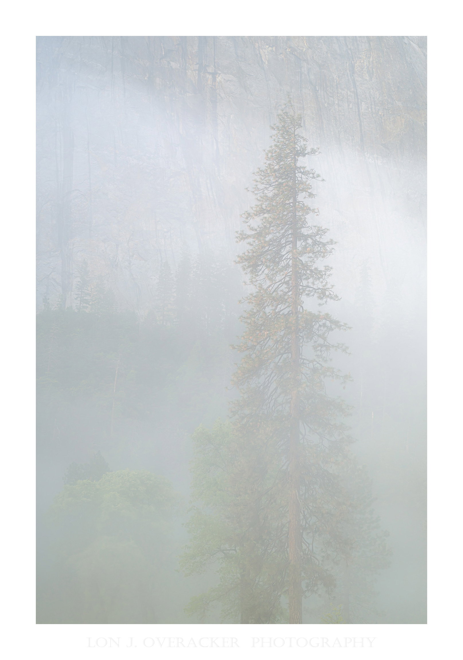
Yet another image from the last morning in Yosemite Valley where we were blessed with valley fog followed by the slow rising sun and glorious light. This image was about 30 minutes before the sun broke the horizon and the fog was pretty thick still.
This was such a surreal morning. People lament how crowded Yosemite is (and it most certainly is during peak/popular times,) but it’s not difficult to find and experience moments like this. There were just two other photographers I was aware of and a couple with a small child who were out at this hour just before sunrise. The silence in the fog, was quite literally a golden hour of peace and tranquility. And of course a photographer frantically searching for comps!
Feedback Requested
Processing was tricky as this could be processed going in many different directions, including b&w. I opted to retain the color because I really liked the greens and reds coming through in the main tree. Tricky on trying to find the balance between having the fog obscure the BG trees on the cliff and the oak at the bottom, vs. giving them more presence. I’m really curious if the processing has found the right balance.
Also, does the processing and presentation promote the notion of silence? What does this portray for you?
As always, your comments, critique and feedback are always welcome!
Technical Details
Camera: NIKON Z 8
Lens: NIKKOR Z 24-120mm f/4 S
Focal length: 71mm
Shutter speed: 1/6s
Aperture: f/11
ISO: 125
Lon, I really like concept here, but I believe the contrast is too low. I realize this was visually foggy, but it lacks some punch, for lack of a better word. I believe you could adjust this a bit.
This is one of those images where a few different versions ( say three) with differing contrast/sat levels could be posted.
-P
Lon: I can see @Preston_Birdwell’s point about the contrast but I like this as is. The subtlety of the light and color is very appealing to me and invites careful scrutiny. When I blow it up to full size all of those positive qualities come out even more. In the smaller versions it’s hard to see the details in the rock face (El Capitan?) but they’re a great complement in the large version. Well seen and presented. >=))>
Hi Lon! I really like the subtlety of this image. To me, the full size version takes away any concerns of contrast and hidden details. The fog is doing its job of obscuring unnecessary details and highlighting the beautiful light and colors. I love it as is and wouldn’t change a thing. I do agree with Preston that “This is one of those images where a few different versions ( say three) with differing contrast/sat levels” would be an interesting experiment. But I don’t know that any changes would make it better.
Yes, I definitely get a feeling of silence when I view this image… Calm, as well. I love how the subtle detail in the background really comes through when one views the image large and as such I wouldn’t change a thing about this.
Visual notes based on the original image:
Lon,
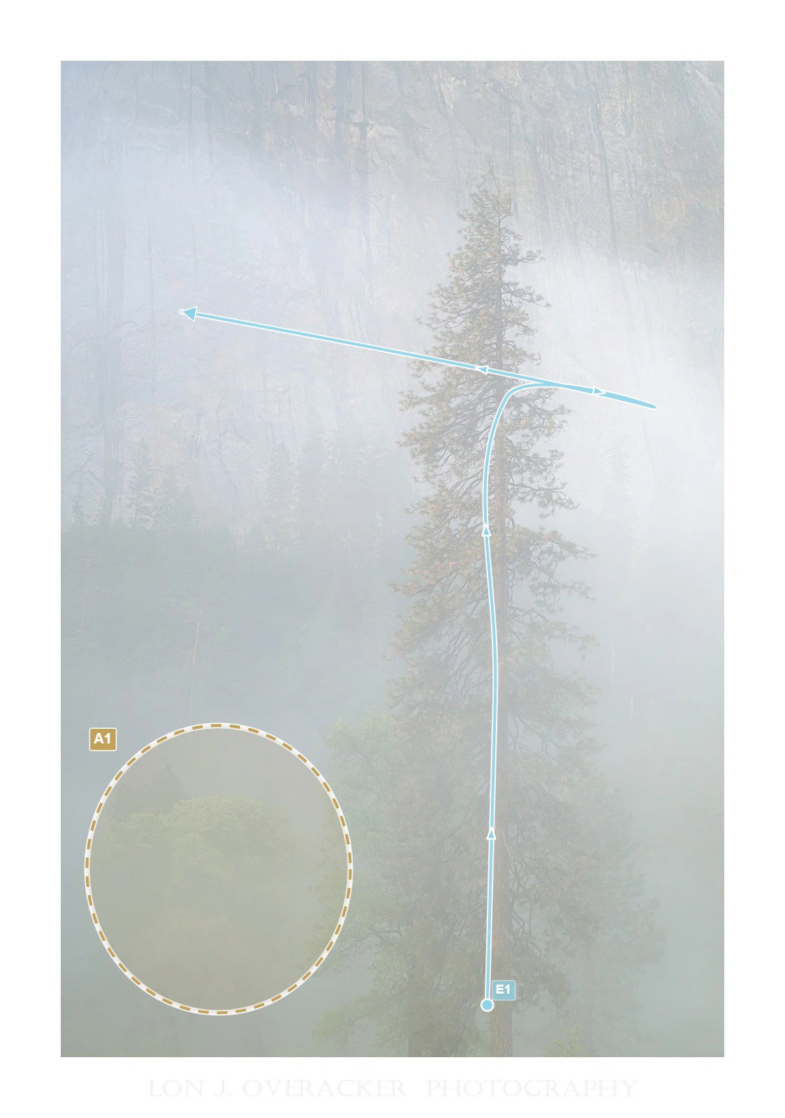
The main tree gets my attention first but then it pulled away to the brighter fog strip running through the upper third of the frame. I don’t know if raising the contrast would help or hurt the silence of the photo. As it is, it is a quiet photo visually. If the contrast was increased, it will introduce new visual items to take attention away from the main tree and then it might be visually noisy. Yet at the same time, the hint of other trees does nag at you to look at them even though they are difficult to see.
[E1] This is how my eye moves through the frame
[A1] These trees keep nagging at me to look at them
It does have a sense of silence. I thought @Youssef_Ismail made a good point about the lower left but when I cropped from the bottom it got worse. I thought there was not enough detail in the lower area and you could just eliminate it. But actually the lack of detail there gives the image a more ghost like sense because the tree is rising out of ambiguity. So I would handle the criticism by desaturating or cooling the foliage Yourself is referring to. Make it shades of grey for just that area.
You’re killing me with the morning light on that last day, Lon.
I have two thoughts here. When viewing this one small, like thumbnail size, I can see where @Youssef_Ismail notes the trees in the lower left disrupting the scene a little bit. In fact, those trees almost look like smudges in the small view. However, view this one large and for me, all concerns go away. I love the trees in the lower left as I can tell what they actually are. I love the ambiguity of nearly everything else except for those pines, front and center. You can just make out enough of the granite wall behind the trees to assume that this is in Yosemite Valley.
Absolutely. Perfectly! I think you nailed the processing on this one.
1 Like
Lon, I looked at the small and large version, and followed the comments made - seeing the points of contrast, and the barely visible tree in the lower left - and also the option of b&w. In the end, I like (very much) the image you posted, with this level of (low) contrast, all the trees (barely) visible and the subtle vanishing colors. To me, it is a splendid image, I can feel the fog (and I grew up in a very foggy place so I feel home in it…) and certainly the silence. Splendid.
I’ve been meaning to respond and thank everyone, but was unavoidably detained this past week or so. But I want to thank @Preston_Birdwell , @Bill_Fach , @Steve_Kennedy , @Tom_Nevesely , @Youssef_Ismail , @Igor_Doncov , @David_Haynes and @Antonello_Provenzale for your comments and keen observations.
I tend to agree and can’t argue the issue raised about the oak trees in the lower left corner. In the end, there isn’t much more for me to try and make this image more than what was originally captured. Even in the original RAW, the oaks at the bottom are pretty darn obscured . And the interesting thing with all the processing available, I can make the fog almost completely disappear OR make it a fog-out. But no matter the processing, the bottom left just isn’t going save this image.
I do love the stately pine in the mist and the hint of the trees growing on the sheer granite cliffs is a classic Yosemite scene, but cropping just that area diminishes the presence of the main pine as Igor point’s out.
Anyway, I won’t drag on with this one. I appreciate the honest observations and feedback!
This is a key point. There’s a lot of directions to take this, and likely will be variations instead of improvements.
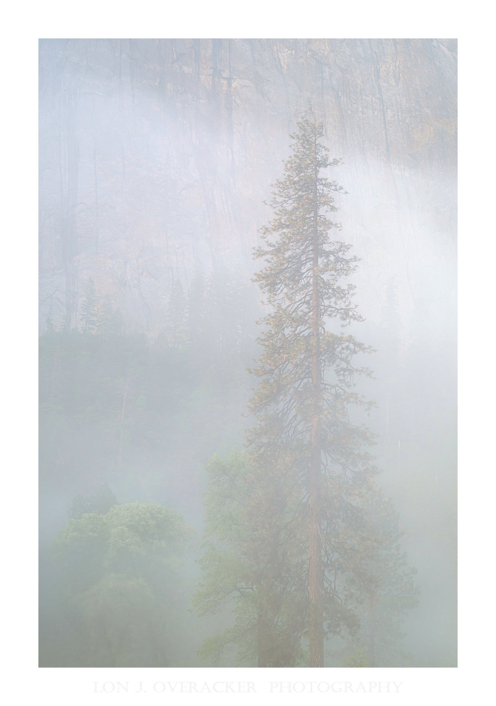
My thoughts ran a bit counter-current about that lower left corner. I actually find it very attractive, and played with bringing it out. I agree color is much better here, and so I also bumped that a little (and I also moved it slightly less green). Again, likely more variation than improvement. Regardless of all the above, it’s a wonderful image and really does speak to your goal of silence.