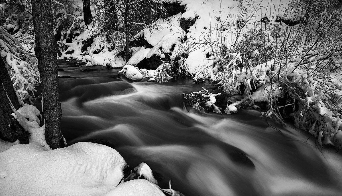
A few weeks ago I drove up to Lewis Creek after one of the (now many) storms that hit the Sierras. I was planning on shooting some of the waterfalls. Unfortunately with the amount of snow that fell I wasn’t able to hike down to the waterfalls I wanted to shoot and ended up just with this shot of the creek. I feel like the Black and White works better here as the creek water was rather brown this day but I am open to opinions.
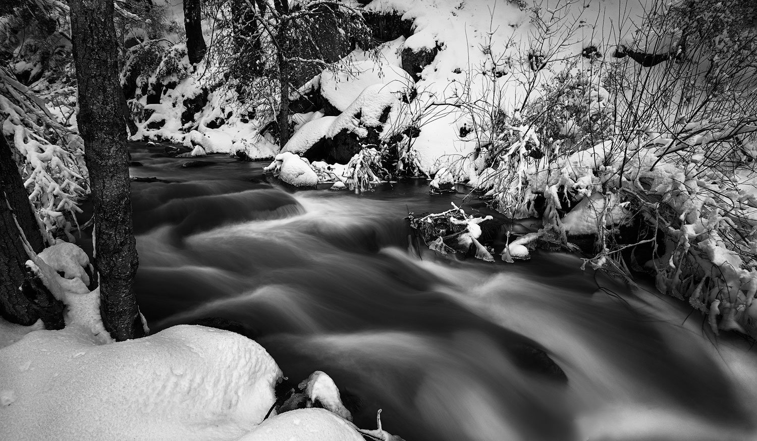
I think the B&W works really well here and is my favorite by far. I normally don’t like to do screen grabs of other people’s work and post, but I could not describe a crop suggestion without it. To me, the sweetest part of the image is the patterns in the water and I cropped to hopefully further emphasize that. My take, anyway. Nice image.
David, the B&W works so much better for me as the muddy water in the color version is not very appealing. Bummer about not getting to the falls, but this looks like a great Plan B to me. I like Harley’s crop suggestion, but I would only go up enough to get rid of the ice and snow in the LRC. Just my opinion of course. BTW the B&W processing looks good.
Just love the texture and flow in the river. B&W works best here, I think. (It’s too bad we have a mental block on thinking the brown water is dirty, or not pleasing. We all understand why it is, i guess we just can’t get past the color…)
I might favor a crop too, and I think Harley option works well, really simplifying the scene. I think I’m leaning more toward Ed’s idea. For me the biggest reason for the crop I think is to eliminate the snow-covered sticks, or whatever that is LR. It’s not so much the gentle curved snow in the LRC; I like how that part frames the corner.
Depending on your standards, you could do some creative Content Aware cloning or other techniques. I was also thinking of cropping a little off the top for a more pano format. Not sure why, but I’ve been on a pano-critique binge recently…
Here’s my attempt. Maybe a little closer to what Ed suggests. Also cropped down a little from the top. Did some dodging and burning to brink out the whites in the water a little bit and even out some dark areas around (might not even notice.)
Thanks for the comments everyone. I like the idea of a crop, I am somewhere in between Harley and Lon’s. I am not opposed to some cloning and content aware work for the LRC bu the work needed to make it look good is a bit out of my league right now so I’m leaning toward more of a crop.
I sort of prefer the original composition minus that odd snow thingee on the bottom. I prefer the water bounded on the bottom. I would suggest that the tree in the b&w be dodged to have the luminosity of the colored version. It’s a bit heavy now.
I actually like the colored version as an artistic expression of the scene. I would make the image b&w and retain the brown water. The water just looks bizarre, so I would emphasize that even more.
Just my 2 cents. As a whole I like the image very much. I do prefer the b&w like the others.
For sure black and white for me too, and I much prefer Lon’s crop. I’d drop the contrast of that lower left snow; it would make it look a little cleaner. Nice image; I really like the water texture you captured.
David, I’m coming in late here, but prefer B&W and Lon’s crop. While I think B&W is the way to go here, the original color file looks too warm to my taste, and it might have had more appeal if it was cooled down some.
Great image! I prefer the black and white also. Did you capture any shots with less water blur? I’d be interested in seeing just a tad more detail in the water. Just a small nit though. It’s a lovely photo as is.
Thanks for the comments, I decided to go more towards Lon’s Crop along with some dodging and burning in the water. I tried to clone out the bottom snow the best I could although I think Lon did a better job. @Tony_Siciliano The fastest shot I got was .5 seconds. I just liked the silky look of the slightly longer exposure to go along with the snow.
Another vote for the black and white, David. I like the processing for tones. I like Harley’s crop, but I was going to suggest a little more lower right snow bank. I find the hint of an ice rim and the little snowy dollop on the foliage kind of nice. Maybe there are other distractions (or limits in what you captured) that made that undesirable. I’m eager for other thoughts on this.