And a revision as suggested below:
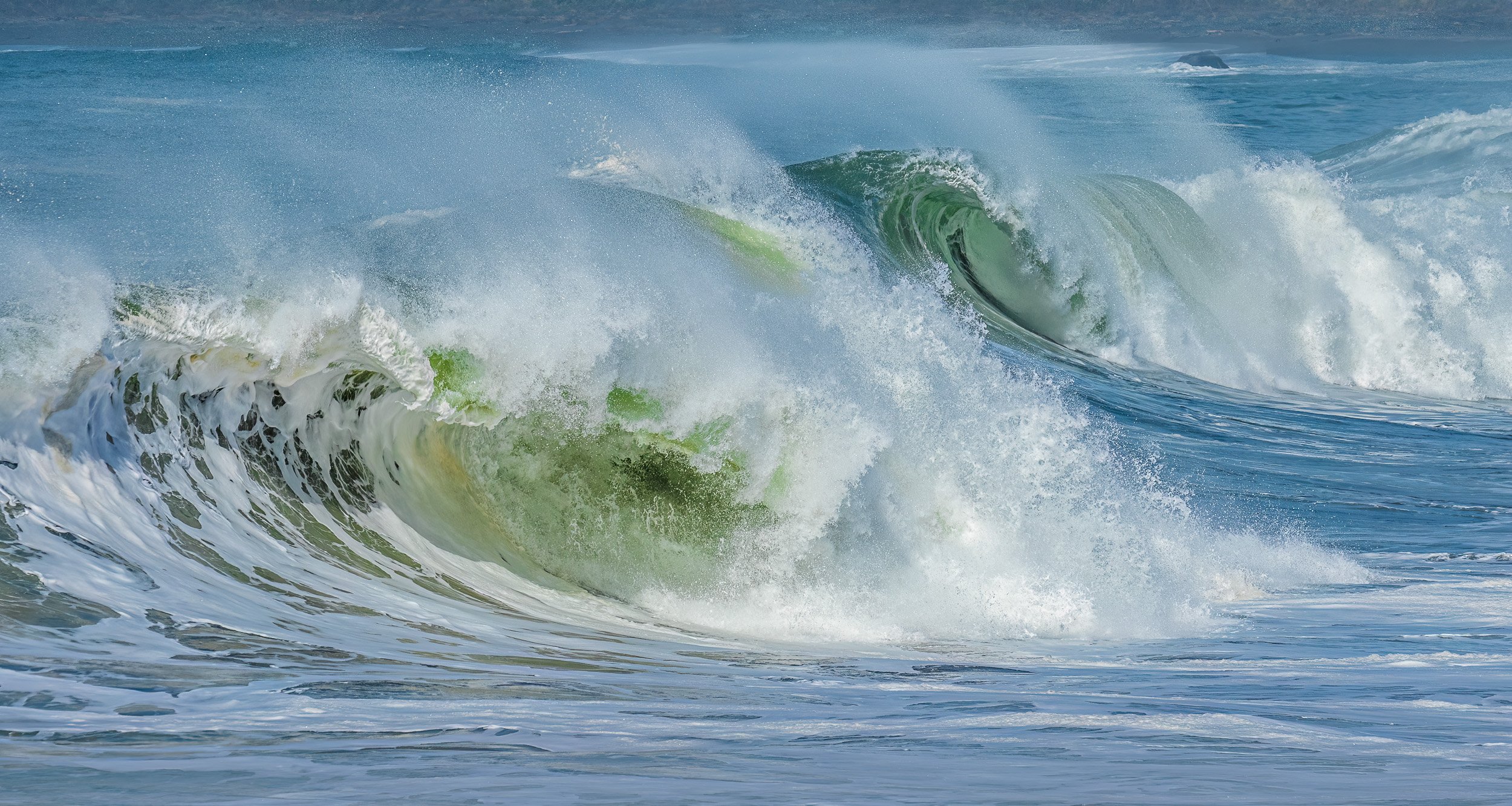
The next one from the best day I’ve ever had shooting waves. Awesome surf and unusual soft light!
Specific Feedback Requested
All comments welcome!
Technical Details
Canon 7D2, 100-400 II at 230, 1/1600 sec, ISO 400, f/8. Basic sliders in LR, but pushed pretty far. In PS, denoise but not a noticeable difference, removed a gull in the wrong place, minor softening of the top and bottom. Cropped to about 60% of the original frame thanks to a very un-level horizon. I think I was getting tired of hand-holding by this point but the time stamps show I held on for another hour. Over 90 minutes I shot 390 keepers. No telling how many I deleted – probably 3-4 times that many.
4 Likes
This is super, Diane. This image does capture their energy but I feel that it shows more their gracefulness and beauty. It’s the oval, the double oval shapes, and how everything is just suspended in time. I think that because of the movement the eye doesn’t capture the beauty that’s there. That’s how a photo shows more than the eye can see. No nits from me. I really don’t see anything obvious that can improve this. The small rock looks fine to me.
A really fine wave image, Diane. I would remove the rock in the upper right, as I find it continually pulls my out of the wave, where I want to linger. No other suggestions and it looks good.
Hi Diane,
I like this a lot. The choice in shutter speed is quite nice as it takes me right there to what it was like. I appreciate the soft light as well. I’m trying to see what I would recommend to improve this and I’m struggling. The only thing I can recommend is a slight crop off of the top and/or bottom. That rock upper right is slightly a distraction, but I can also see how it provides scale, so I’m 50/50 on it as well. Overall a very nice image!
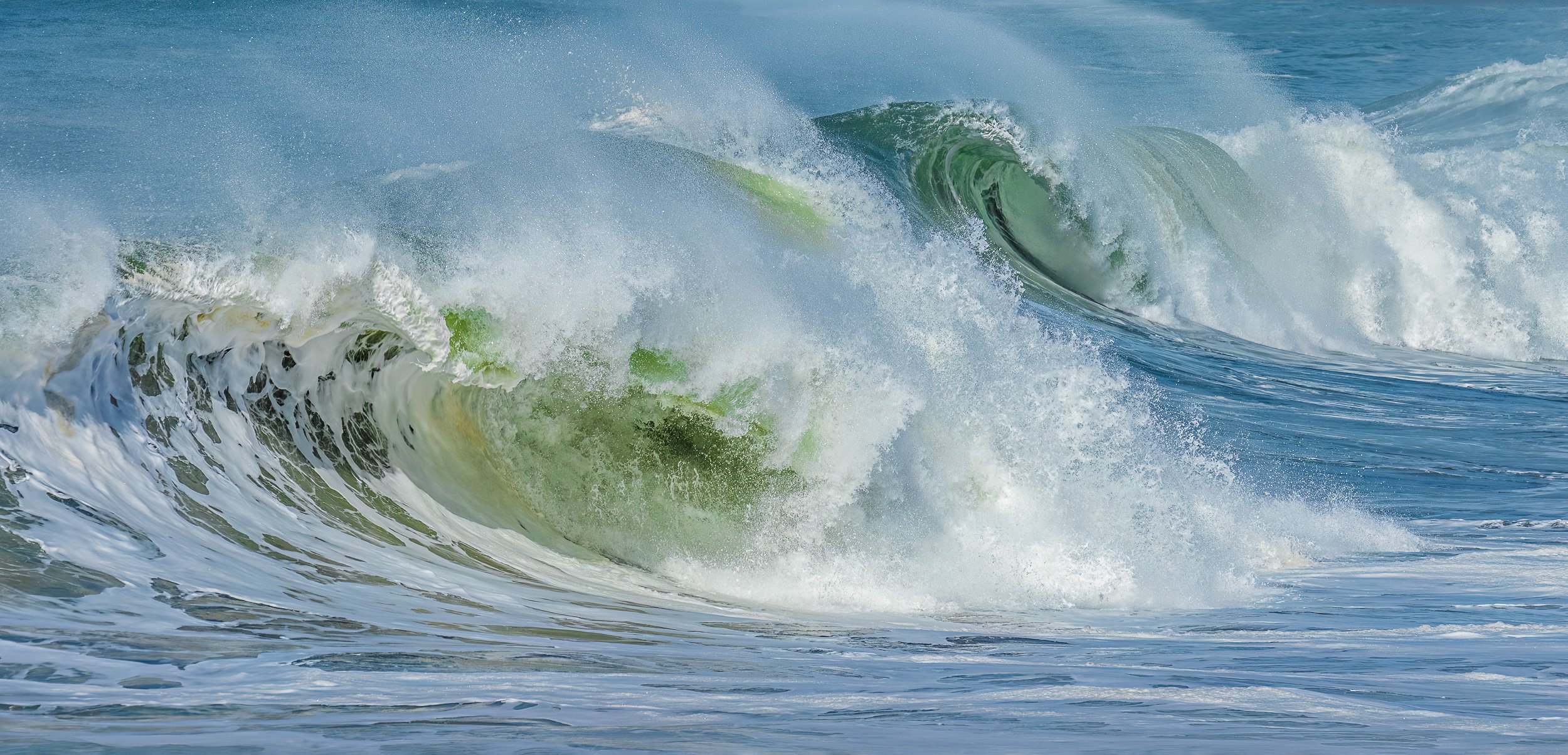
Thanks, @Igor_Doncov, @Harley_Goldman and @Matt_Payne! Gee, Harley, after carrying away armloads of driftwood I just didn’t have the energy to pick up that rock… But Matt’s idea solves the problem, along with the white area of foam that I’m not happy with. I was trying to save what I could of the rooster tails, but they weren’t that great here. I’ve posted a second version above, which I think is an improvement. Thanks for the feedback!
1 Like
The revision works rather well for me. 
Hi Diane. Not much to add here. I like the cropped version. The colours are gorgeous.
Diane,
Wow, these just keep getting better. Have any more in store for us?
This is fantastic. Great feedback as the edited version is boiled down to the essence of what you were seeing and shooting.
Colors are rich and beautiful - that soft light you mention was a great asset on this day.
No other suggestions or nits. You’ve nailed this one!
Lon
1 Like
The cropped image is just amazing! Agree with the others, nothing to add.
Thanks everyone!! @Lon_Overacker, 385 more…
Best one yet, Diane. Absolutely superb!
The revision does work better - I’m glad you tried it out! =)