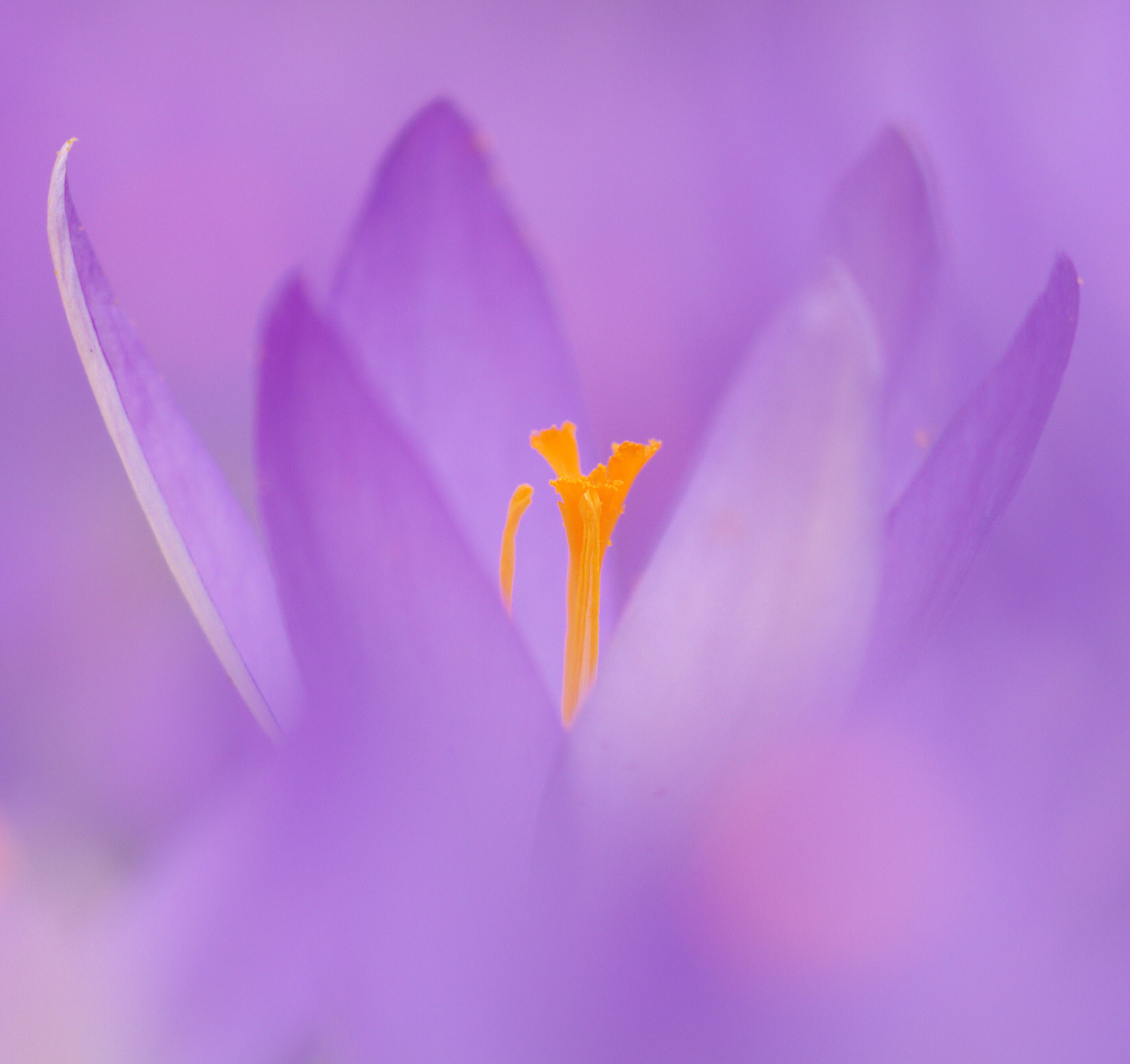
A close-up of a crocus. We had no winter this year, but wind and rain made images of these first messengers of spring not easy. So I posted this one, made a few years ago.
All feedback welcome.
Pertinent technical details or techniques:
Pentax K5, Pentax M 4/100mm macro, f4 and 1/200sec.
If you would like your image to be eligible for a feature on the NPN Instagram (@NaturePhotoNet), add the tag ‘ig’ and leave your Instagram username below.
Lovely, delicate capture, Han, nicely sharp in the flower centre. I really like the softness of this - maybe even the sharp petal to the L might be softened a bit as well ? Beautiful as is.
Wow…this sure is a beautiful image! The crop and central stamens in focus are just fantastic. The framing of them with the petals in front and behind also add to the power of the image. The in-focus petal on the left, as well as its relative brightness compared to the other petals pulls my eye to the left edge of the frame a bit and serves as somewhat of a distraction, but I’d be interested in others thoughts on this, as it completes the image if considered differently. My only other minor nit would be to burn down the lower left corner as it’s a tad bright as well. Thanks for sharing this beautiful shot!
Beautiful, Hans. I would agree with @Jim_McGovern about the LLC and I might clone out the white speck on the edge of the petal on the far right, but both are minor things. Quite lovely.
Thank you all, @Patricia_Brundage, @Ian_Wolfenden, @Harley_Goldman and @Jim_McGovern .
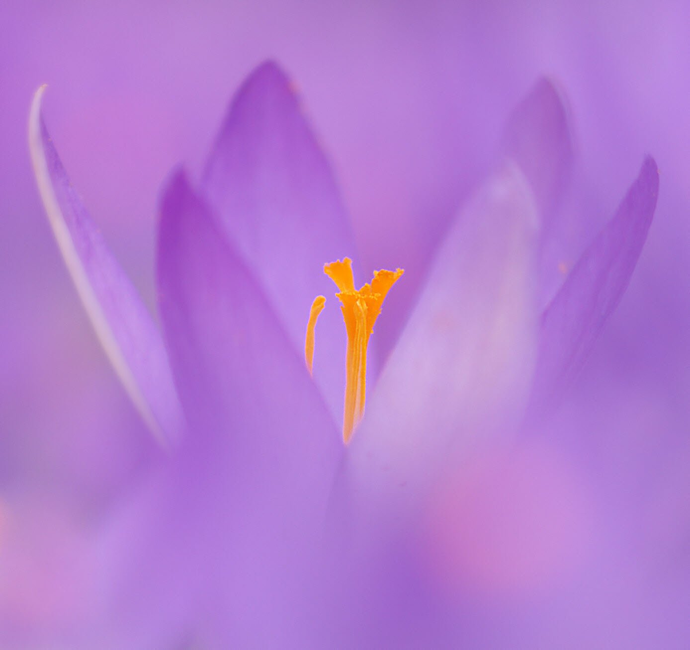
I cloned out the little speck, and softened the in-focus petal on the left a bit. Good suggestions. I agree about the LLC as well, it is a bit bright. Simply burning it down does no good to the image, because the saturation is low there and burning it results in a (too dark) grey. As an alternative, I cloned hue and saturation from another spot in the image to the LLC, to make it a little less bright.
I added the result here.
Han: Beautiful image and the repost adjustments are fine additions. I edited your title to reflect the Repost. It’s always good to do so so that others know you’ve made some refinements. >=))>