Critique Style Requested: Standard
The photographer is looking for generalized feedback about the aesthetic and technical qualities of their image.
Description
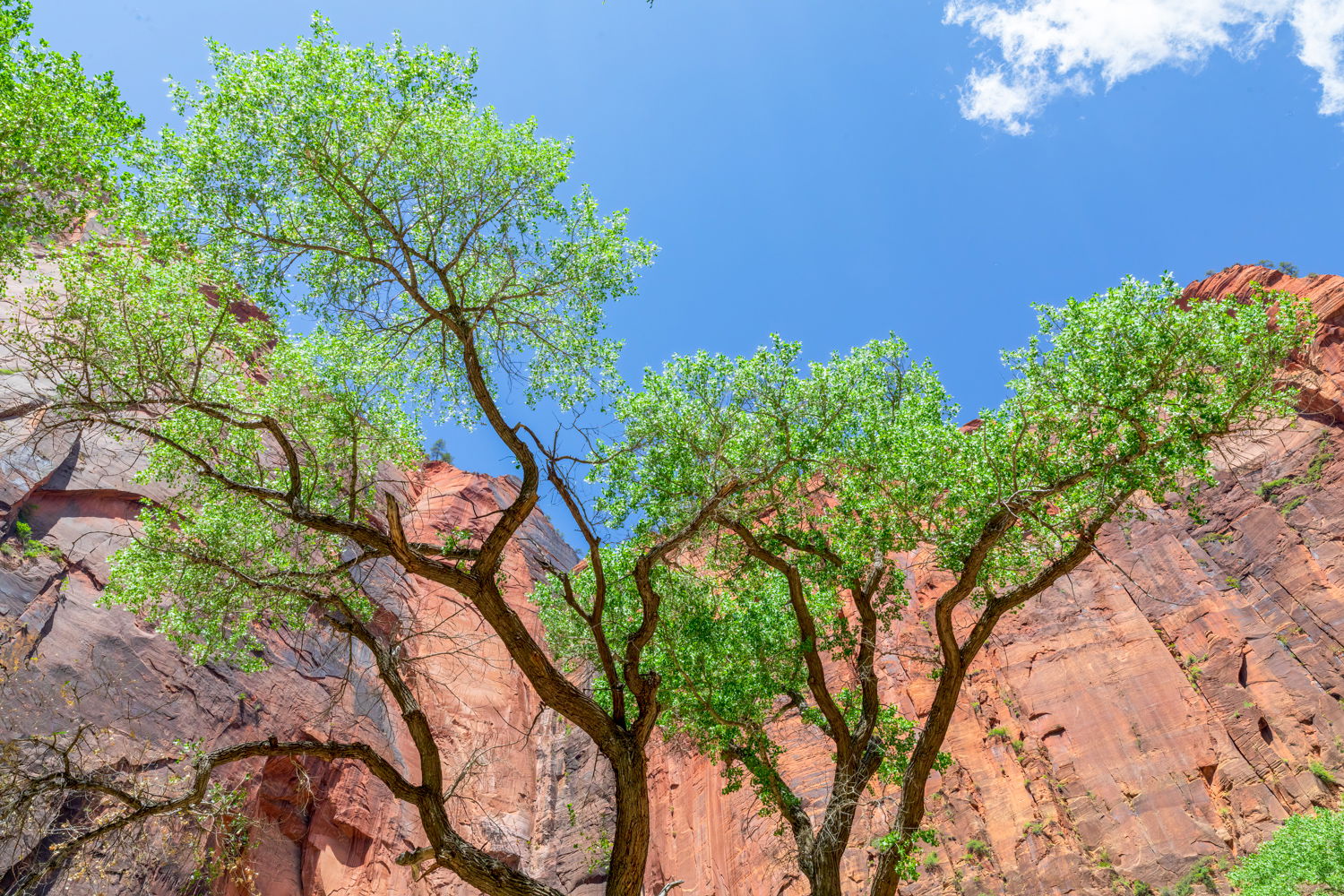
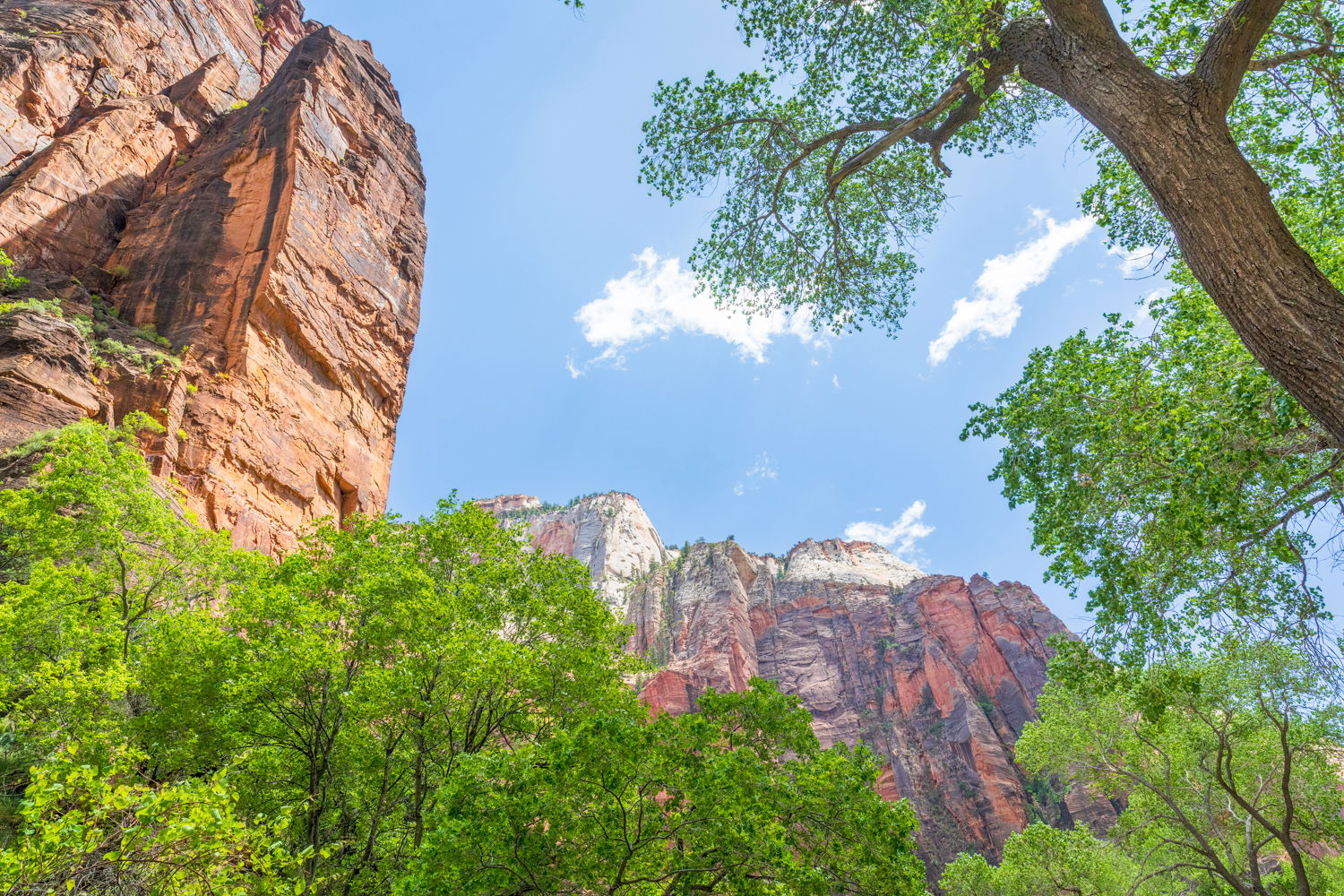
I have been going to Zion for fifty years, but shockingly never in the spring. I always went in the autumn or winter, after a snow storm. So I decided this year I would go and see it when there is green. And green there was. It was fabulous seeing bright green against the red rock. Zion is a magical place, with or without a camera. With a camera, you can point almost anywhere and get a good photo.
It was a little disturbing to see how crowded it is now, even in May. And e-bikes have taken over. They allow them on the Pa’rus walking trail along the river from the junction bridge to the visitor center and it kind of depressing walking alon the river admiring the beauty all around and then have some one (many some ones!) zoom by you from behind. Oh well, as my friend Sid (Siddhartha, AKA, Buddha) said, “things change”.
Specific Feedback
Any and all comments welcome.
Technical Details
Both of these photos were taking along the trail from the Temple of Sinawava to the beginning of the walking in the Narrows. I decided not to take my tripod and instead shot using ISO of 800 to allow an f/11 and exposure of 1/50-90 for hand held since my Canon f 2.8 24-70 is not image stabilized.
Critique Template
Use of the template is optional, but it can help spark ideas.
- Vision and Purpose:
- Conceptual:
- Emotional Impact and Mood:
- Composition:
- Balance and Visual Weight:
- Depth and Dimension:
- Color:
- Lighting:
- Processing:
- Technical:
1 Like
Hey Tony. I like your “outside the box” thinking here with some different compositions than usual. I think the second image is the superior one, but I think both images are overexposed to the point of highlight clipping. I would try a small curves adjustment to boost the midtones and a shadow/highlight adj to try and bring down the clipping a little. Also, there’s a dust spot or tree leaf creeping in at the middle top in both images.
I love that this image (or actually both of these images) are all about colour and more specifically about the three primary colours - red, green, & blue. 
Tony,
Wow, what a seasonal contrast! Funny, because the majority of images we see from Zion are in the fall, I almost have to question the greens! 
But once past the pre-conceived perceptions of a place, this image is quite striking with the blue and green - and actually as has been pointed out, the RGB!
This of course is personal choice, but I could see - especially in the 2nd image, a reduction in the whites or exposure by a 1/2 stop, maybe more? I wouldn’t say this is overexposed by any stretch, but the blue sky seems a little bright - to me.
I just noticed, again to my eye.. the greens in the second image seem spot on. The first image, I think the greens are a tad towards the blue side; Almost like it was KR64 instead of Velvia… Again, always a matter of personal choice and not anything wrong.
I especially like the first one and how the cottonwood trunks and branches contrast against the red rock canyon walls. You were fortunate to have the cloud in the URC to help with balance against that negative space.
Both are excellent captures from Zion!