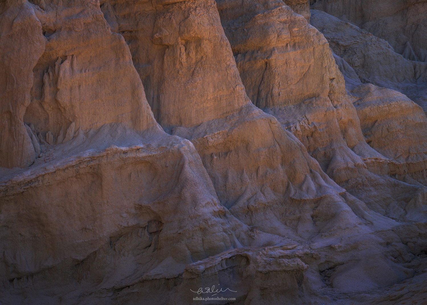
From my scouting trip to the Mojave desert this past Winter. I am attracted by the details on the cliff, especially that gently sloping strata in contrast to the vertical structure. And then there is the bounced light, too, which makes the scene quite intriguing. I am trying to capture those ideas in the image. I am wondering: Does the image design make sense? Is it coherent?
8 images, focus stacked, 200mm, f/8, 1/250, ISO 200, flipped horizontally.
Repost with a slight increase in contrast:
@adhikalie
**_You may only download this image to demonstrate post-processing techniques.
1 Like
I like this very much. From a design angle, this works well. The light is very soft, but I do think a very slight boost in contrast would look nice, too. I like the repeating buttresses. Well done.
–P
I agree with Preston about the slight contrast boost but I’m really liking the repeating patterns here. I also think you did well flipping the image horizontally because it has a nice flow to it.
Adhika,
Great job isolating this fairly intimate composition. The “bounce light” is in full effect here and wonderful. I might even suggest enhancing just a bit with some sort of light painting; either like with dodge/burn or painting effects combined with the contrast boost that has been suggested.
I’m really enjoying the soft and subtle colors (subtle, yet are colors that perhaps could be exploited a tad more?)
Hard to suggest any big changes or find any nits. Oh, I do see a handful of little white specks - maybe rocks you might clone out. Not a huge deal though.
Lon
This has a very subtle beauty to it. The blues are sort of interesting because there’s a hint of purple in them. Perhaps that’s from the bounce light. The image seems a bit too dark to me, particularly the lower areas. But there is a nice glow in that darker area which I wouldn’t want to lose. I can see what attracted you to this subject.
Thanks, @Preston_Birdwell, @Tom_Nevesely, @Lon_Overacker, and @Igor_Doncov!
I have amended the OP with a little bit boost in contrast. I think it has that sort of light painting effect that Lon mentioned.
Bingo! That’s it! great job on the repost. Thanks for taking the time Adhika!
Lon
Love the repost Adhika - the bounced light is more prominent but still exquisitely soft 
Adhika, Great intimate capture! I love the textures and soft light in this image. The composition works really well for me. I like how the three parallel structures act as layers moving your eyes towards the image.
I had one small take on the contrast boost. For me, I liked what it did to the lower/darker half of the image, but I liked the upper/brighter half of the image in the original version. To me on my screen, the upper/brighter part of the image with the contrast boost added looks a little too crunchy.
Other than that, no further nits from me. This was really well processed!
Tremendous subtlety (sp?) Adhika. I’d be tempted to boost sat just a bitl, but that’s a personal taste statement. Love the lighter aspect of the image at the upper half, and the rising crescendo of distant buttresses. Energetic and dynamic composition for rocks! Extremely well done.