The photographer is looking for generalized feedback about the aesthetic and technical qualities of their image.
Description
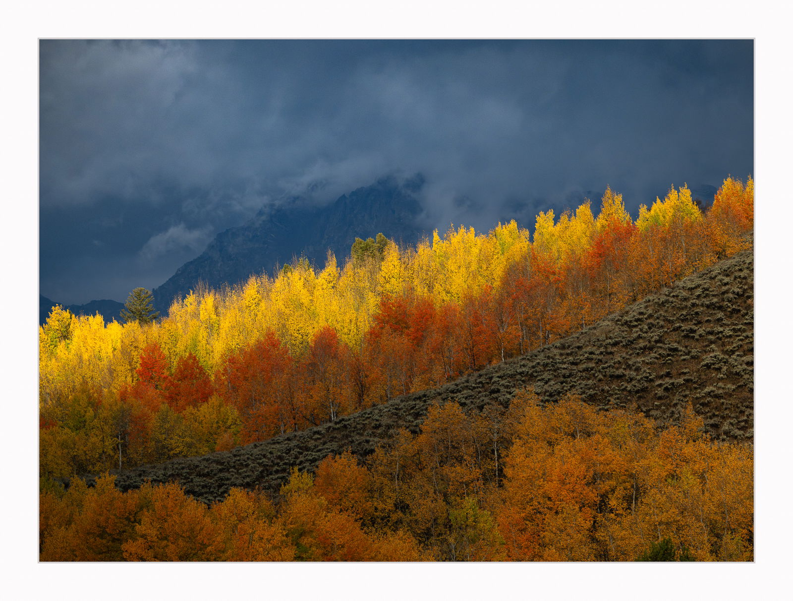
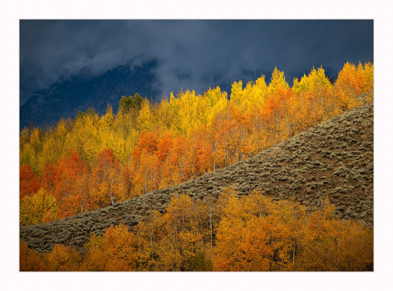
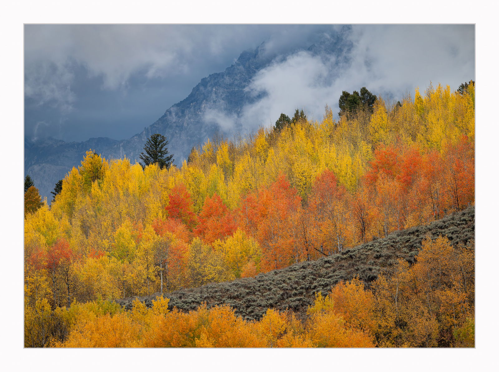
More images from my recent Fall colors trip. These were taken in the Tetons mere seconds apart showing how the light raking across a scene can dramatically affect what the image looks like. The first image was taken as I noticed the yellow aspen trees brightly lighting up but the light hit only the tops of the yellow aspen trees. The second image was taken just seconds later when the light hit the tops of the yellow aspen as well as a portion of the orange aspen trees just beneath the yellow trees as well as the sage brush. It was a softer light. In the third image the light is spread across most of the scene including the backdrop of the mountains. This is a slightly different composition of the same trees but further down the slope to the left with a few pine trees in the grouping. I very much love the first image but wanted to share how different these turned out in the space of about 30 seconds.
Just looking at these after posting and the compression is KILLING these images. Yikes
Specific Feedback
While I prefer the first one my wife prefers the second one. She doesn’t know why, she just does. So, I was wondering if I was way off base in much preferring the first image over the other two? Your thoughts? Thanks very much.
Technical Details
Z9, 180-600mm lens, Wide open at f/5.6, 260mm, 1/5000, ISO 1000, hand held
I saw the light playing across the scenes above and quickly grabbed my long lens which was attached to my Z9 and had auto ISO enabled so these were the setting I got. If I had more time I obviously wouldn’t choose ISO 1000 and a shutter speed of 5000 but…I would have missed the whole thing if I had played with the settings that were set for wildlife. I do all of my landscapes with the Z8 and all of the wildlife with the Z9.
Critique Template
Use of the template is optional, but it can help spark ideas.
Vision and Purpose:
Conceptual:
Emotional Impact and Mood:
Composition:
Balance and Visual Weight:
Depth and Dimension:
Color:
Lighting:
Processing:
Technical:
Wow, what a beautiful set of images David! It’s really hard to pick a favourite but after going back and forth a few times my vote goes to the second image – the one with more light on the green(ish) hill.
Hi David,
Decisions, decisions, decisions; you are making it hard to pick a favorite from this trio. I am not sure if you are going to get a concensus on a favorite, but I am voting for # one by a razor thin margin. I am just loving that band of light that separates the aspens from the BG mountains and clouds. Of course that could change tomorrow because all of these are wall hangers. Beautifully done; no suggestions from me.
When I first observed the photos, only two and three could open. I assumed there only two and chose 2 which is actually 3. I still prefer it; so I’m with @Igor_Doncov.
I’m going to have to agree with your wife, and say the second photo has more appeal. The wider lighting I think adds more overall contrast between the bright yellows and oranges which contrast better with the blue BG of the mountain and clouds. I also like the accentuated detail the light affords the scrub on the exposed hillside, adding so much texture to the scene, as well as opening up the details in FG trees. Yes, the second one.
All of these are portfolio-worthy but that first one makes my heart skip a beat. The lighting, tonal and color contrasts and composition are fantastic, David. All three are also perfectly processed. Outstanding work!
Well you can’t go wrong with any of them; these are amazingly beautiful. I’m with @Igor_Doncov and @Jim_Gavin in that I prefer three. With that said, I might move it a little darker overall, in the direction of the lovely contrast in the first two. Beautiful fall images David!