The photographer is looking for generalized feedback about the aesthetic and technical qualities of their image.
Description
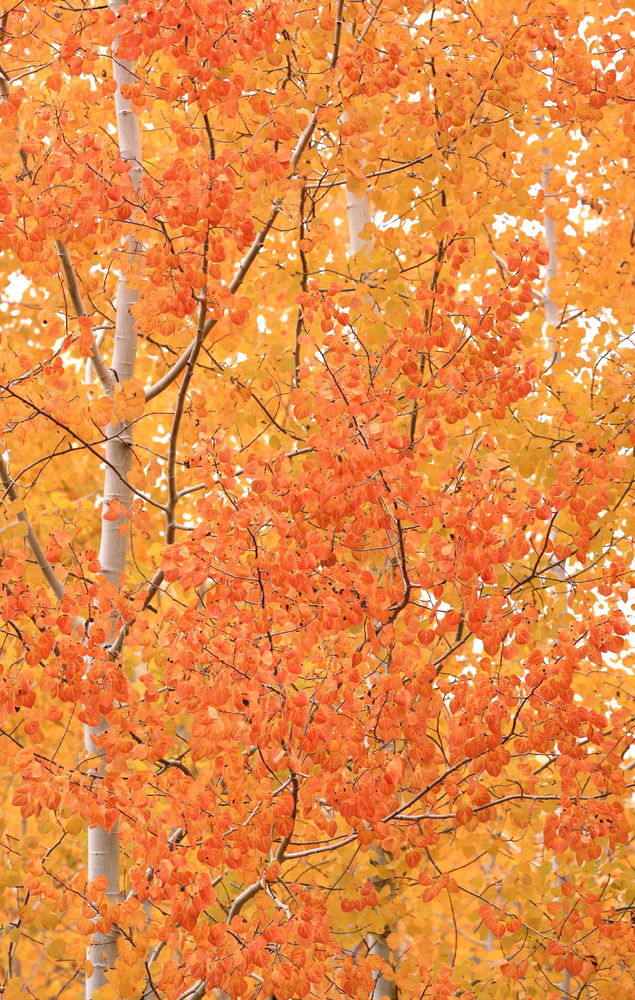
There is an aspen grove along White Pass highway along the Tieton River that is usually very nice in he fall. This year the colors here in he Yakima area have been excellent. It was raining (a bit unusual here) making for nice shooting conditions.
Specific Feedback
I toned down the contrast and saturation. Too much? Not enough?
Use of the template is optional, but it can help spark ideas.
Vision and Purpose:
Conceptual:
Emotional Impact and Mood:
Composition:
Balance and Visual Weight:
Depth and Dimension:
Color:
Lighting:
Processing:
Technical:
Delish colors. I wouldn’t tone it down any more unless you want to.
I wonder though, if a little crop in from the right side might help eliminate some of the sky showing through the leaves. There seem to be more of those “sky blobs” on the right side than the left. About 2/3 of the way down, there is one patch of sky that is right on the edge of the frame, I might crop in until that one is not bleeding out over the edge.
You could probably also use generative fill on some of those spots if you wanted to.
@Michael_Lowe@Michael_Lowe Thank you for the comments. @JulieEdwardsViola Thank you for the comments and the suggestions about the “sky blobs”; especially the one bleeding over the edge.
Gorgeous!! The sky blobs don’t bother me as they are small and well distributed, and they echo the white trunk. Not a criticism or even a suggestion, but I’d bet this is one where you could come up with several equally good versions with slight tweaks to WB in the raw file.
The color in those leaves is amazing! I love that aspen trees produce such a wide variety of colors in the fall. Your composition is perfect and processing looks spot on. @JulieEdwardsViola already mentioned the sky blobs, which is something I often struggle with when shooting these types of scenes. I’ve taken to using generative fill to eliminate some - but not all - of them in my images. I usually target the most offensive ones and leave the less obtrusive ones alone.
Jim, the color just explodes here! I love the mix of red and yellow, and the fact that you included only the single trunk make image much stronger. The white spots do not bother me at all. No nits to pick.
_P
Jim, this is a wonderful collection of yellow and orange Aspen leaves. You’ve balanced the trunk on the left well with the masses of leaves. I’d say you got the saturation just right.
She looks like she’s on fire. Terrific colors on this aspen, Jim. No, I would tone the colors or the saturation down any more. Looks great to my eye. And most pleasing to me is what @Michael_Lowe said about the spider webbing effect. I love that. The composition looks great to me and, although is some sky blobs poking through, they don’t yell burnt highlights to me making them standout. No nits at all but I have a small suggestion…Maybe dodge the trunk of the aspen just to the right of center along the bottom edge. It’s much darker than the other trunk and it might make it feel like just one aspen if you could lighten those dark patches.