Re Work:
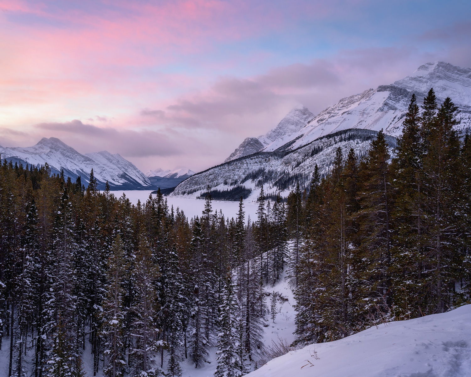
Cropped to have more balance and eliminate dark distracting cloud on ULC.
Added some warmth to highlights.
Enhanced the colors very slightly
I also added some brightness to the mid-tones.
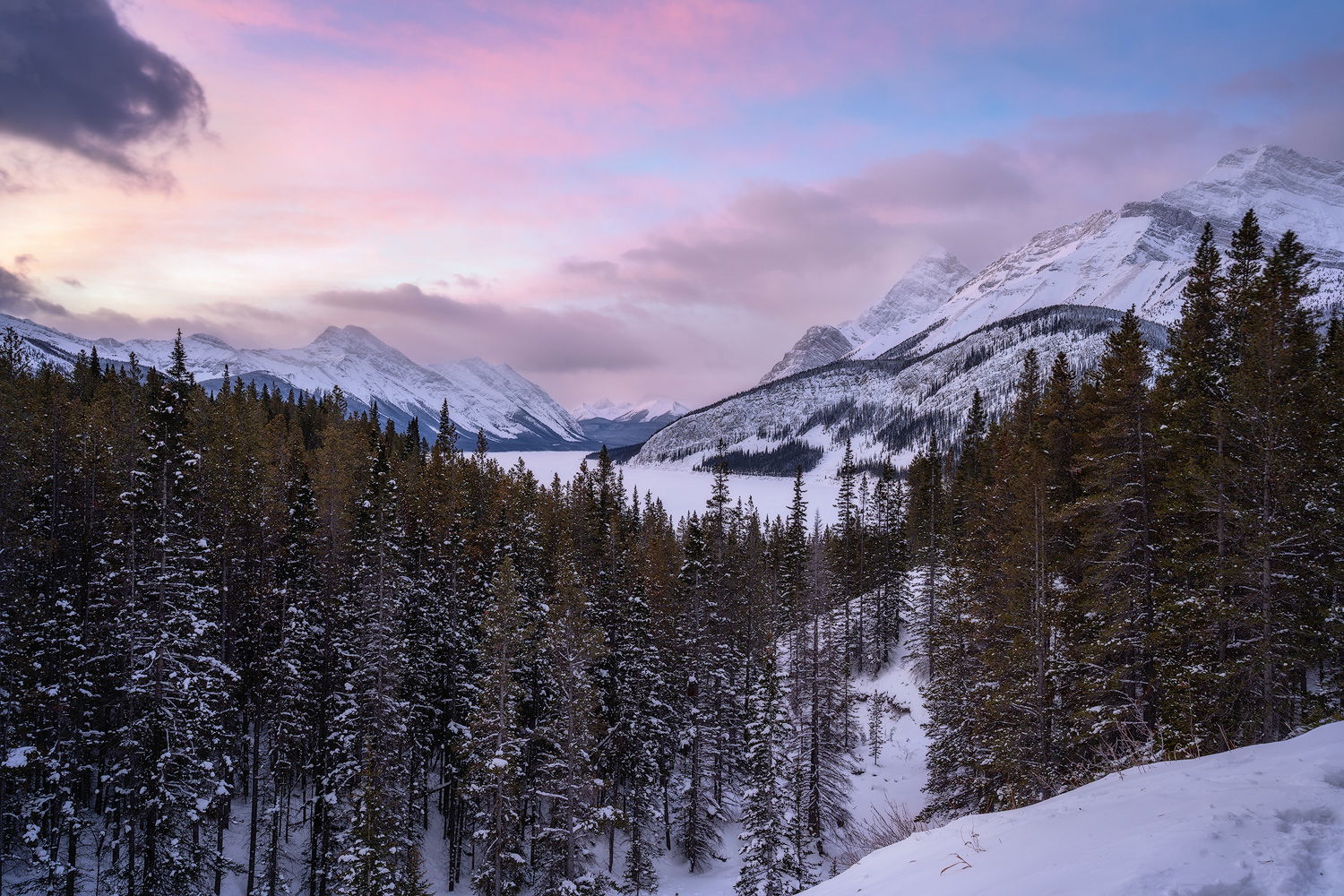
Well that one day was special.
The Chinook wind has just made a drastic change in temperatures from -30 C to around 0 C.
We set out to hike up this windy pass in the Rockies when i left my house it was -22 C in Calgary an 1.5 hrs later at the base of the pass, my car thermometer was reading 2 C .
Unfortunately we lost our way, the snow was fresh, we had no snow shoes and we were blazing the trail but luckily we caught that pre sunrise glow while we were at an opening in the trees over looking the valley.
I struggle with snow scenes. I bracketed this scene but ended up working with my middle exposure as i felt the dynamic range was sufficient!
It was a tug of war with the white balance there was a heavy magenta cast on the image but the scene as i remember it had a lot of magenta/red reflected from the sky by the fresh snow.
We continued through to the top of the pass where we could not stand for longer than a few minutes due to the strong wind gusts. On the way back the clouds were interesting as well as the light
I will share a couple of other images from the way down in the coming days.
Specific Feedback Requested
Any feedback is welcome
Specifically colors and balance, part of me feels that the image needs a bit of a color boost and i feel the trees in the LLC are too heavy..my initial thoughts when i composed the image was that the trees counter balanced ridge in the right side of the image.
Now after completing the work and coming back a day later i am not sure if my decision.
Technical Details
Is this a composite: No
One exposure processed twice one for sky and one for land then blended in Photoshop
Well, this sounds like an epic photo hike, and you had really nice light here too. I just love the soft light kissing the top of the mountain on the right. And I like how the diagonal line of the trees funnels my eye to the lake, and the mountain on the right.
This is subjective, but I’m not sure significantly boosting the sky colors would be harmonious with the gentle light on the mountains (which is what I like most about the image). What I might consider as an alternative is to warm up the sky, and the whites on the top of the mountain, where it is already receiving light.
In terms of composition, I think your gut feeling is right, it feels a bit heavy on the left. I think some of it is the darkness in the extreme LLC, and some of it is the dark cloud in the ULC, which has a lot of visual weight. You need a diagonal line in the left trees to pull the eye to the mountains, but I’m not sure you need this much of it
Here is a rework warming the sky/mountain, and cropped to 4x5, reducing space on the left. More than anything I just wanted to see how it looks with less space on the left, and it was just easier to do a rework. Let me know what you think.
A very good image, but I agree that @Ed_McGuirk 's crop takes it up a notch or two to an excellent one (and not just. because it removes the annoying cloud). It is tough to be a ruthless self-editor - to work either in the field or in post to eliminate anything and everything (no matter how attractive it might be in itself) that doesn’t add to what, specifically, you want to be sharing with the reader.
I hear you @Kerry_Gordon
I think it is good to hear feedback like this to for me to be more self critical. I like the cropped and used it in my final image and i know as i was cropping i was thinking “but the trees are nice” however the truth is that they were not adding anything and the cloud was taking too much attention to the corner.
I’m glad that I was able to help Aref. I like what you did with the rework, the subtle increase in saturation still fits with the overall mood of the image.