
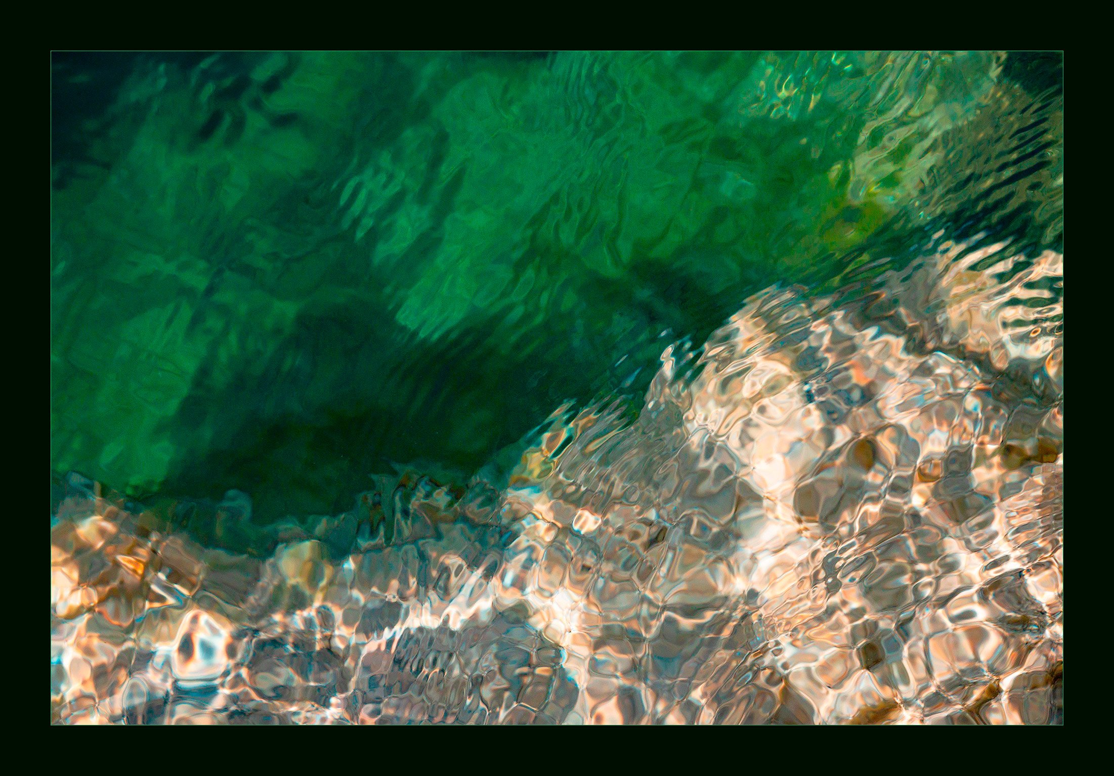
This is from a section of Canyon Lake where the water is fairly deep with a rocky shoreline. It is quite mesmerizing to stand above watching the water patterns. Thought it would make a good puzzle since there are some hints of character here and there. Enjoy!
I purposely pushed the ss and iso in an attempt to stop the water to make the patterns more readable. Did this work? Other thoughts, comments or suggestions are welcome.
Nikon Z6ii, f/13, 1/000sec., iso1600 @210mm (28-300mm), tripod & polarizer
1 Like
I think it works pretty well - the greens are especially lovely. Have you tried playing with the luminosity in that color range? I bet it could bring out even more of the hidden depths.
Thanks @Kris_Smith. I did an adjustment for brightness/contrast but that’s about it. I’ve been using the TK panels for luminosity masks but am not very experienced at using them. I can create them, just haven’t figured out how to make adjustment to a masks I’ve already created. Any suggestions would be great.
Are you using the full TK8 panel or the free TK6 version? If you’re using the full version, I recommend watching any Sean Bagshaw or Dave Kelly video on You Tube. Or better yet, get the TK8 Video Guide by Sean Bagshaw. When I started using the TK8 panel, I bought that set of videos with it and they are invaluable. I think Tony’s having a sale on everything right now so it might be a good time to snag something.
From there I also got Sean’s Luminosity Masking Master Class videos and even though they’re done with the TK7 panel, they are loaded with great info. At first it was overwhelming and so I had to watch things over and over while practicing on my own photos (although Sean includes the images he’s working on so you can practice on them). Just recently I bought Sean’s latest Workflow video and a lot of things clicked in terms of when to do what and how different types of masks work with each other. Slowly, but surely I’ve got a clearer idea of which tool or action will produce the result I want.
For this I used a color mask based on the lightest greens, used some of the mask refining tools to isolate just the colors I wanted to target and then put that out to a levels adjustment layer and pulled the lights in to the center and also nudged the blacks a bit to the center as well.
Then I used a zone mask to target the darker parts of the green shades. Using a color mask wasn’t getting me the mask I wanted so switching to a zone got it. Again I refined the mask using the tools in the gray box just above the output buttons. Then I put it out to another levels adjustment layer and did the same things with the sliders only to a lesser extent.
Oh and the colors were much brighter and intense in the photo I opened compared to the one you posted. For example I didn’t do anything to the lighter portion of the shot - all those gem colors were in the file I opened. Not sure why they look so different, but here it is before I did any masking at all -

All good questions, @Kris_Smith. I am using TK8 panels, full version. Also have several of Sean’s videos and gotten through most of them. Must admit I do keep going back and revisiting them. They are great and very helpful. So watching them over and over seems to be key. I don’t understand why the colors were so much brighter/intense when you opened them? Do you use TK’s web sharpening tool to prepare your files for uploading? Could that be it? Or do you think it is your computer, operating system or monitor? Love the green reflections you got in the rocks? Truly appreciate your taking the time to pass this information along.
Linda, the distortions caused by ripples when looking through clear water are always lots of fun. This is an intriguing look with the strong contrast between the brighter parts and the darker greens. I would have done some darks (and maybe some mid-tone) dodging of the green areas to reduce the the luminosity change across the fame, especially targeting the upper left corner and the darkest area. I do find the strong contrast across the frame interesting and dramatic. SS choice in views like this is a major challenge. If you go too fast, then the focus change across the frame becomes a problem, if you go too slow, the shapes start to blur. In many instances, it seems that slow enough to get similar blur throughout the frame is the best choice.
adjustments per Mark’s suggestions:

adjustments with Kris’ suggestion and some of my own:

Thanks, @Mark_Seaver and @Kris_Smith for taking the time to give me some great ideas. Both of the revision are better, at least for me, in that they do show a lot more of the levels of green in the water. Mark, yes I was definitely playing with a fast ss and iso in an attempt to get a clear crisp shot. Definitely need to go back and experiment more with adjusted ss. Between your thoughts on bring out the darker/mid tones and @Kris_Smith’s I am feel a bit overwhelmed about post processing. There are so many options about how to achieve the desired effect it can be challenging to obtain the best results. Still working on that aspect. Thanks again for your kind thoughts.
Linda, yes, there are a multitude of things that “can be done” to a photo both in RAW and in post processing. Your “job” as the photo creator is to decide which (if any) are the ones that you believe fit with what you’re trying to do with your photo. Trying alternative processing is how you refine your vision.
1 Like
Thanks, @Mark_Seaver. That’s exactly where I am. 